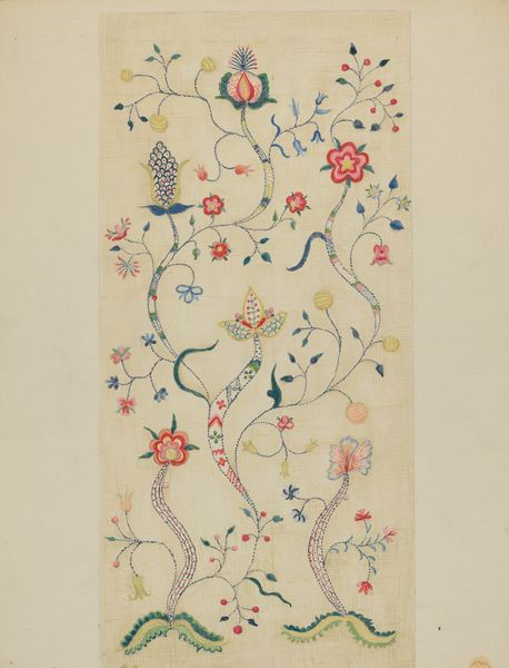
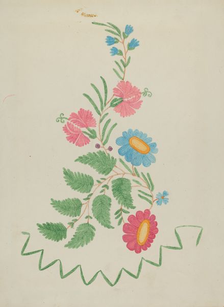
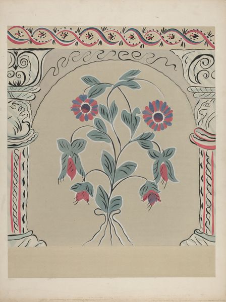
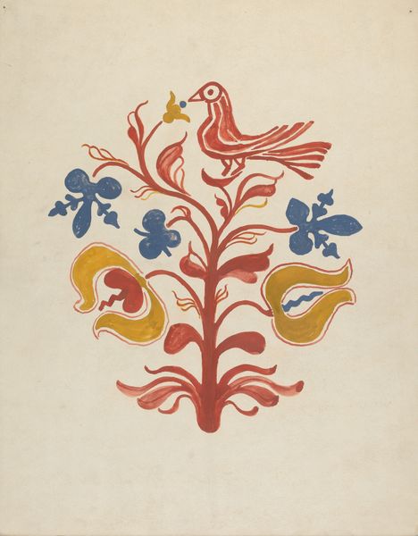
drawing, watercolor
#
drawing
#
water colours
#
pastel colours
#
pattern background
#
watercolor
#
watercolour illustration
#
decorative-art
Dimensions: overall: 46.2 x 36.2 cm (18 3/16 x 14 1/4 in.)
Copyright: National Gallery of Art: CC0 1.0
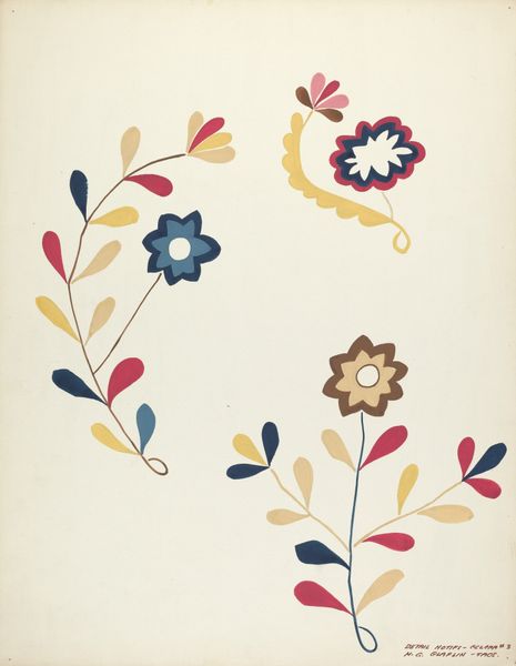
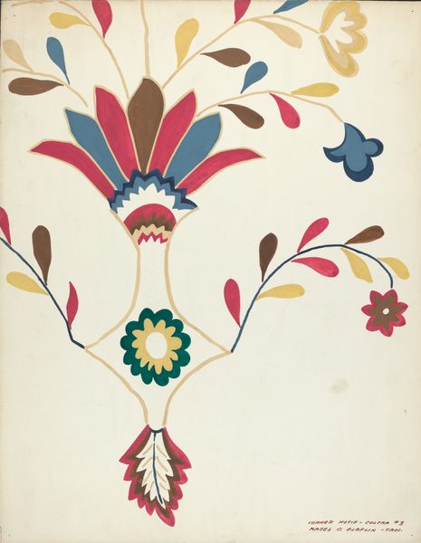
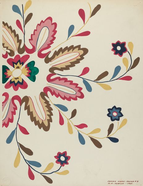
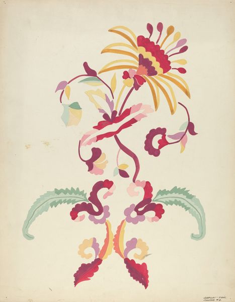
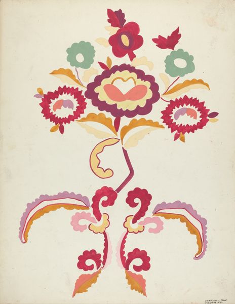
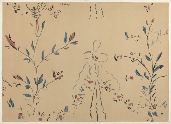
Majel G. Claflin created this design for a proposed portfolio using gouache, probably sometime in the early 20th century. Look at these colours! Soft yellows, deep blues, reds. It's a really interesting combination, and you can see how the artist is exploring different colour pairings through the different floral motifs. The gouache gives the images a beautiful matte surface, almost like velvet. And notice how the artist has allowed the brushstrokes to be visible, giving the design a real sense of immediacy and energy, as if it was made in one sitting. The petals on the bottom right, for instance. They’re not perfect, and that’s what I love about them. It's the kind of mark that makes you want to pick up a brush yourself. This piece reminds me a little of the work of Hilma af Klint, but in a totally different register. Both were interested in pattern and design, and both saw artmaking as a process of discovery. Art is a conversation, right?
Comments
No comments
Be the first to comment and join the conversation on the ultimate creative platform.
More like this