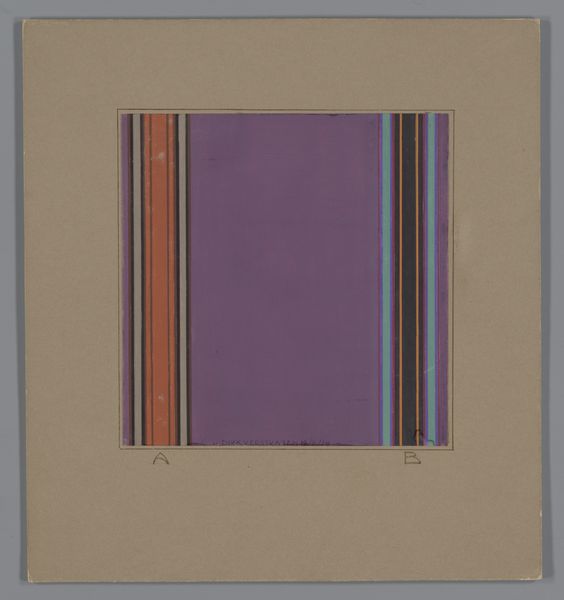
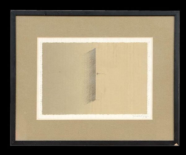
drawing, paper
#
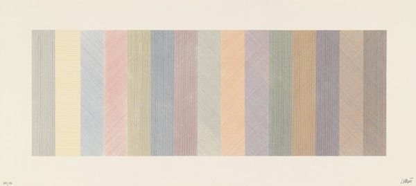
faded colour hue
#
art-deco
#
drawing
#
homemade paper
#
light colour palette
#
pale palette
#
pastel soft colours
#
muted colour palette
#
white palette
#
paper texture
#
paper
#
geometric
#
folded paper
#
abstraction
#
soft colour palette
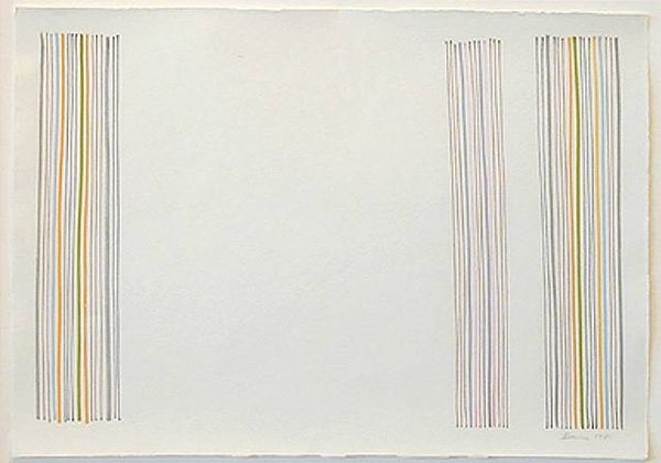
Dimensions: height 239 mm, width 213 mm
Copyright: Rijks Museum: Open Domain
Editor: This is “Ontwerp voor een tapijt met verticale banen,” or “Design for a carpet with vertical stripes,” possibly from between 1924 and 1928, by Dirk Verstraten. It’s a drawing on paper. It has this cool, almost retro vibe with its muted colors and simple geometric design. What do you see in this piece? Curator: It’s interesting how Verstraten's design reflects a broader shift in the early 20th century. Think about the rise of modernism and the Bauhaus movement, emphasizing functionality and stripping away unnecessary ornamentation. The Art Deco influence is visible through its elegant simplicity. But, who do you think was this carpet made for, and where was it intended to be displayed? Editor: Well, given the period, I’d guess it might have been intended for a modern, middle-class home, perhaps reflecting the changing tastes of the time. Were there particular political or social ideals associated with this type of design? Curator: Exactly. Post-World War I, there was a desire to rebuild society, and design was seen as a tool for that. The clean lines and geometric shapes can be interpreted as a rejection of the past and an embrace of the future. The muted tones could reflect a sense of austerity following the war. Editor: That makes sense. It's not just a pretty pattern; it's a statement about a new way of living. Curator: Precisely. Consider how museums and design exhibitions at the time promoted this aesthetic, shaping public taste and defining what was considered "modern." It speaks volumes about the period's aspirations for a more rational and efficient world. Editor: It’s fascinating to think about design as a form of social commentary, consciously shaping values. Curator: Indeed. It prompts us to consider the politics embedded within seemingly simple aesthetic choices and the institutions that bolstered those choices. What do you take away from our talk? Editor: I’ve learned to appreciate the significance of Art Deco designs and also what goes into influencing people's choices. It's more than just pretty stripes.
Comments
No comments
Be the first to comment and join the conversation on the ultimate creative platform.
More like this