Copyright: Gene Davis,Fair Use
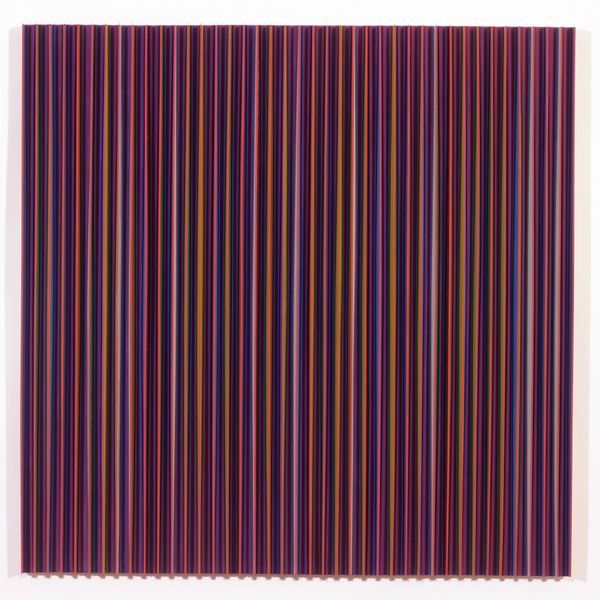
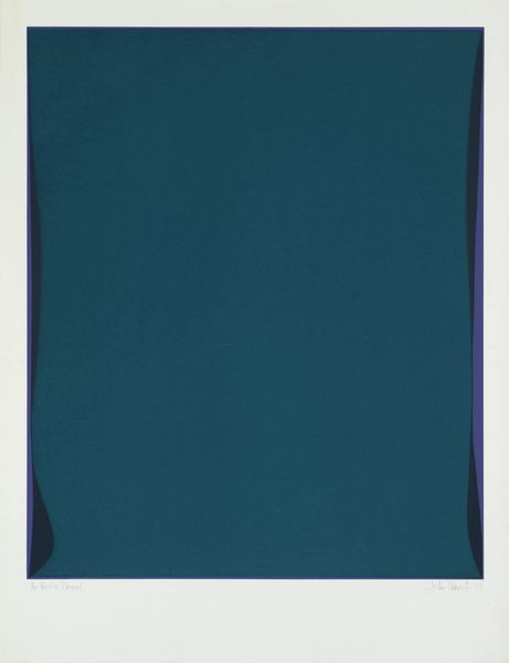
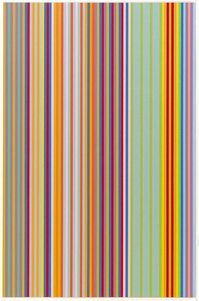
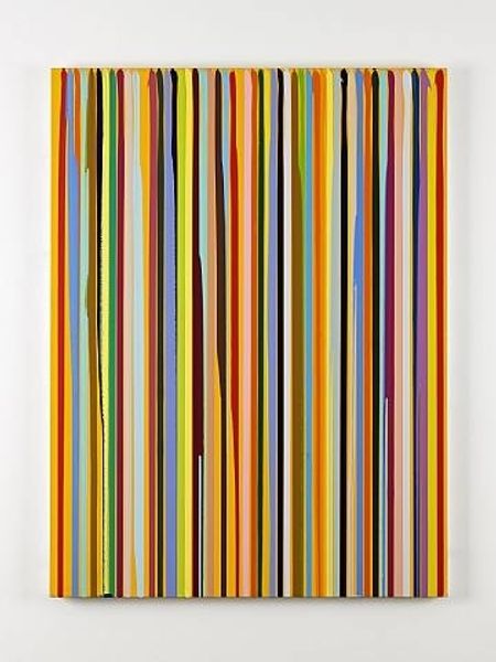
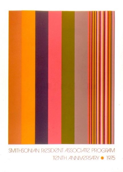
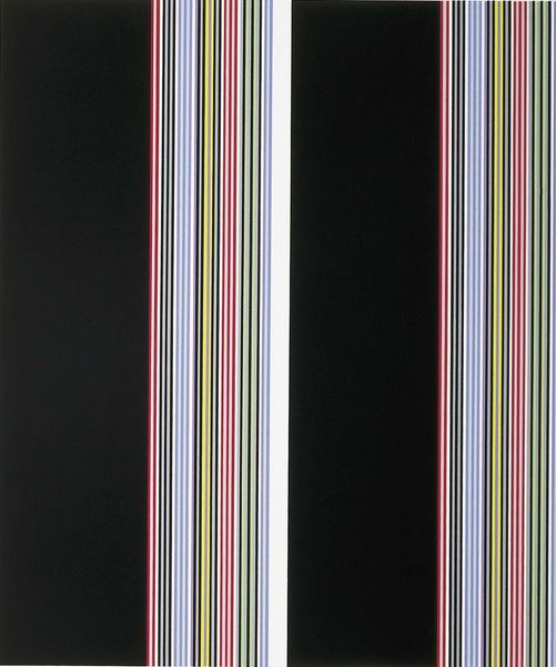
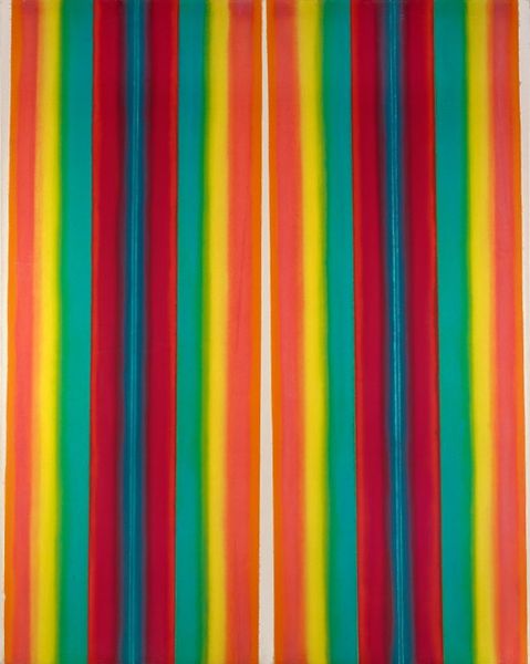
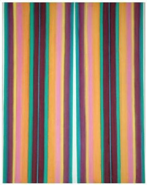
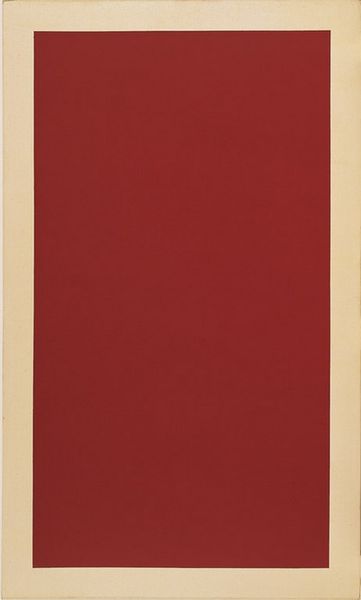
Gene Davis made this poster in 1980, for the Smithsonian Resident Associates Program, and, well, it’s basically stripes! There are columns of vertical stripes along either side of a large plum colored rectangle. What’s fascinating is how Davis uses color to create a sense of rhythm and movement. There's a real musicality to the arrangement, like notes on a scale, and it feels intuitive. I mean, how does one decide which color comes next? You can almost feel him choosing each color, one at a time, until there’s a balance. The plum color is interesting, too. It’s solid, opaque, providing a grounding for the color harmonies either side, and it feels pretty monumental. Davis reminds me a bit of Agnes Martin in his dedication to a specific format, but where Martin is all about subtlety, Davis goes for bold expression. It’s about exploring the endless possibilities within a limited framework, a conversation of ideas across time.
Comments
No comments
Be the first to comment and join the conversation on the ultimate creative platform.
