drawing, watercolor
#
photo of handprinted image
#
drawing
#
pastel soft colours
#
muted colour palette
#
white palette
#
collage layering style
#
fashion and textile design
#
feminine colour palette
#
watercolor
#
historical fashion
#
united-states
#
soft colour palette
#
clothing design
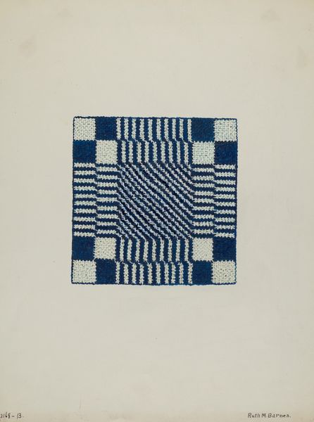
Dimensions: 11 3/4 × 9 in. (29.85 × 22.86 cm) (sheet)
Copyright: Public Domain
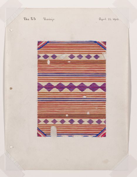
Curator: So delicate…it almost breathes, doesn't it? It feels like a whisper of a memory. Editor: It’s surprisingly understated for something made in 1904, at the height of artistic maximalism. We're looking at “No. 13,” currently housed at the Minneapolis Institute of Art. It appears to be a drawing. Curator: Yes, a watercolor and pencil drawing on paper, in fact. And it's more than just a drawing; it feels like a captured moment of reverence for textile art. Look at those carefully rendered stripes, how the colors soften and bleed just so…like a sunset on woven threads. Editor: There's definitely an interesting tension between representation and abstraction. The textile itself is quite minimal—simple horizontal bands of red and dark blue—yet the softness of the watercolor almost elevates it, lending a dreamlike quality. Note how the ground is simply raw paper? What does the formal starkness do to the emotional context? Curator: It is numbered "13" at the top, also carrying the notation “Navajo” beside this, and hand dated “May 12, 1904," all written lightly in pencil. Considering this level of finish, maybe it was for a book on Navajo weaving and textiles? Think about the artistic skill to recreate this weaving, as opposed to using then newly available photography! The imperfection becomes the art, a subtle, vulnerable mark. It tells us that we need to bring more to the creative endeavor, something deeper that a mechanical recreation cannot bring to us. Editor: You know, looking at the color palette—that subdued, almost faded red and the deep blue—and then considering the period it was made in the United States...it brings a very distinct historical atmosphere into play. It evokes cultural appropriation in fashion design of Native American crafts, perhaps something of a romanticised take of Native American textiles to create a modern trend piece. The raw paper itself becomes more charged, then. Curator: Yes. And in this supposed 'mistake', it’s a way of connecting us, the viewers, to our shared creative hearts…allowing this cultural object to teach. I think its vulnerability opens it to the idea that anything and everything is allowed and important in creative works. Editor: That said, I think the dialogue that emerges between the raw paper, color, and object create new meaning. Curator: Indeed! Now, where does it take *us* as viewers?
Comments
No comments
Be the first to comment and join the conversation on the ultimate creative platform.
More like this