drawing, print, paper, typography, ink
#
drawing
#
type repetition
#
aged paper
#
art-nouveau
#
homemade paper
#
ink paper printed
# print
#
hand drawn type
#
paper
#
typography
#
ink
#
hand-drawn typeface
#
fading type
#
thick font
#
modernism
#
historical font
#
columned text
#
calligraphy
Copyright: Rijks Museum: Open Domain
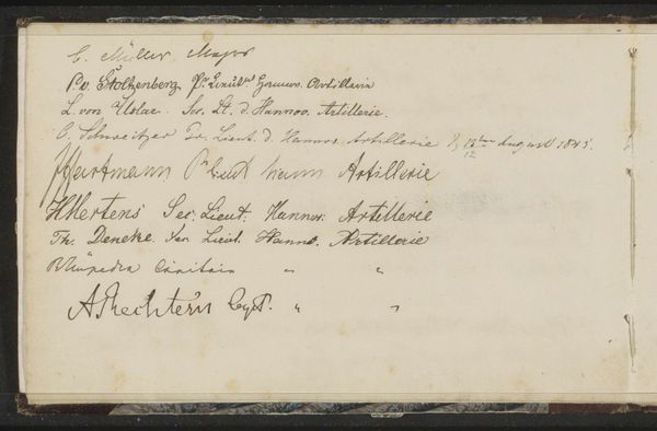
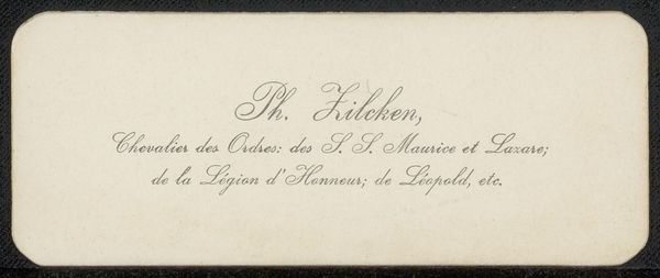
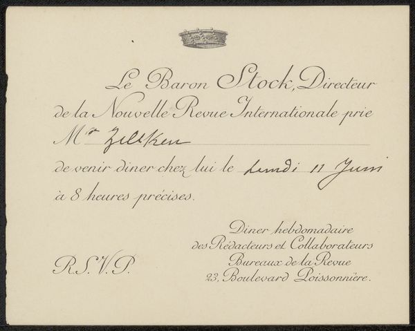
This is a thank you card to Philip Zilcken from an anonymous artist, created in June 1903. At first glance, the composition seems simple: black ink on a cream surface, a study in contrast and clarity. The names, meticulously listed, create a rhythm of forms, each letter a tiny architectural element. These names, carefully arranged, are not merely identifiers but become visual components. The repetition of "Thorn Prikker" functions almost like a musical motif, binding the composition together. The card, in its design, evokes questions about identity, artistic communities, and the act of recognition. Does it challenge fixed meanings? The careful distribution of names and the elegant script transform a utilitarian object into something more profound. It asks us to consider the aesthetic dimensions of everyday communication. The formal qualities of the card—its balance, typography, and the interplay of light and dark—elevate it, prompting us to see beyond the surface and engage with the ideas it subtly communicates.
Comments
No comments
Be the first to comment and join the conversation on the ultimate creative platform.
More like this