Dimensions: height 207 mm, width 131 mm
Copyright: Rijks Museum: Open Domain
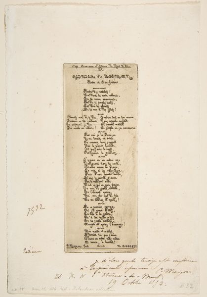
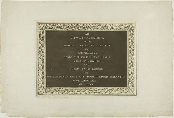
Curator: Well, the immediate feeling it evokes is one of delicate nostalgia; the subtle cream of the paper and ornate typeface really lend an air of a bygone era. Editor: Indeed. This "Menukaart," which translates to "Menu," is believed to date somewhere between 1850 and 1900, though the creator remains anonymous. We can classify it as a print using typography. What draws my eye is how the lettering’s form affects readability, how serifs interact. Curator: And look at the material realities implied. This wasn’t just churning out identical copies; each was handled, touched by the printer. I wonder about the economic status of the restaurant that commissioned this, and the clientele who could afford to dine there. Consider the paper—its sourcing, production… all feeding into a very specific class dynamic. Editor: But even within that rigid social structure, notice the visual tension. The border, composed of repetitive floral motifs, contains, or perhaps, elevates the humble list of dishes within. Structurally, it presents us with an order: soup, meats, desserts. There’s a hierarchy presented, and within that framework the typography acts as its own design element guiding our eyes. Curator: Certainly, the aesthetic choices reflect a broader cultural context. The flourishing of romanticism impacted the way even the most functional documents, like menus, were produced. And one cannot deny the role of "genre painting" which captured everyday life, influencing how people perceived dining and presentation. The means by which these printers combined lettering and decorations, and who had access to this kind of fine service, gives a social snapshot. Editor: Ultimately, regardless of societal context or class associations, the careful orchestration of type and ornamental detail work to establish this menu's elegance, its ability to offer a moment of temporary escape. Its quiet precision speaks to aesthetic harmony through graphic elements alone. Curator: Well, in its design, typography and distribution we’ve unearthed insights into production, consumption, and social life of the 19th century through what might appear merely to be an ephemera. It makes one hungry to know more! Editor: I, at the very least, have gained an appetite for seeing familiar typography through renewed appreciation.
Comments
No comments
Be the first to comment and join the conversation on the ultimate creative platform.
More like this