drawing, paper, ink, pen
#
portrait
#
drawing
#
ink drawing
#
pen illustration
#
pen sketch
#
paper
#
ink
#
pen
#
calligraphy
Copyright: Rijks Museum: Open Domain
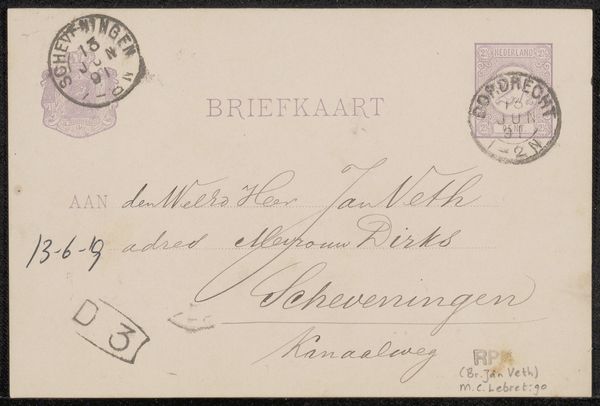
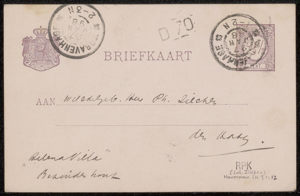
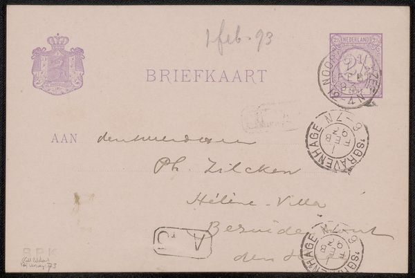
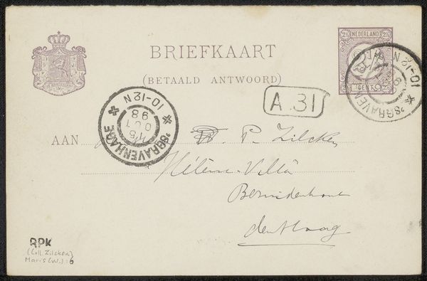
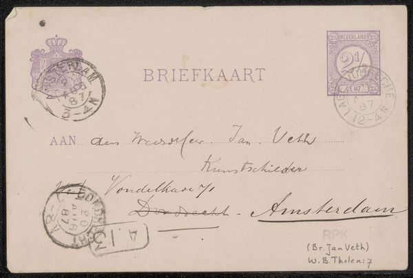
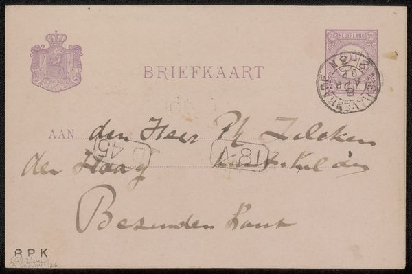
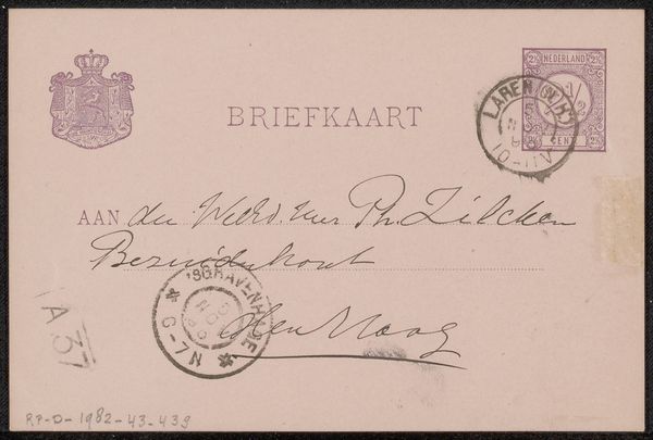
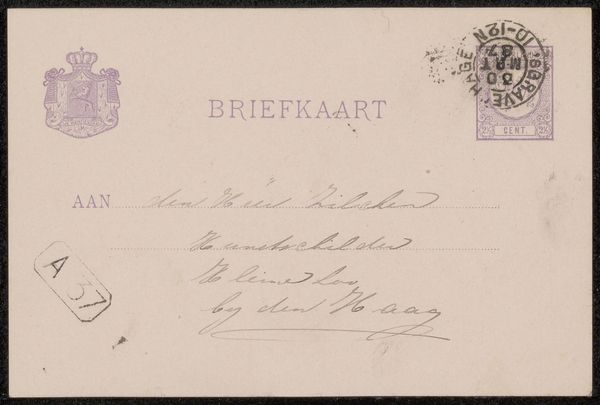
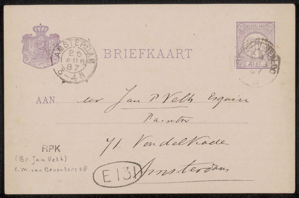
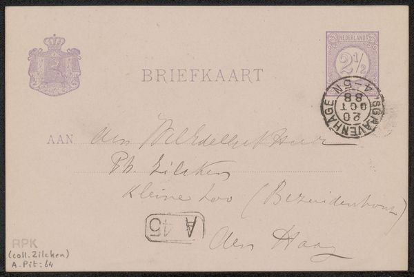
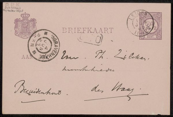
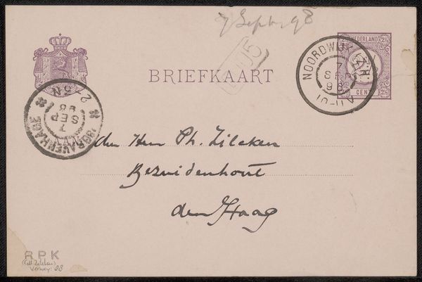
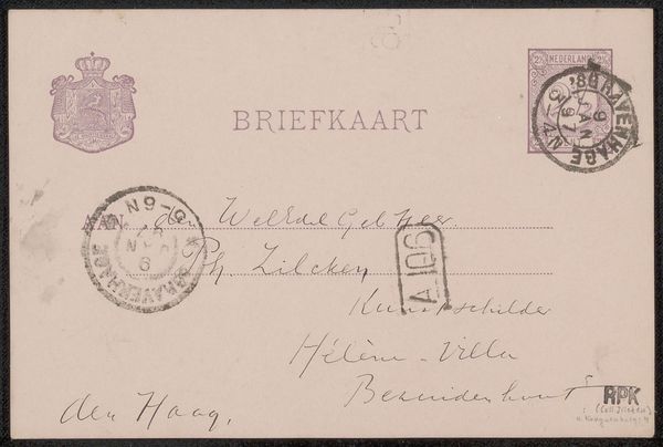
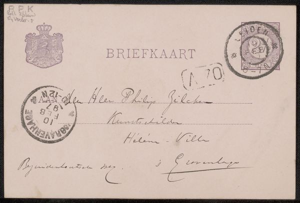
Curator: Let's delve into this intriguing "Briefkaart aan Philip Zilcken," potentially crafted in 1892 by Eduard Karsen. What strikes you most immediately? Editor: The tactile feel! It makes me think about the very act of correspondence and communication, not just as an exchange of words but as an interaction with specific materials, such as the paper and ink themselves, and how those materials shape and influence meaning. Curator: Precisely. It speaks volumes, doesn't it? The handwriting itself functions almost like an emblem, communicating on several levels beyond merely transcribing the address of the recipient, a fellow artist named Philip Zilcken. The scripted letter is full of subtle design elements, from flourishes to pressure. Editor: It really shows its function as an ephemeral, mass produced commodity designed for broad distribution within the modern postal system, yet it's customized via personalized calligraphy and the purple ink used for the various stamps and crests on the card. Even the two and a half cent stamp becomes integrated into the artistic composition of the card as a whole. It's as though it is consciously aestheticizing its function as both mail and visual design. Curator: Those stamps tell stories! Here is a form of authentication from an official body. There's the crest too, also official-looking, which has its own semiotic weight in turn. And the circular postmark looks like some kind of modernist abstract form set against the crisp lines of the typewritten text. This wasn’t *just* a communication. The symbolism adds layers upon layers to a message intended to connect people. Editor: True. I'm wondering, given it’s a postcard, what dictated this object's portability? Where and how was it made and distributed? This card would have been part of a complex system of labour involved in resource extraction, printing, design, and distribution networks across vast distances. Who would have designed this typeface, or determined the quality of the paper stock used? I wonder about the decisions made to mass produce it to meet various cultural needs at the time. Curator: I see it now – a confluence of intentions mingling in such a mundane object. These aren’t just scribbles or functional symbols, but rather threads that tie people together. Editor: Indeed. This exploration makes me think more deeply about all the unseen forces that meet when someone casually drops a letter into a mailbox. It certainly complicates one’s assumptions about the creative act.
Comments
No comments
Be the first to comment and join the conversation on the ultimate creative platform.
More like this