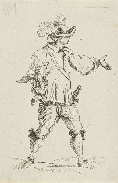
print, engraving
#
portrait
#
baroque
#
dutch-golden-age
# print
#
portrait drawing
#
genre-painting
#
engraving
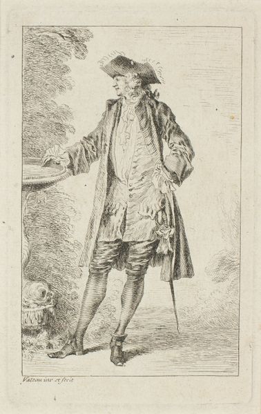
Dimensions: height 253 mm, width 174 mm
Copyright: Rijks Museum: Open Domain
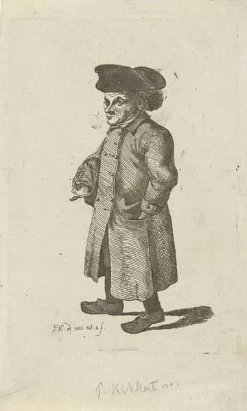
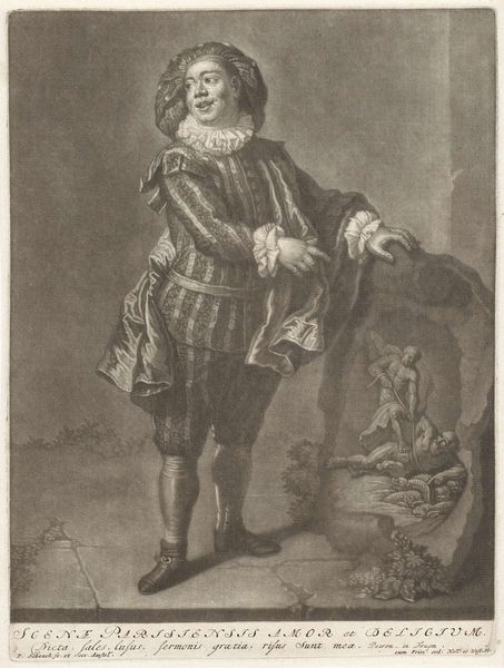
Editor: Here we have Jacob Gole’s "Portret van Raymond Poisson als Krispijn," dating sometime between 1670 and 1724. It's an engraving. I find the way he's posed so intriguing. The contrast is stark and highlights his almost performative stance. What are your immediate impressions of the piece from a formal perspective? Curator: Formally, the portrait’s strength lies in its masterful manipulation of line and value. Note how the engraver uses hatching and cross-hatching to define form, creating a play of light and shadow that enhances the subject's theatrical persona. Observe the crispness of the ruff versus the softness of the background. How do you think that tension plays out for the viewer? Editor: I guess the ruff draws the eye, right? I see that contrast as adding a sense of drama and almost separates him from the background, highlighting the texture and making it feel… well, more dramatic than the rest of the portrait, more in focus. Curator: Precisely. Gole uses the visual weight of the intricate details – consider the lace cuffs and the subtle rendering of Poisson's features – to anchor the composition. The linearity is key, creating visual rhythms that activate the surface and contribute to the portrait's dynamism, despite the limited grayscale palette. The artist truly demonstrates what can be achieved through focused mark-making and form. Editor: It’s interesting to think about how such detailed work could create so much drama, or really highlight that theatrical stance so much, just by how it’s all drawn. Curator: Indeed. Paying close attention to texture through form has shifted our perception today, and will going forward as well. Editor: I agree; analyzing the engraving techniques has helped me notice nuances in the drama.
Comments
No comments
Be the first to comment and join the conversation on the ultimate creative platform.
More like this