acrylic-paint, ink
#
op-art
#
circle
#
op art
#
acrylic-paint
#
form
#
geometric pattern
#
ink
#
pink
#
geometric
#
geometric-abstraction
#
abstraction
#
line
#
modernism
#
hard-edge-painting
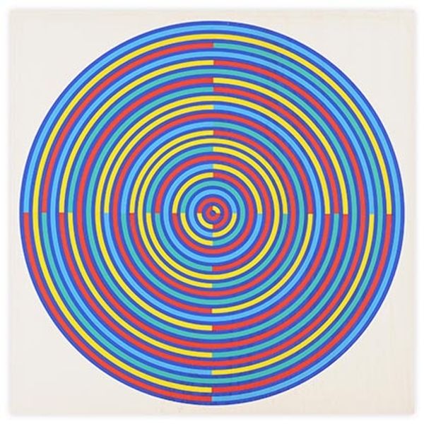
Copyright: Tadasky,Fair Use
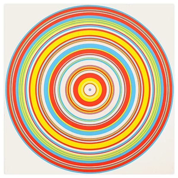
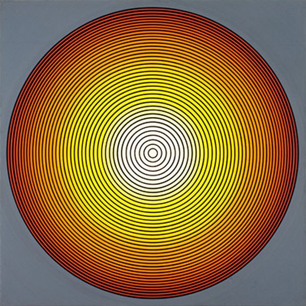
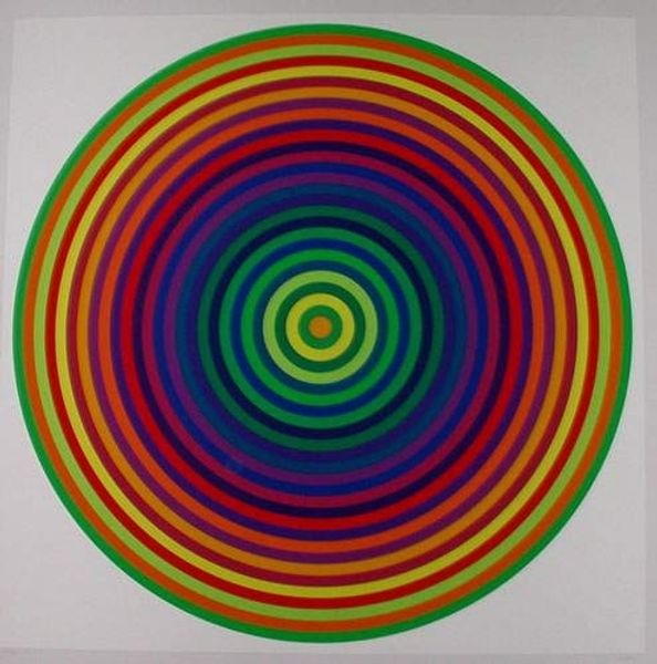
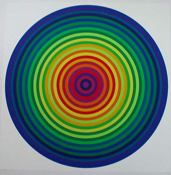
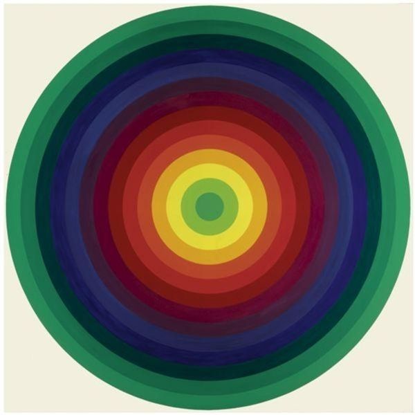
Editor: We are looking at Tadasky's "A 12" from 1962, executed with acrylic paint and ink. The contrast between the vivid yellow background and the concentric circles of purple is immediately striking. What is your perspective on the success of this composition? Curator: The formal elements within "A 12" operate on several levels. Note how the artist utilizes contrasting colors to create an almost palpable sense of depth and movement. The hard-edged quality speaks to a distinctly modernist sensibility, but how does the application of line and color complicate a reading of pure formalism, in your opinion? Editor: It is fascinating how the precision of the lines and shapes contrasts with the optical illusion of movement. The colors vibrate against each other! Does that suggest a challenge to the ideas of 'pure form'? Curator: Precisely! The tension lies in how the surface becomes destabilized. Though seemingly flat, the interlocking circular forms and their chromatic relationships push and pull the eye, defying any static reading. It is about the experience of seeing, about visual sensation achieved through pure form, even as that form seems to dissolve before our eyes. Editor: That's an interesting paradox! I was so focused on the image itself that I didn't fully consider how the optical effect enhances the viewing experience. Thank you! Curator: Indeed. By considering the push and pull of the formal elements, and reflecting upon our embodied perceptual experiences, we achieve a deeper understanding.
Comments
No comments
Be the first to comment and join the conversation on the ultimate creative platform.
More like this