drawing, ink
#
portrait
#
drawing
#
pen sketch
#
figuration
#
ink
#
line
Dimensions: height 334 mm, width 244 mm
Copyright: Rijks Museum: Open Domain
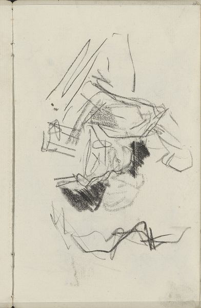
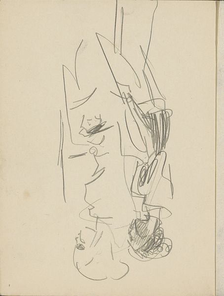
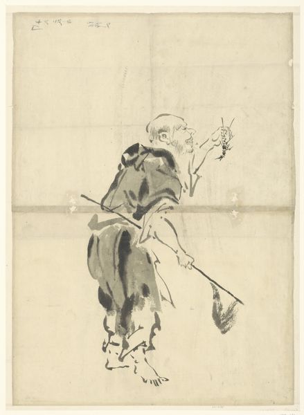
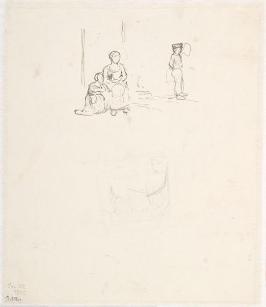
Curator: Here we have a cover design by Karel Thole for N.S. Ljeskow’s *De onsterfelijke*, dated to around 1965. It's an ink and pencil sketch. Editor: It has a rather monastic feeling. That stern gaze, the simple robe... is it me, or does he look vaguely judgemental? And what’s with that strange skyline in the background? Curator: Well, given Thole's prolific work in science fiction and fantasy book covers, that severe character and somewhat unsettling landscape hints at themes present within the narrative of the novel. Think about it, even the lines used in this drawing are extremely economical, reduced to their essence as much as possible in service of speedy book production. Editor: You know, those gestural lines really give a sense of depth to his character. I am curious about the object the character is holding. Could it be a staff, signifying authority, or perhaps an anchor, given the title "The Immortal"? It really is a potent image when thinking about the power the church and nobility have held for centuries in European history and the character is peering through an enclosure of some sort. Is the character free? Enclosed? Why? Curator: I think Thole uses pen and ink here to evoke a mood and to explore how simple drawings can evoke greater thoughts. His choices underscore the cultural perception of authority figures and class disparity—what seems to me a stark commentary on those elevated from others. I believe the materials contribute to the book's commercial value and how effectively they conveyed thematic value. Editor: That dark patch in the corner… it’s so abstract. Does that signify something? The unknown? Threat? Curator: It certainly creates a sense of unease. This is quite insightful though, seeing as this design provided direction and meaning to an unknown book cover that was awaiting a finished product! Editor: Fascinating. Thole layers meaning through simple lines, alluding to cultural weight with incredible deftness. Curator: Precisely, and he achieved all that with relatively accessible and mass-produced materials. This is far from the elite and often gatekept art. It truly is a wonder of what happens when production quality can elevate book quality.
Comments
No comments
Be the first to comment and join the conversation on the ultimate creative platform.
More like this