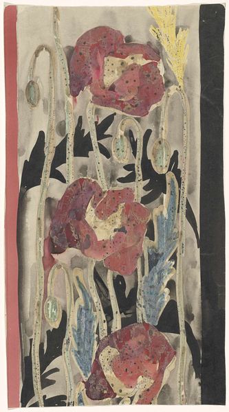
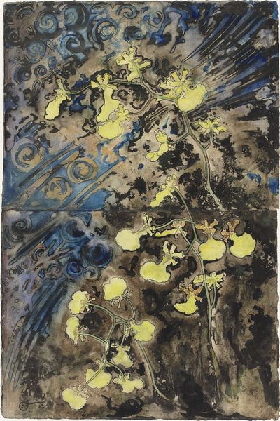
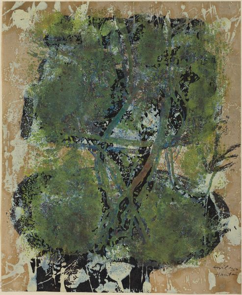
Ontwerp met papavers voor de rand van het wandtapijt Gezicht op Florence 1925 - 1926
0:00
0:00
careladolphlioncachet
Rijksmuseum
Dimensions: height 298 mm, width 176 mm
Copyright: Rijks Museum: Open Domain
Curator: This is Carel Adolph Lion Cachet's "Design with Poppies for the Edge of the Tapestry 'View of Florence'," created between 1925 and 1926, and held here at the Rijksmuseum. It employs watercolor and drawing techniques to capture the essence of a decorative floral border. Editor: My immediate reaction is a muted, almost dreamlike quality. The colours, though varied, blend softly together. I am intrigued by the lack of sharp definition in many of the elements and also how these material bleed marks subtly augment the intended art. Curator: Absolutely. Cachet's method here highlights the labor involved in translating landscape into ornament. Watercolors allow for nuanced application, but consider the larger project, a tapestry. The shift to textile manufacture changes labor relations significantly. Were these poppy motifs actually adopted, what can you tell about the textile, and labor involved in it's manufacture? Editor: Looking at it from a Formalist perspective, I find it fascinating how the poppies are stylized, not directly realistic. It's not botanical illustration; he reduces the flower and leaves to more essential, repeating shapes which will augment the tapestry design itself. This design process highlights an underlying structure beneath observed flora. What can that tell us? Curator: The poppies themselves. As symbols, poppies have different contexts. This design emerges shortly after the Great War, of course, where poppies were adopted to memorialize the dead on the Western front. It raises important questions. Do poppies evoke post-war associations influencing the perception of this piece at that point in time? How does the shift from handmade to industrialized material alter the object's function? Editor: I hadn’t considered such social contextual layers behind a floral design. Speaking of those colors – the juxtaposition of yellow, blue and dark red creates this kind of visual harmony. There is visual rhyme across the image with those stem and petal forms; a strong compositional underpinning supporting any implicit message. I find this very beautiful on that basic visual level. Curator: And I think you also reveal how it functions between "high" and "applied" art through careful examination. This pushes back against this separation and shows its relevance for a better awareness about this intersection and, ultimately, our broader visual culture. Editor: So, in engaging with both artistic process and the formal aspects, we've perhaps expanded how we understand and appreciate its visual construction here in the museum.
Comments
No comments
Be the first to comment and join the conversation on the ultimate creative platform.
More like this