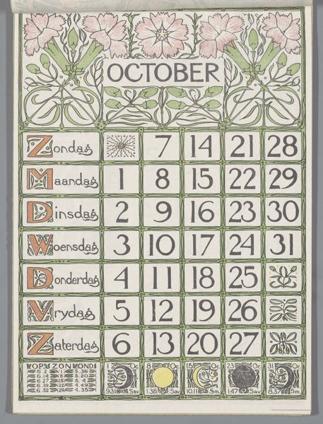
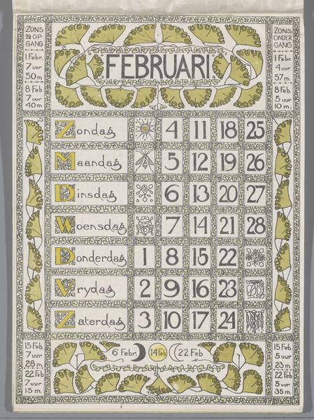
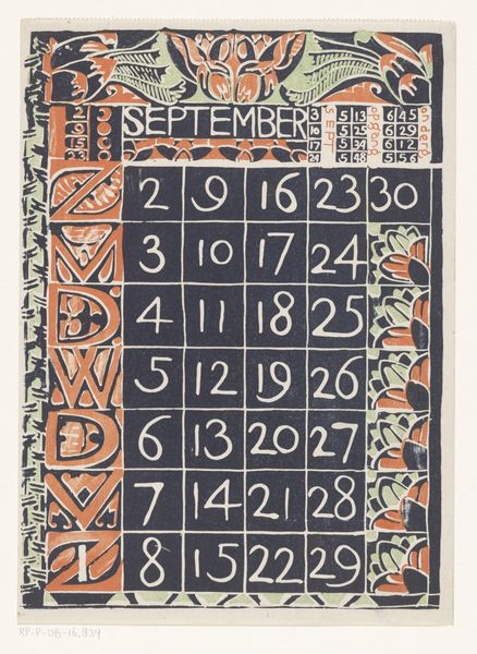
drawing, graphic-art, paper
drawing
graphic-art
natural stone pattern
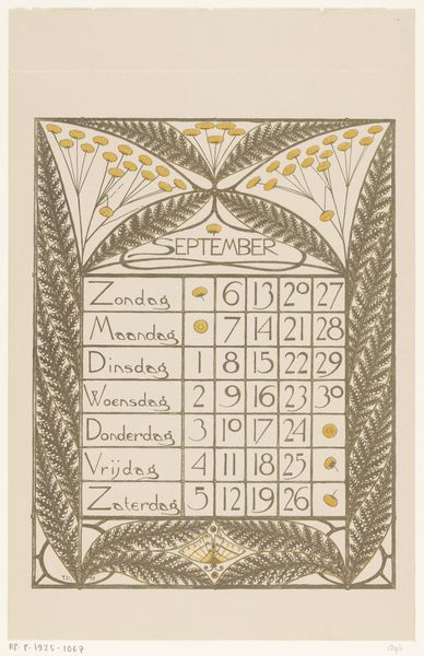
art-nouveau
pattern
paper
pattern background
pattern design
repetitive shape and pattern
repetition of pattern
vertical pattern
regular pattern
pattern repetition
decorative-art
layered pattern
funky pattern
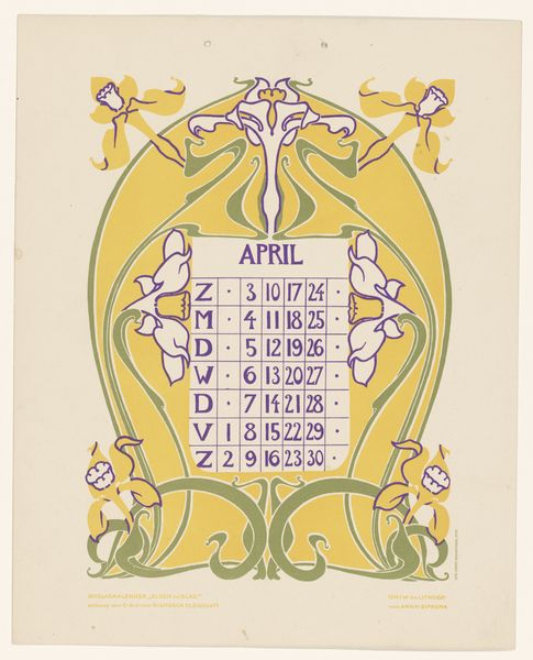
Dimensions: height 245 mm, width 176 mm
Copyright: Rijks Museum: Open Domain
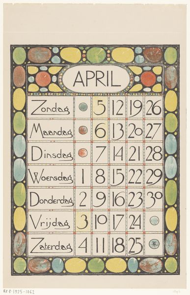
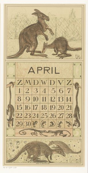
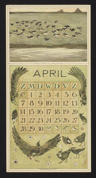
Curator: We're looking at "Kalenderblad april 1900," a graphic work by Theo Nieuwenhuis currently held at the Rijksmuseum. It’s a calendar page for the month of April, rendered in that unmistakable Art Nouveau style. What’s your initial take? Editor: Well, immediately I’m struck by its rigid geometry clashing intriguingly with organic motifs. There’s this tension between the hard lines of the calendar grid and the sinuous floral designs. It's almost as if nature is trying to break free from the structure imposed upon it. Curator: Precisely. Nieuwenhuis is masterfully using contrasting lines and forms. Note the repeating curvilinear shapes of the flora bordering the piece, offsetting the strict, architectural arrangement of days and dates. The patterned borders act as framing devices, drawing the eye into the central, functional calendar itself. Editor: And think about the labour that went into crafting something like this, presumably printed and disseminated widely. Each stylized letter, each little leaf, rendered with care in service of…organizing daily life. It raises questions about the relationship between artisanal skill and mass production at the turn of the century. Consider how many hands may have been involved. Curator: The muted palette of greens and browns is rather sophisticated. Consider the careful colour blocking: the pale apricot tones designating days and highlighting significant dates balance perfectly against the darker linear structures creating the forms, offering us a complex, decorative surface with immense depth. Editor: Those choices of earthy pigments speaks to a move against industrial dyes. But even those natural colors needed fixing, layering with varnishes maybe, to last. We can't see the surface qualities of this printed artwork today to really understand how it must have worked materially. What kind of inks, papers? It becomes like reverse archaeology. Curator: You make a critical point regarding its function and construction within society. Beyond that, the piece achieves a remarkable formal synthesis. It encapsulates that quintessential Art Nouveau ambition to unify the fine and applied arts—to transform the everyday into something beautiful and conceptually rigorous. Editor: Ultimately it is also quite touching; Nieuwenhuis clearly brought all of this effort to bear in providing a design intended for everyday utility. I’ll leave thinking how many unknown lives would be punctuated by this crafted form, helping people negotiate existence. Curator: A fitting point on which to reflect. Thanks to its aesthetic refinement and artful craftsmanship, this piece rewards slow, prolonged viewing even today.
Comments
No comments
Be the first to comment and join the conversation on the ultimate creative platform.