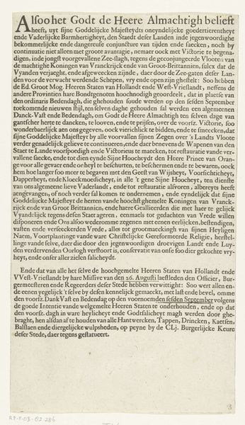
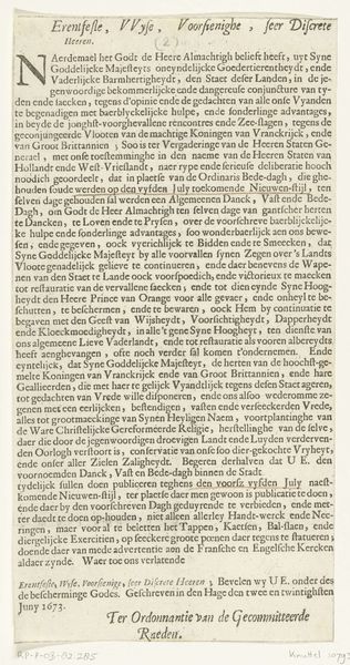
Tekstblad bij de prent met het vertrek van koning Karel II van Engeland vanuit Scheveningen naar Engeland, 1660 1660
0:00
0:00
anonymous
Rijksmuseum
graphic-art, print, typography, engraving
#
graphic-art
# print
#
typography
#
hand-drawn typeface
#
thick font
#
pen work
#
engraving
Dimensions: height 112 mm, width 170 mm
Copyright: Rijks Museum: Open Domain
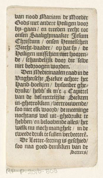
Curator: This is a fascinating print, simply titled "Text Sheet for the Print of the Departure of King Charles II of England from Scheveningen to England, 1660," dating back to, well, 1660. Editor: It looks like a crowded page, overflowing with tightly packed text. I am almost overwhelmed by its density. It's also beautiful in the meticulous pen work involved and especially how its text resembles an intriguing textile. Curator: Indeed! It's primarily an engraving with typography, an informational broadside announcing Charles's return after exile. Note how the various individuals are enumerated around the perimeter in a legend, keyed by letters. Editor: The choice of materials feels key. Engraving allowed for multiple reproductions, disseminating the news quickly. But this isn't just news; it's carefully constructed propaganda, literally etching a narrative into the public consciousness. Consider the deliberate blackletter typeface, and how this evokes ideas about formality and timeless truth. Curator: Precisely! It aims to legitimize Charles's restoration, presenting it as divinely ordained, a fulfillment of national destiny. Observe the appeal to religious sentiment right in the opening line with its talk about God and his intentions to give hope. It really suggests an element of God-driven determination in those very first lines! Editor: But beyond the divine right of kings, it’s a savvy material strategy. This is about manufacturing consent, distributing a tangible piece of ideology, an act as calculated as any political maneuvering on the high seas. The choice of specific materials, typography, and methods all speak to a conscious decision about the visual rhetoric needed to sell this narrative. The designer wanted to signal importance and significance for wide dissemination. Curator: So true, but in what a surprisingly modest fashion! A broadside, a bit of ink… and history changes course. I see so much faith being put into those very deliberate wordings. Editor: Or consider all the anonymous artisans involved. How many pairs of hands prepared the paper, mixed the ink, worked the press? How were they organized and remunerated for that work? It forces us to consider a whole economy and complex material culture which traditional historical narratives obscure when they're primarily centered around great events. Curator: A wonderfully important thing to bring to our attention when faced with works such as this. Thank you! Editor: Thanks, the pleasure was mine. It has been so interesting seeing history materialize through such interesting processes.
Comments
No comments
Be the first to comment and join the conversation on the ultimate creative platform.
More like this