graphic-art, print, typography, engraving
#
graphic-art
#
dutch-golden-age
# print
#
old engraving style
#
hand drawn type
#
text
#
typography
#
engraving
#
historical font
Dimensions: height 120 mm, width 70 mm
Copyright: Rijks Museum: Open Domain
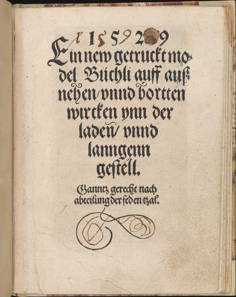
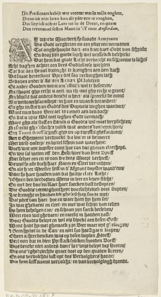
Curator: Here we have "Voorwoord," an engraving dating back to 1659. The piece is currently held in the Rijksmuseum. What are your first impressions? Editor: It has a strong texture, a darkness against the paper that feels both historical and somehow rebellious. It almost reminds me of samizdat literature, hidden transcripts pushing against established norms of thought. Curator: Interesting. I see the text first and foremost. The typography uses what's described as a "historical font," but there is also the interesting note about the "letter-setting being based on the setter’s opinion". This suggests something less formalized and perhaps even radical about the process. Do you think it pushes the bounds of accessibility or intelligibility? Editor: Perhaps. It demands close reading, and for a contemporary audience, that's a choice. There’s a dedication to ‘Mariam the Mother of God’, suggesting religious undertones, and a section on the ‘medicinal council’, hinting at concerns about sickness. How do those interact with a reader of the time? Who was the intended public for the book from which this was a preface? Curator: These considerations were tied with how widespread certain "medicinal councils" could be openly written and spread. The Reformation changed a lot of things about this, but especially the vernacular. In other words, the "ordinariness" of the writing suggests a rising democratization and a shift from visual symbolism that the Church encouraged in lieu of more direct modes of engaging its faithful followers. It’s complex; an attempt to bring people closer through writing—particularly on medicinal matters. Editor: It raises questions about the interplay between authority and personal interpretation, the tensions that can emerge when challenging old conventions around spiritual leadership. This speaks to a desire to decentralize knowledge and power, albeit in a perhaps subtle and contained manner, within the specific socio-political frame of 17th-century Netherlands. I see this not just as a historical font, but a symbol of the evolving relationship between individual conscience and collective religious doctrine. Curator: So beautifully observed! Thinking about "Voorwoord," and what this typography signifies, from form to legibility to distribution...it is, still, so affecting to unpack and digest after all this time. Editor: Yes, these quiet visual statements hold echoes that resound through generations. It reminds us of the constant need to critically assess how dominant ideologies perpetuate themselves—even through the fonts they choose.
Comments
No comments
Be the first to comment and join the conversation on the ultimate creative platform.
More like this