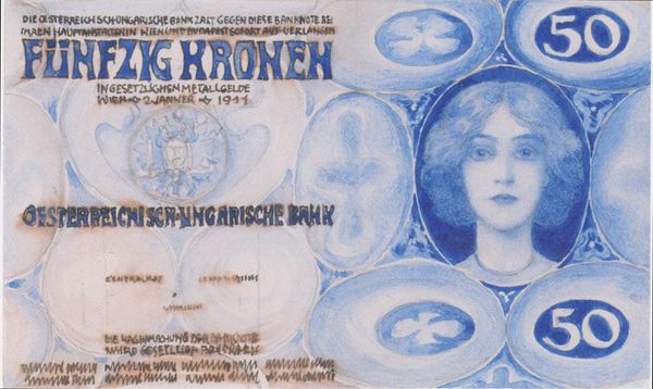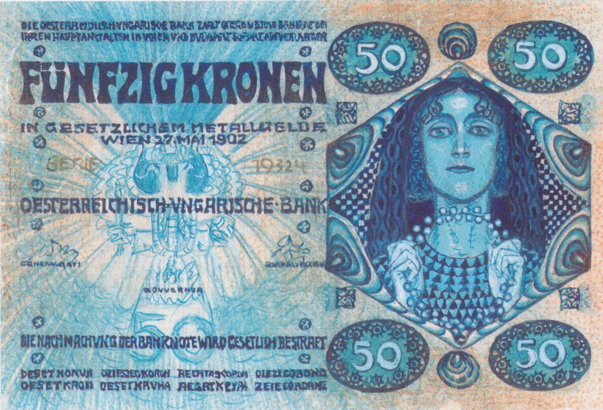
1902
Design for the bill of 50 crowns
Listen to curator's interpretation
Curatorial notes
Koloman Moser designed this 50 crown note, likely with pen and ink, at the turn of the century. The composition seems to be built from modular, repeating forms: rows of triangles, spirals, and little egg shapes. You get the sense of a pattern maker whose process involves working out variations on a theme. The whole thing is awash in shades of blue, and this makes me think about how we associate color with value. Here, the cool monochrome palette lends a sense of austerity and makes the currency feel precious, even while the overall design has a whimsical, handmade quality. Look at the figure in the diamond at the right: a woman with flowing hair surrounded by concentric teardrops. Her pose is stylized, almost like a Byzantine icon, and yet the details of her face and hair are rendered with delicate naturalism. Moser was a key figure in the Vienna Secession, a movement that included Gustav Klimt. Thinking of Klimt’s opulent gold surfaces, it’s interesting to see Moser using a more restrained palette, and creating value through texture and pattern. It points to the incredible range of possibilities within a shared artistic milieu.