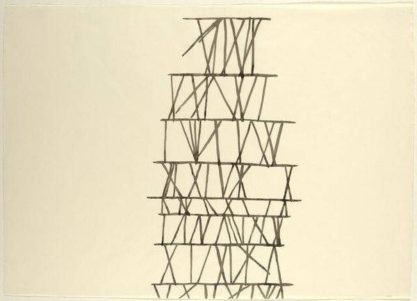
drawing, mixed-media
#
abstract-expressionism
#
drawing
#
mixed-media
#
form
#
geometric
#
abstraction
#
line
Copyright: Pablo Palazuelo,Fair Use
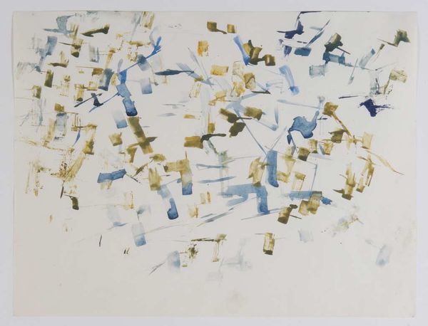
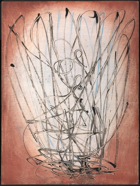
This untitled work by Pablo Palazuelo is made with what looks like watercolour or gouache, and maybe even ink, judging by the delicate lines. I'm immediately struck by the colour, which is like a burnt orange or maybe even a rust colour. The piece seems to be all about process; you can see how Palazuelo built up the shapes and lines, almost like a construction. The paint is applied in thin washes, letting the paper show through, which gives it a light, airy feel. The lines are crisp and clean, giving it a sense of precision. There's a tension between the looseness of the washes and the sharpness of the lines which is really interesting. Look at the top right, where there are three little upside down 'V' shapes, floating like birds. Palazuelo's work reminds me a bit of Paul Klee, with its playful approach to abstraction and the way it invites us to see the world in new ways. Art is an invitation to consider different perspectives, and a reminder that meaning is always open to interpretation.
Comments
No comments
Be the first to comment and join the conversation on the ultimate creative platform.
More like this