Dimensions: height 440 mm, width 210 mm
Copyright: Rijks Museum: Open Domain
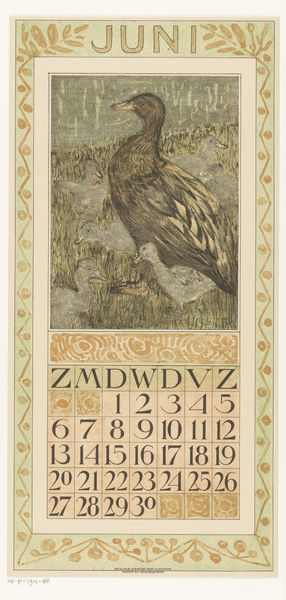
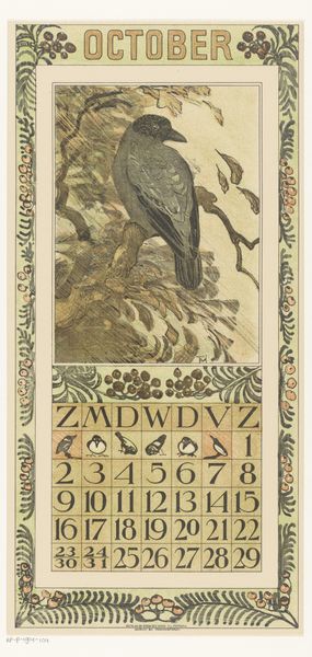
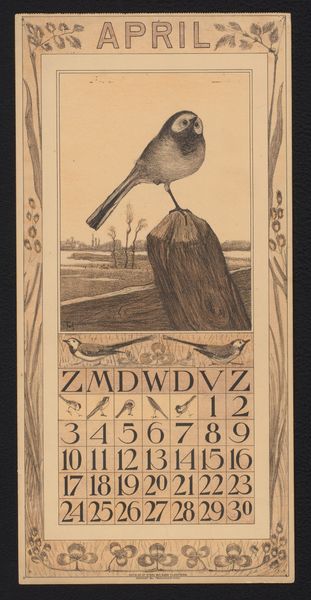
Theo van Hoytema made this calendar page for June with 'kwak', I guess that's night heron in Dutch, and it was created with lithography. Look at the subtle colour palette, a limited range of muted greens, browns, and creams. It's so understated, and yet the bird's stare is so intense. There's a real tension between the delicate, almost fragile quality of the lithographic marks and the piercing gaze of that bird. It reminds me of a kind of process of layering and building, much like painting itself. The texture is smooth, but you can almost feel the grain of the lithographic stone. The way the ink is applied gives it a slightly speckled effect, like the feathers themselves. The little row of birds on top of the dates have such a cute, grumpy energy, almost like a gathering of gossiping neighbours. It's definitely got a touch of Aubrey Beardsley about it. Van Hoytema's prints create a world that's both whimsical and deeply serious, leaving us to find our own meaning in the ambiguity.
Comments
No comments
Be the first to comment and join the conversation on the ultimate creative platform.
More like this