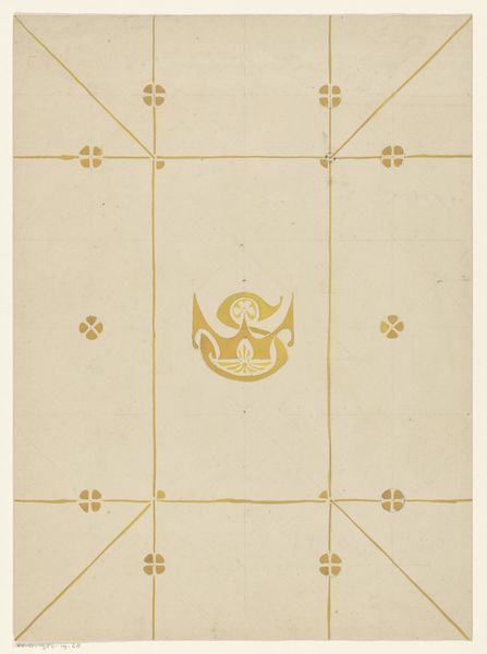
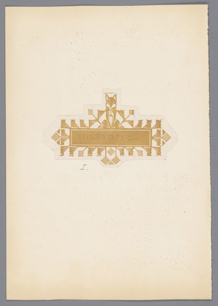
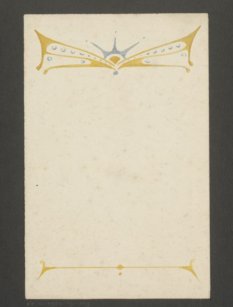
Ontwerp voor een sjabloon met een kroon en de letters CC 1884 - 1952
0:00
0:00
drawing, graphic-art, paper
#
drawing
#
graphic-art
#
toned paper
#
paper
#
geometric
#
decorative-art
Dimensions: height 299 mm, width 244 mm
Copyright: Rijks Museum: Open Domain
Curator: Here we have Reinier Willem Petrus de Vries’ “Ontwerp voor een sjabloon met een kroon en de letters CC,” or “Design for a stencil with a crown and the letters CC,” which records a concept from somewhere between 1884 and 1952. The medium appears to be a drawing in graphic art, employing paper. What are your initial thoughts? Editor: The design has a distinctly regal yet playful character. The crown, rendered in what appears to be toned paper, has these almost cartoonish teardrop shapes along the top—somehow serious and whimsical all at once. The symmetrical arrangement has this immediate formal quality that relaxes slightly as you register that these letters are entwined and connected into this geometric shape. Curator: Right. The design does reveal interesting approaches to Dutch identity, especially given de Vries' work during periods of significant political upheaval. He was producing as graphic art was itself developing rapidly alongside broader movements in democratic representation and labor organization. The crown—an undeniably political symbol of colonial and monarchical power—is mediated here through almost corporate-seeming initials: two conjoined “C”s. How should we read that? Editor: I see the monogram implying an assertion of personal or institutional power mediated through artistic design. It raises the questions about authorship and authority; where do creativity and the role of an artist intersect with symbols of power? Was the decorative style attempting to democratize the image of power, bringing it closer to the people, or conversely, further enshrine an elevated authority? Curator: The ambiguity you raise, especially around the use of “decorative art,” makes the viewer reflect on the power structures implicit within the artwork's design itself. De Vries' stencil feels both practical and symbolic. The symbolism asks for more than passive observation; instead, there's a historical push to explore deeper associations within the Dutch colonial context and broader aesthetic sensibilities of his time. Editor: It’s an insightful point, reframing how we engage with graphic design. It goes beyond pure aesthetics, touching on questions around representation, access, and societal power structures embedded within. Curator: Well said. Examining art as both aesthetic expression and political or social document requires these considerations, which the design of this stencil provokes beautifully. Editor: Indeed. It seems even seemingly innocuous forms bear closer, critical viewing.
Comments
No comments
Be the first to comment and join the conversation on the ultimate creative platform.
More like this