About this artwork
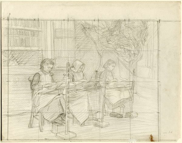
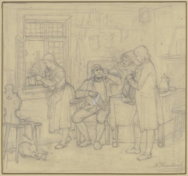
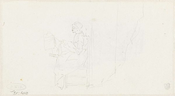
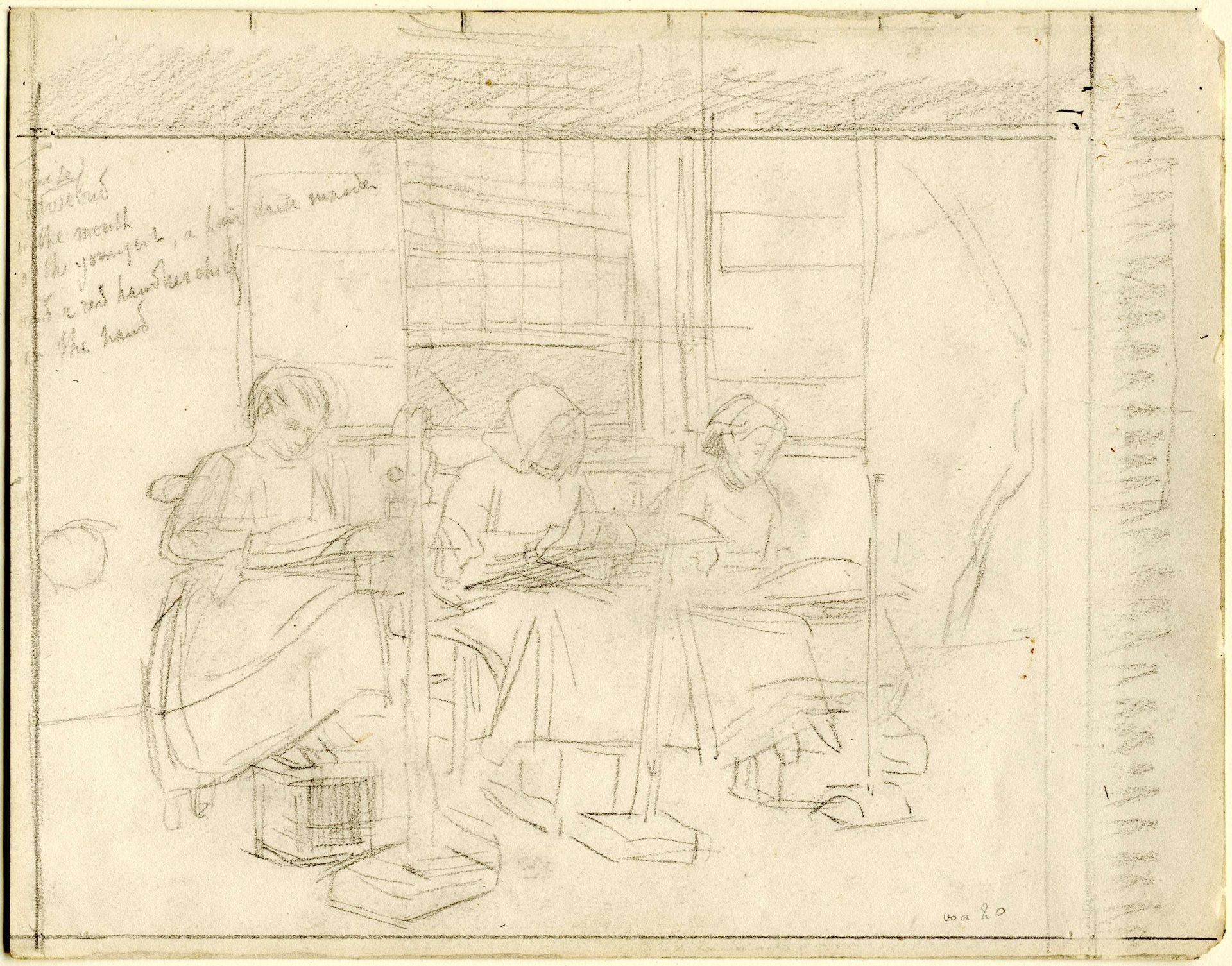
Editor: Here we have Jan Veth’s "Kantwerksters," created sometime between 1874 and 1925. It’s a pencil drawing on paper, and the figures almost seem to float on the page. It gives off a calm, domestic feeling. What catches your eye about this piece? Curator: Initially, the linear quality of the pencil work commands attention. Veth masterfully uses hatching and cross-hatching to delineate form and space. Note how the repeated verticals of the lace-making apparatus create a rhythmic structure, grounding the composition despite the ethereal quality you mentioned. Editor: I see that now, almost like a visual beat throughout the scene. Is the light significant here? Curator: Indeed. The window provides a key structural element. Notice how it isn't simply background, but interacts with the figures. The subtle gradations of tone, especially around their faces and hands, suggest a nuanced understanding of light's role in defining form and creating atmosphere. Editor: So it's not just about depicting lacemakers, but about how line and light build the scene itself? Curator: Precisely. While we could explore the subject matter historically, from a formalist standpoint, it’s how Veth manipulates the medium itself that truly elevates this from a simple genre painting to a compelling artistic statement. Consider, too, how the unfinished areas contribute to the drawing's overall aesthetic; the negative space is just as vital as the rendered forms. Editor: I hadn’t thought about that before, the importance of what's *not* there. Thanks, this close look at line and form has really shifted how I see the drawing! Curator: A formalist reading, while not exhaustive, can open exciting avenues for interpretation. Considering line, tone, and structure gives us access to a level of intentionality that may otherwise be missed.
Artwork details
- Dimensions
- height 234 mm, width 300 mm
- Location
- Rijksmuseum
- Copyright
- Rijks Museum: Open Domain
Comments
Share your thoughts
About this artwork
Editor: Here we have Jan Veth’s "Kantwerksters," created sometime between 1874 and 1925. It’s a pencil drawing on paper, and the figures almost seem to float on the page. It gives off a calm, domestic feeling. What catches your eye about this piece? Curator: Initially, the linear quality of the pencil work commands attention. Veth masterfully uses hatching and cross-hatching to delineate form and space. Note how the repeated verticals of the lace-making apparatus create a rhythmic structure, grounding the composition despite the ethereal quality you mentioned. Editor: I see that now, almost like a visual beat throughout the scene. Is the light significant here? Curator: Indeed. The window provides a key structural element. Notice how it isn't simply background, but interacts with the figures. The subtle gradations of tone, especially around their faces and hands, suggest a nuanced understanding of light's role in defining form and creating atmosphere. Editor: So it's not just about depicting lacemakers, but about how line and light build the scene itself? Curator: Precisely. While we could explore the subject matter historically, from a formalist standpoint, it’s how Veth manipulates the medium itself that truly elevates this from a simple genre painting to a compelling artistic statement. Consider, too, how the unfinished areas contribute to the drawing's overall aesthetic; the negative space is just as vital as the rendered forms. Editor: I hadn’t thought about that before, the importance of what's *not* there. Thanks, this close look at line and form has really shifted how I see the drawing! Curator: A formalist reading, while not exhaustive, can open exciting avenues for interpretation. Considering line, tone, and structure gives us access to a level of intentionality that may otherwise be missed.
Comments
Share your thoughts