painting, acrylic-paint
#
abstract-expressionism
#
st-ives-school
#
painting
#
pop art
#
colour-field-painting
#
acrylic-paint
#
geometric
#
abstraction
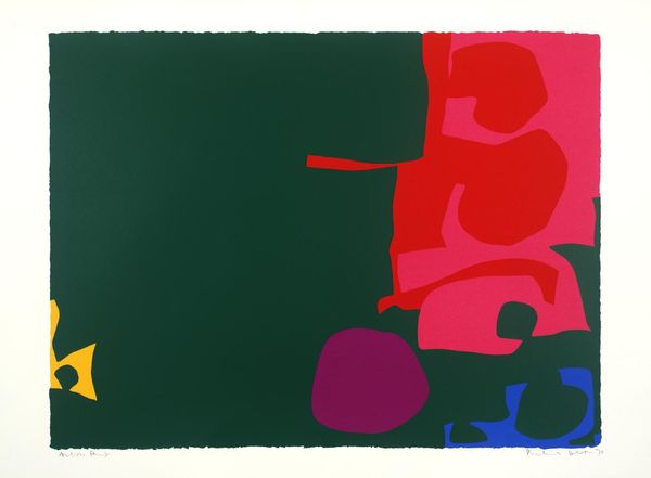
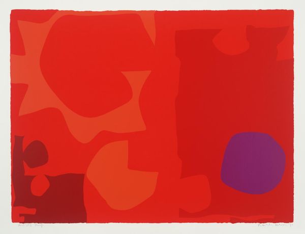
Copyright: Patrick Heron,Fair Use
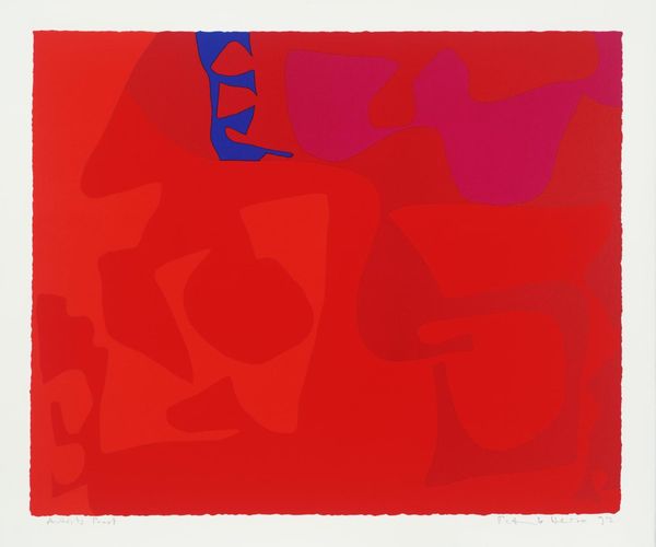
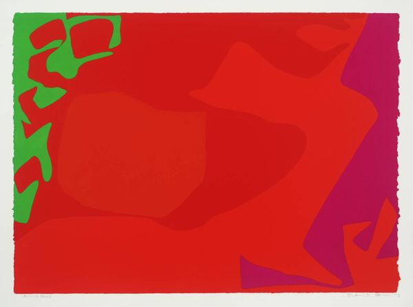
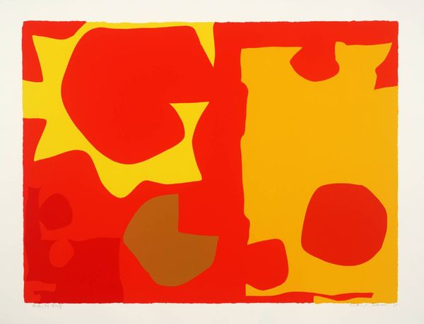
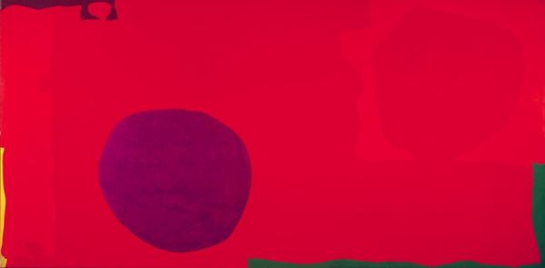
Patrick Heron made this print, Interlocking Scarlet and Pink in Deep Green, with screenprint. It looks like he started out with solid colors, maybe he was thinking about Matisse cut outs? The way he’s put these shapes together is like a dance. Look at that big green area, how it pushes the reds and pinks over to the right. Then there’s a little peek of blue and yellow which stops it from being too serious. There is a dialogue between the colors, a push and pull. I particularly like that round purple shape down at the bottom, which I think functions as an anchor for the whole thing. Does it remind you of the work of Gillian Ayres or John Hoyland? All three artists share a love of strong color combinations, an emotional response to color, and a formal interest in the relationship between forms. For Heron, like many painters, art is a way of investigating the visual world, a constant questioning rather than a definitive statement.
Comments
No comments
Be the first to comment and join the conversation on the ultimate creative platform.
More like this