drawing, paper, ink
#
drawing
#
hand-lettering
#
ink paper printed
#
old engraving style
#
hand drawn type
#
paper
#
personal sketchbook
#
ink
#
hand-drawn typeface
#
ink drawing experimentation
#
intimism
#
ink colored
#
sketchbook drawing
#
sketchbook art
Copyright: Rijks Museum: Open Domain
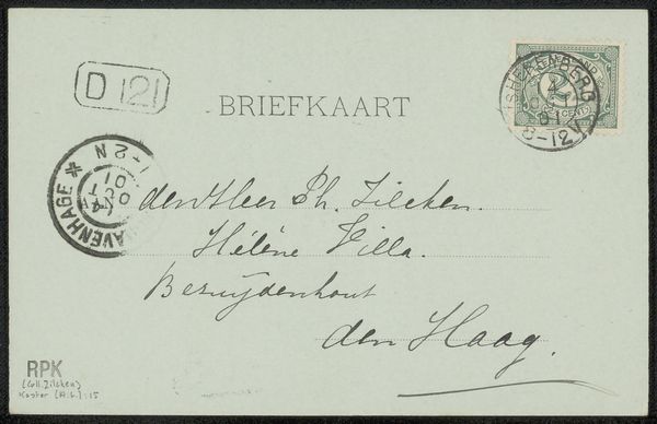
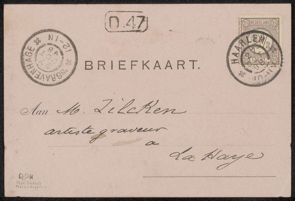
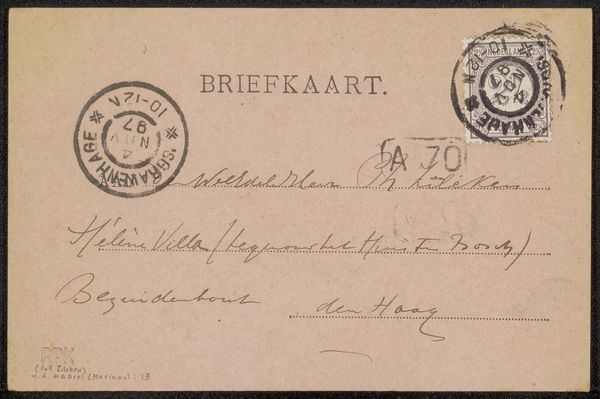
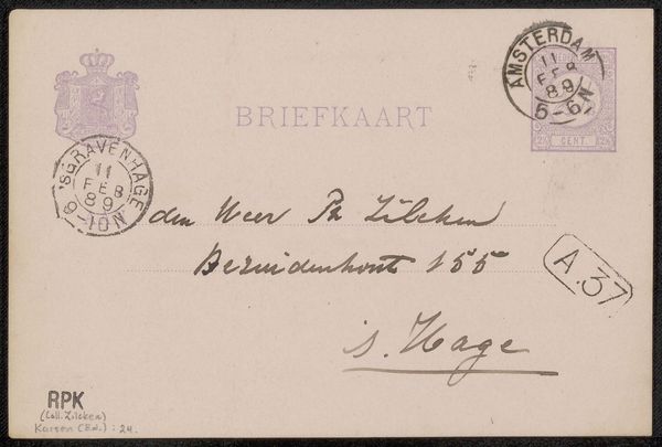
Editor: We're looking at "Briefkaart aan Philip Zilcken," a drawing made with ink on paper, sometime between 1901 and 1925, attributed to Margaretha Meyboom. The subdued tones and delicate handwriting give it a very intimate feel, like peering into a private correspondence. What do you see in this piece? Curator: Immediately, I am drawn to the contrasting visual languages at play. The printed word "BRIEFKAART" and the stamp offer a rigidity against the flowing cursive of the handwritten address and return. This contrast creates a visual tension. Note also the materiality of the paper itself, its slight discoloration speaks to the passage of time and invites reflection on impermanence. Editor: That's interesting, I hadn't considered the contrast. Is the handwriting style significant at all? Curator: Certainly. Observe how the loops and ligatures in the cursive script almost become abstract forms. The ascenders and descenders push against the implied lines of the address, disrupting any sense of perfect order. Even the ink itself, varying in density, contributes to this interplay of form and texture. Do you see how Meyboom experiments within the structure of the postal format? Editor: I do, now that you mention it! It’s almost like she's subverting the functionality of the postcard for artistic expression. So, you're focusing on the visual push and pull within the composition rather than what it communicates directly? Curator: Precisely. The aesthetic qualities are what arrests our attention and encourages thoughtful observation. The handwriting transforms from text to texture. Editor: I see what you mean, focusing on the artistic choices and elements helps appreciate what the drawing itself conveys beyond the written information. Curator: Indeed, it is the internal structure and execution of those choices that provides the art's particular affect and invites ongoing close scrutiny.
Comments
No comments
Be the first to comment and join the conversation on the ultimate creative platform.
More like this