Copyright: (c) Ellsworth Kelly, all rights reserved
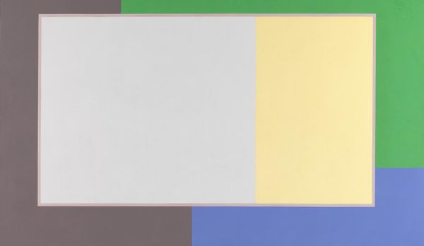
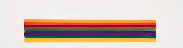
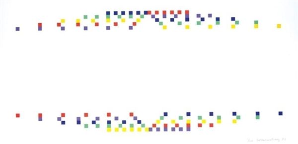
Curator: Here we have Ellsworth Kelly's "18 Colors (Cincinnati)," created in 1982. The medium is acrylic paint on canvas. Editor: My first impression is one of playful austerity. It feels like a deconstructed flag, perhaps. Reserved yet vibrant. Curator: Yes, that’s a great observation. The work consists of eighteen precisely rendered squares, each a different color, arranged in two horizontal rows against a white background. Notice the sharp, clean lines. Editor: And how each color is discrete, with minimal tonal variation. I'm curious about the choice of colors and how it might engage with its sociopolitical context. Did the artist intend these specific pairings? Was it influenced by the city, Cincinnati, in any way? Curator: Kelly was very interested in the interplay of color and form; how color, shape, and placement alone could evoke a sense of space and emotion. His concern wasn't necessarily with external references but with internal relationships between elements on the canvas. Editor: But can we ignore the implications of arranging colours, especially in that era? The hard-edged abstraction here almost demands engagement with the history of geometric abstraction, with artists who perhaps had overtly political messages embedded in form. Curator: Kelly definitely departs from pure geometrical exercises, focusing on the phenomenological impact of colour perception. Think about Gestalt psychology: the mind’s inherent drive to organize visual information into patterns. Each color affects how you perceive its neighbors. Editor: Absolutely, but what's particularly resonant for me is thinking about colour associations across different cultural contexts, given the location suggested in the title. There’s something here about the codification of visual language… Curator: A fascinating perspective! It illustrates how, even in a seemingly non-referential work, multiple interpretations can be valid. Thank you, this artwork provides rich opportunities for experiencing and understanding how the elements of shape and colour interact. Editor: A productive experience that highlights just how the visual is inseparable from larger structures of power.
Comments
No comments
Be the first to comment and join the conversation on the ultimate creative platform.
More like this