Dimensions: support: 1525 x 1528 x 35 mm
Copyright: © estate of Agnes Martin | CC-BY-NC-ND 4.0 DEED, Photo: Tate
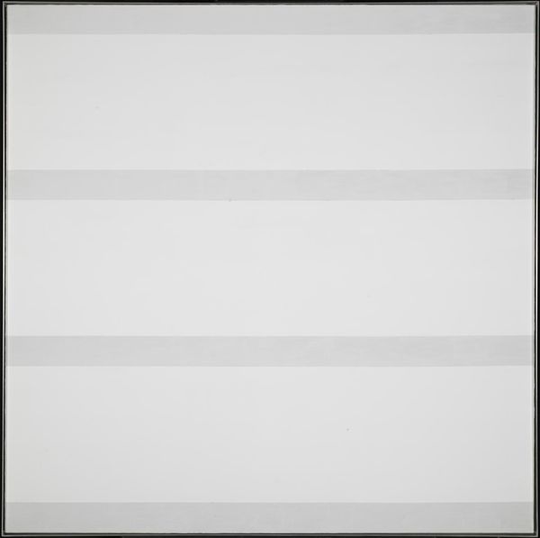
Editor: Here we have Agnes Martin’s "Untitled #5," a large square canvas residing at the Tate. I’m immediately drawn to its subtle horizontal lines and the delicate color variations. What visual elements strike you most profoundly? Curator: The grid structure, in its adherence to right angles and even spacing, speaks to a formal, almost mathematical purity. Note how the subtle shifts in pigment deny absolute uniformity, disrupting any sense of sterile perfection. What do you make of the tension between the imposed order and the organic imperfections? Editor: I see how those slight color variations and the handmade quality challenge the strict geometry, creating something more human and serene. I hadn't considered the grid as an imposed order before. Thanks! Curator: Indeed. The work invites a contemplation of those very contradictions.
Comments
Join the conversation
Join millions of artists and users on Artera today and experience the ultimate creative platform.
tate 12 months ago
⋮
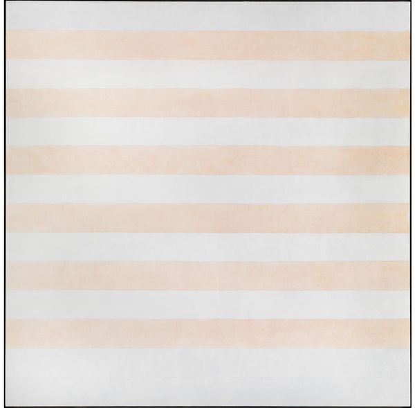
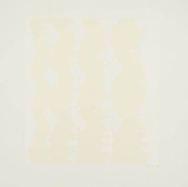
Untitled #5 is a large abstract painting on canvas by the Canadian–American artist Agnes Martin, signed and inscribed by the artist on its verso. The square pictorial field is divided into eleven horizontal bands of white, blue and peach acrylic paint. The colours alternate in a regular pattern and the divisions are demarcated by wavering graphite pencil lines. As with all works from this period by Martin, Untitled #5 was begun by priming the entire surface of the canvas with an opaque coating of white acrylic gesso, which is never fully covered by subsequent layers of colour. This gives the painting a visual sparseness and vibrant luminosity; the thick white gesso sealing and emphasising the slightly toothy texture of the linen canvas support. On top of this base coat of paint the artist measured out and marked with pencil rectangular bands across the width of the canvas, into which she painted alternating duck-egg blue and pale peach ‘salmon-brick’ colours using a different type of acrylic, Liquitex, which gives a translucent and tempera-like finish. These same colours appear in the later paintings Faraway Love 1999 (Tate AR00178) and Happy Holiday 1999 (Tate AR00179), but in Untitled #5 they are applied with lighter, looser brush strokes and the Liquitex was diluted to produce almost gestural veils of colour. Within the composition’s repeating horizontals, the three bands left empty of colour are also the widest, at approximately one and a half times the width of the peach and blue bands. This irregularity reinforces the white gesso’s role as a blank background onto which colours and pencil marks have been inscribed. The painting was completed by further reinforcement of the pencil lines demarcating the striped surface of the canvas. By drawing on top of the acrylic paints, Martin reverses the traditional notion of drawing as preparatory work to be painted over. These strong, persistent horizontal lines are the final addition to the work, and are drawn so as not to reach the edge of the canvas, creating the impression that they are floating across the colour field. Explaining her drawing technique, the artist stated in an interview with the critic Joan Simon that:
More like this