Copyright: CC0 1.0
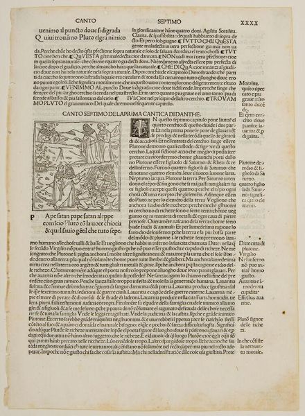
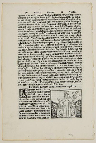
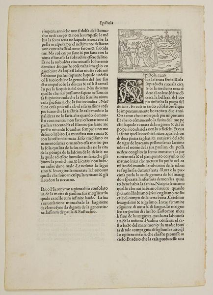
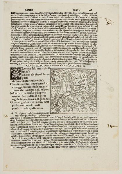
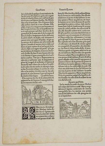
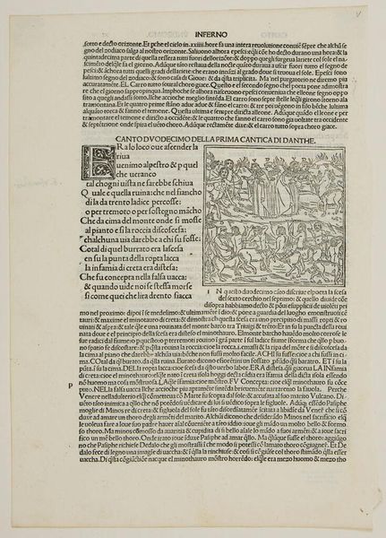
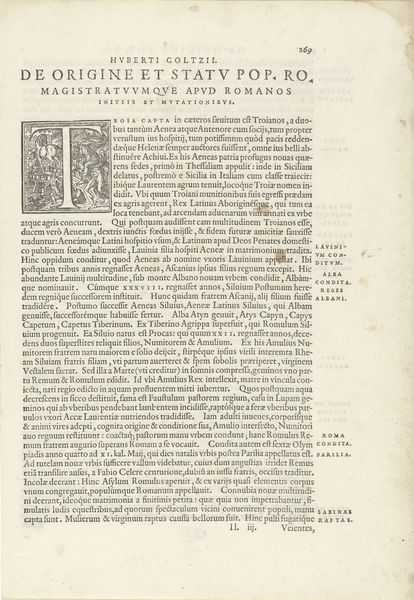
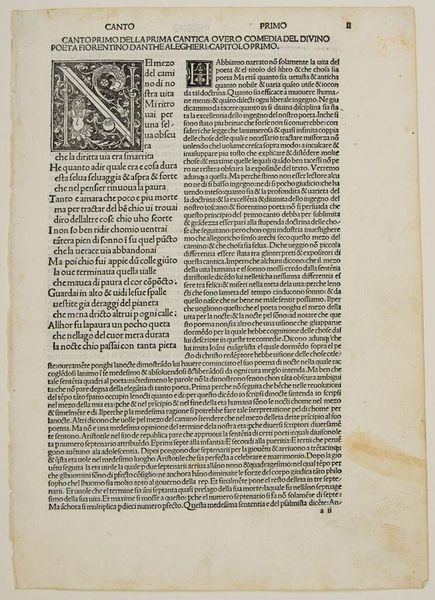
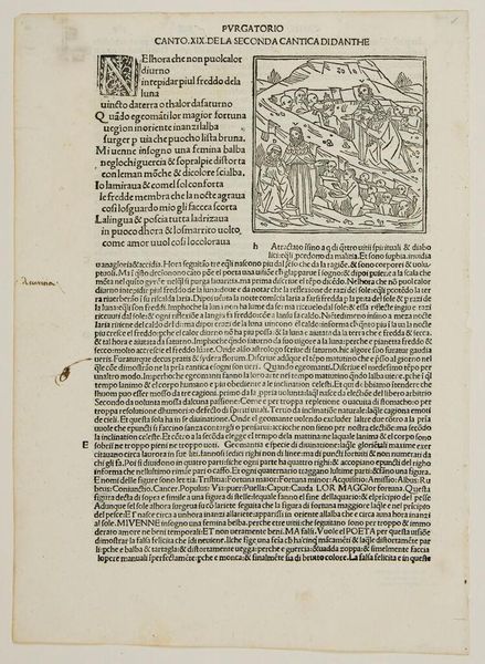
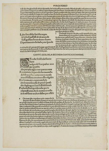
Editor: Here we have "Initial H Used by Symphorien Barbier," an anonymous work held at the Harvard Art Museums. It looks like a printed page, perhaps from a book. The elaborate initial "H" really catches my eye. What do you see in this piece? Curator: The letterform is indeed the focal point. Note the intricate interweaving of organic forms within the geometric structure of the 'H.' This tension creates a fascinating visual dynamic, a dialogue between the natural and the constructed. Observe how the negative space contributes to the overall design. Editor: So, it's the interplay between form and space that interests you most? Curator: Precisely. Consider also the texture of the paper, the slight imperfections in the print. These elements contribute to its unique character. Is it not evocative? Editor: I see what you mean, the texture almost gives it a sense of depth despite being a printed page. It's definitely something to consider. Thanks for pointing that out!
Comments
No comments
Be the first to comment and join the conversation on the ultimate creative platform.
More like this