Copyright: CC0 1.0
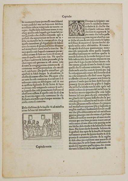
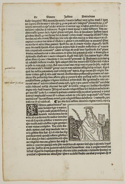
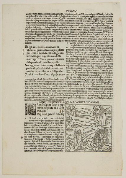
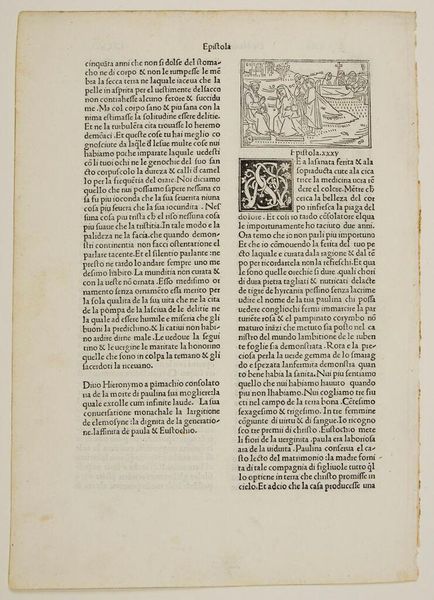
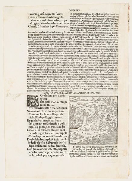
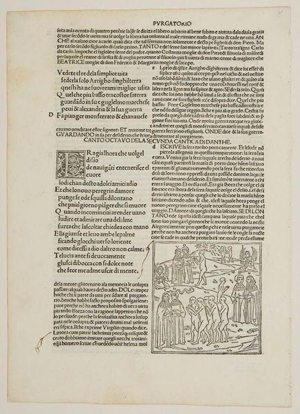
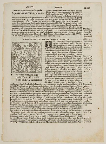
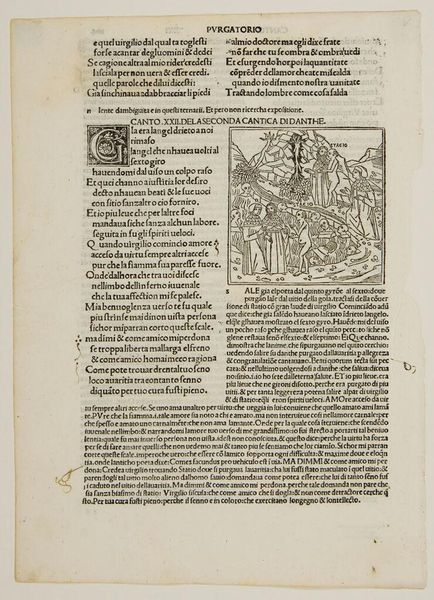
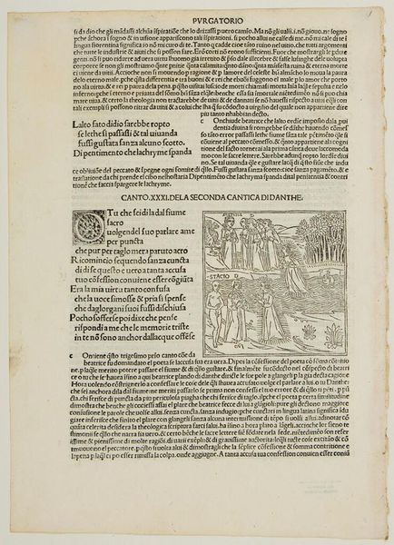
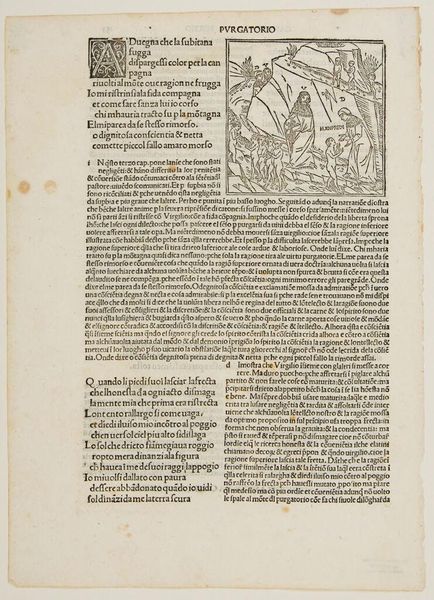
Editor: Here we have "Illustration I," an undated print from an anonymous artist, housed in the Harvard Art Museums. The density of text is quite striking; the whole page feels visually heavy. What are your first impressions? Curator: The visual field is dominated by a play of contrasts. Observe the stark difference between the dense, almost impenetrable blocks of text and the delicate, intricate designs within the initial letter. This juxtaposition creates a visual tension, inviting a closer examination of the page as a constructed object. Editor: So, you're drawn to the formal elements first? How does that affect your reading of the work? Curator: Precisely. The lack of explicit contextual information necessitates an engagement with its inherent qualities: texture, line, and the balance between positive and negative space. This approach invites us to appreciate the aesthetic considerations independent of any narrative. What does the typeface suggest to you? Editor: It reminds me of early printed books, like something from the Renaissance! Thank you, I hadn't considered the type as a structural element of the art.
Comments
No comments
Be the first to comment and join the conversation on the ultimate creative platform.
More like this