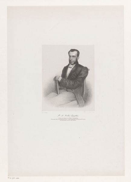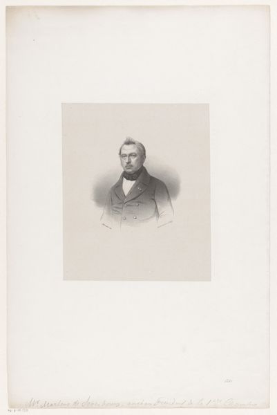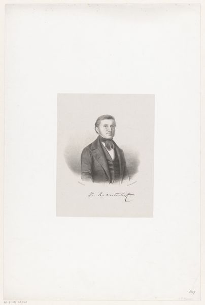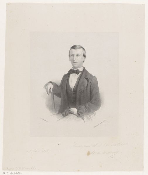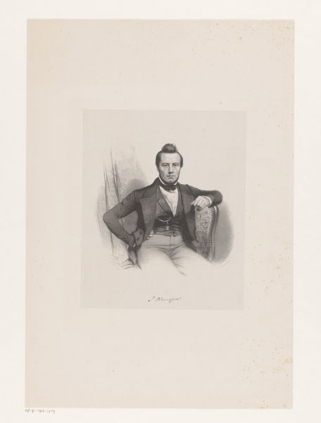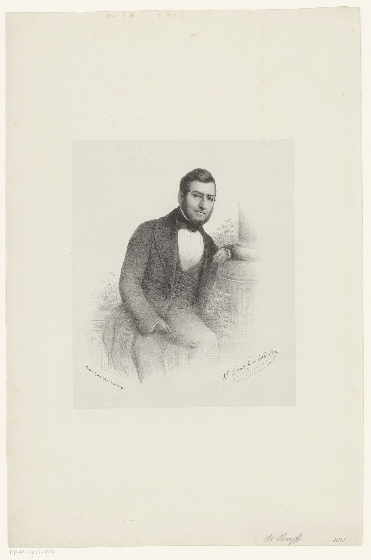
1854
Portret van de heer De Ruyff
Willem (II) Troost
1812 - 1893Location
RijksmuseumListen to curator's interpretation
Curatorial notes
Editor: We’re looking at “Portret van de heer De Ruyff,” a pencil and graphite drawing by Willem (II) Troost from 1854. It’s a surprisingly delicate portrait; the shading is incredibly subtle. What draws your attention when you look at it? Curator: My eye is immediately taken by the contrast in textures. Note the smoothness of the man’s coat juxtaposed with the almost scribbled, textural rendering of the foliage behind the pillar. Editor: Oh, I see what you mean! The textures definitely create an interesting tension. But is the pillar important at all? It looks out of place in relation to De Ruyff. Curator: It certainly does, the pillar, however clumsily rendered, provides structural support both literally and visually. It serves as a compositional element that directs the gaze. The subtle hatching in the background also helps define the form and space, doesn't it? The structural qualities cannot be overlooked. Editor: That's a good point. So you are saying it isn’t about WHO it is, or WHEN it was drawn, but that the elements and *their* specific composition have prominence? Curator: Precisely. The relationships between line, tone, and form are what constitute the artwork’s meaning. And the technical virtuosity evident in the pencil work should not be discounted. What are your thoughts? Editor: I now appreciate how much detail goes into creating different textural effects using only pencil. I still lean towards considering context, but focusing on the relationships between these elements helps clarify the work in question! Curator: Indeed, a close inspection such as this reveals the underlying strategies present in this drawing.