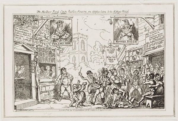
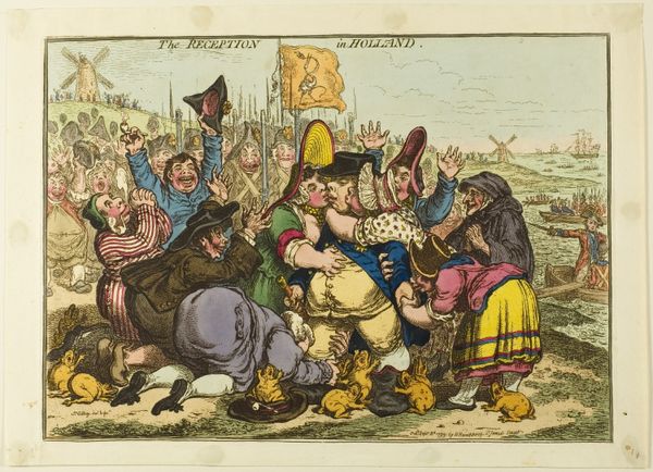
The Mother Red Cap Public House, in Opposition to the Kings Head c. 1820
0:00
0:00
Dimensions: 14 x 22.2 cm (5 1/2 x 8 3/4 in.)
Copyright: CC0 1.0
Editor: Here we have "The Mother Red Cap Public House, in Opposition to the Kings Head," by George Cruikshank. It's quite a lively scene, full of figures and details. What strikes you about the composition? Curator: The composition presents a fascinating duality. Note how Cruikshank employs two distinct groupings, visually separated yet united by the architectural structure of the public houses themselves. Consider the parallelism—the signs, the gatherings, and the implied narratives within each space. How do these visual rhymes affect our reading of the print? Editor: It creates a sense of opposition, as the title suggests. The figures seem almost caricatured. Curator: Precisely. The exaggerated features contribute to a semiotic reading of social commentary. The artist uses line and form to emphasize certain character traits, creating a visual language of satire. What do you make of the use of text within the image? Editor: The text adds another layer to the meaning, almost like captions to the scenes. It all feels very intentional. Curator: Indeed. Cruikshank masterfully integrates text and image, creating a complex and layered narrative. This piece serves as a potent example of the power of visual communication in conveying social and political viewpoints.
Comments
No comments
Be the first to comment and join the conversation on the ultimate creative platform.
More like this