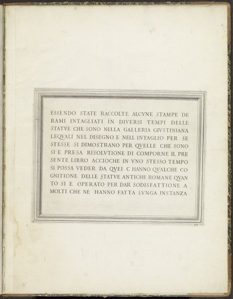
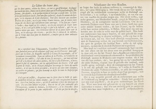
print, typography, engraving
#
baroque
# print
#
text
#
typography
#
geometric
#
engraving
Dimensions: height 205 mm, width 285 mm
Copyright: Rijks Museum: Open Domain
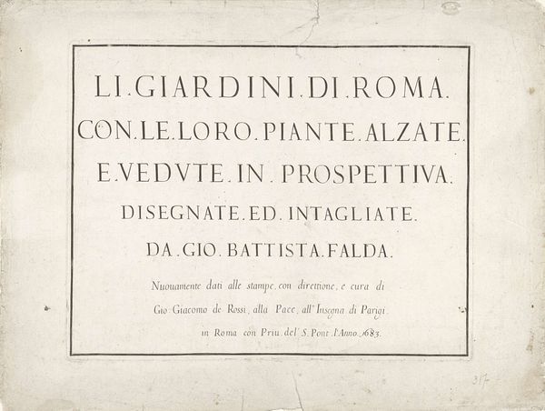
Editor: This is a title page with an embedded title, created between 1653 and 1691 by an anonymous artist. It's an engraving with typography, currently residing in the Rijksmuseum. It's mainly text and geometric forms. It feels incredibly ordered and clean; the typography has an impressive structure. What strikes you most about this piece? Curator: The visual interest lies primarily in the interplay of geometric forms and the meticulous arrangement of the typography. Note how the rectangular frame both contains and emphasizes the text, establishing a visual hierarchy. Observe the weight and counterweight of each letter form. Each horizontal element provides an interval within the rectangular, linear construction, forming an intellectual architecture that frames the textual matter. Editor: So, it's more about the forms than the words themselves? Curator: Precisely. The literal meaning takes a backseat to the arrangement, balance, and the pure form of the letters and shapes. Consider the negative space and how the letters occupy it, and it speaks to the baroque aesthetic through its elaborate structuring of space. Notice how the font itself creates rhythm. Editor: It's almost like the letters are sculptures. Curator: That is indeed the essence of its appeal. By isolating the textual matter and concentrating solely on line, space, and geometric configuration, we gain insight into its structural artistry and formal merit. It transforms the purpose of the title. Editor: I hadn't considered the importance of the empty space before! Now I can appreciate the precision needed to organize and arrange those components, rather than viewing it as simply informative. Curator: Indeed. Seeing it this way reveals its own intricate harmony.
Comments
No comments
Be the first to comment and join the conversation on the ultimate creative platform.
More like this