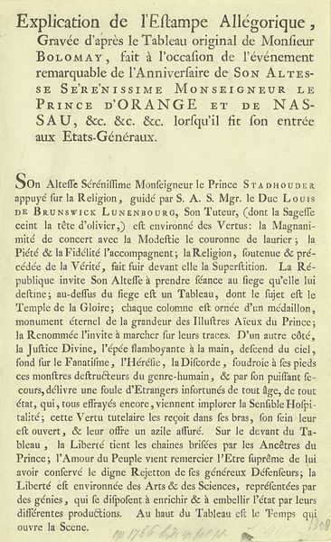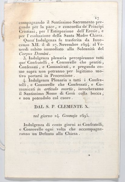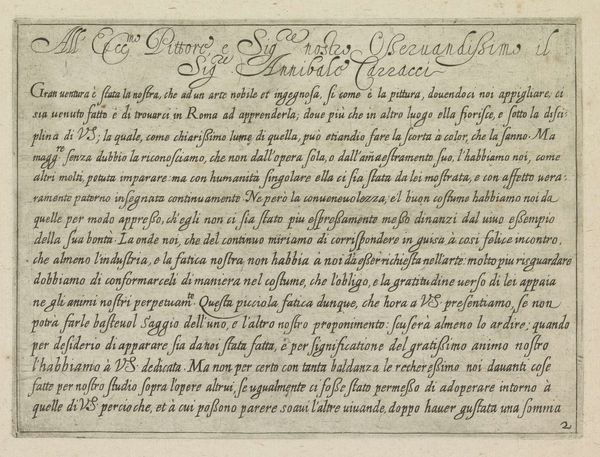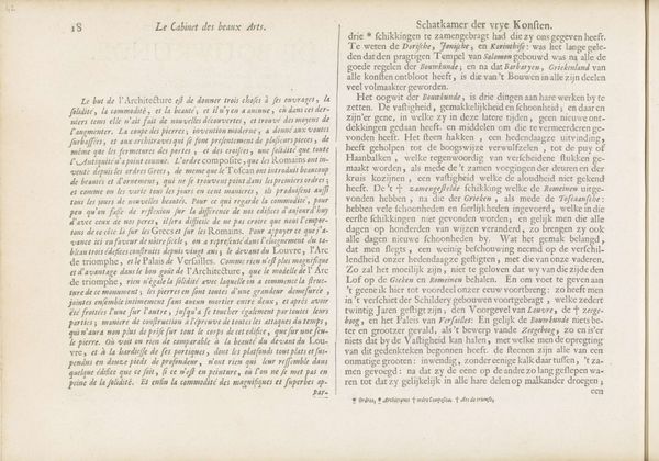
Prodigio dis. Pasquale, / Seguite in Tuvani nella Corsica nel Convento de Padri / Minori Riformati 1760
0:00
0:00
graphic-art, print, typography, engraving
#
graphic-art
# print
#
typography
#
hand-written
#
handwritten font
#
italian-renaissance
#
engraving
#
historical font
Dimensions: height 174 mm, width 270 mm
Copyright: Rijks Museum: Open Domain
Editor: So, this is an engraving from 1760 by Giuseppe Maganza, titled "Prodigio dis. Pasquale." It looks like an announcement or maybe even a news report, printed with very elaborate typography. The whole piece feels very dramatic, almost theatrical, in its presentation. What strikes you when you look at it? Curator: Well, immediately, the handwritten font jumps out. It’s attempting to emulate, and thus invoke, the power of the original miraculous text. This wasn’t just about conveying information; it was about authenticity. Think about the layers of meaning embedded in the very form of the lettering. How does it feel different from, say, a clean, modern typeface? Editor: I see what you mean. It feels more…personal, almost like a direct connection to the events described. Is it typical to see this style used in news reporting? Curator: In the 18th century, absolutely. The "news" wasn't as detached as it aims to be today. There's a deliberate attempt here to convince, persuade, even to inspire awe. This choice evokes the sacred nature of what it reports. Note the language used, too. "Prodigio" – prodigy, or miracle. How does this contrast with a headline you might read today? Editor: Today’s headlines would probably focus on the "who, what, when, where" of the story. This feels much more…interpretive, emphasizing the miraculous aspects. It almost sounds like a sermon more than a news report! Curator: Exactly! The handwritten style reinforces this idea of divine authorship and personal witnessing. These aren’t just events; they are signs, imbued with a significance beyond the everyday. It brings a sense of cultural memory with it, that has spanned the centuries. The typography thus operates as a relic, carrying both information and an emotional weight. It gives cultural and psychological context. What do you take away from it all? Editor: I understand now how the handwritten style, font type, and wording connect, creating the intended emotive, dramatic effect to promote the ‘miracle’. Curator: Indeed. Visual language shapes meaning far beyond just the literal words.
Comments
No comments
Be the first to comment and join the conversation on the ultimate creative platform.
