graphic-art, print, textile, paper, typography
#
graphic-art
# print
#
textile
#
paper
#
typography
Dimensions: height 240 mm, width 164 mm, thickness 35 mm
Copyright: Rijks Museum: Open Domain
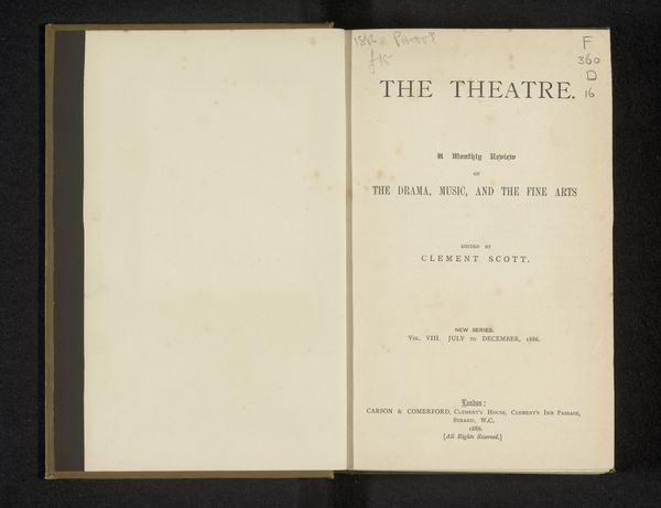
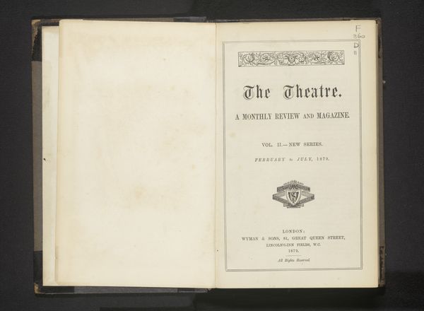
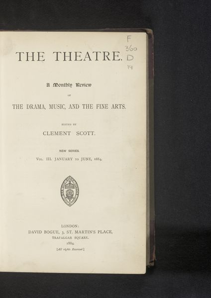
Curator: We're looking at an early edition of "The Theatre," a monthly review edited by Clement Scott, dating back to 1883. The texture of the paper itself speaks to an age of dramatic transformation. Editor: I am immediately struck by its severe typographical layout, the black ink almost swallowed by the off-white of aged paper. It's heavy and reserved— a fitting reflection, perhaps, of late Victorian sensibility. Curator: Observe the deliberate arrangement of text on the page, each line meticulously placed. Notice, too, the title: "The Theatre," in a strong, declarative font at the very top. Consider how it serves as a central signifier. Editor: Absolutely. And it also speaks of the cultural significance invested in the dramatic arts. The title, coupled with the emblem and dedication, signals a publication attempting to bestow legitimacy on its subjects. It seems poised to solidify its position within the established literary and art world. Curator: Exactly, a subtle dance of form and function! What interests me most is how this design aesthetic conveys so much about the values assigned to the drama, music and fine arts within the broader social context of 1880s London. There’s an attempt here, too, at objectivity, in its rigid structure. Editor: Do you really see objectivity? The choice of title itself asserts influence! Even typography communicates. That restrained typeface exudes authority; its legibility, an implicit claim to be taken seriously within academic or intellectual spheres. Curator: A valid point. This work is not merely about aesthetic, but also intent—an argument subtly crafted within its form. The scale too-- the choice of making this accessible through printed publication democratizes theater commentary beyond elite circles, but is controlled by publishers. Editor: Precisely. Reflecting on the cover, it’s like peering into a moment of dramatic interpretation where tradition seeks validation against shifting cultural values within a quickly modernizing era. Curator: I appreciate the nuance, and as someone involved in editing these reviews, Scott, clearly, considered this presentation a pivotal reflection of himself. Editor: I agree; even such minimalist graphic art becomes imbued with intent, symbolism and the fascinating dance of how societies perceive and remember their values.
Comments
No comments
Be the first to comment and join the conversation on the ultimate creative platform.
More like this