print, paper, typography
#
aged paper
#
homemade paper
#
script typography
#
paperlike
# print
#
paper texture
#
paper
#
personal sketchbook
#
typography
#
folded paper
#
thick font
#
paper medium
#
historical font
Dimensions: height 235 mm, width 155 mm, thickness 15 mm
Copyright: Rijks Museum: Open Domain
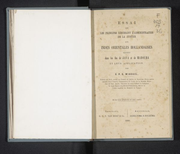
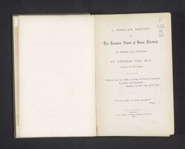
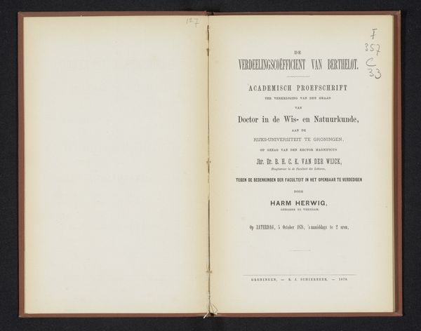
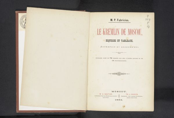
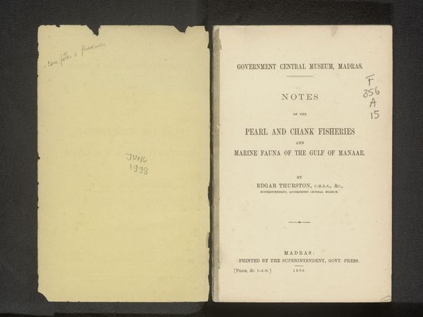
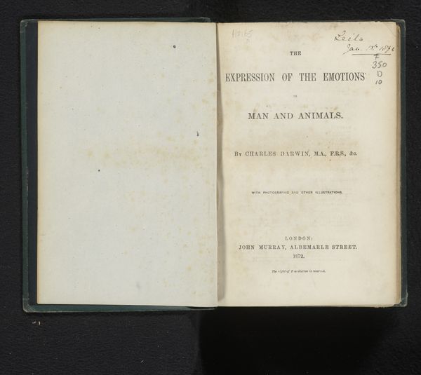
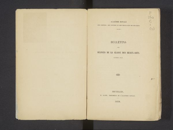
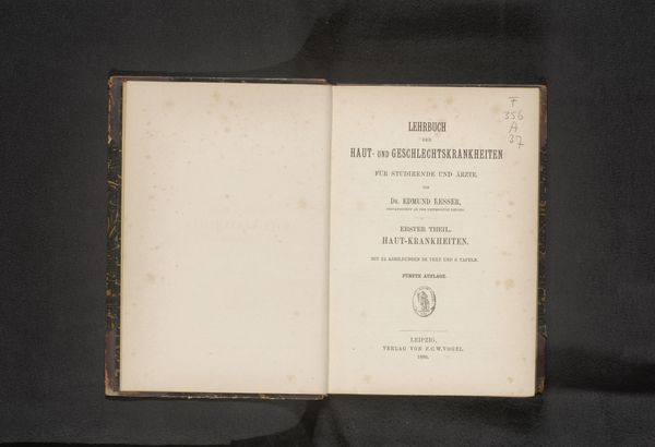
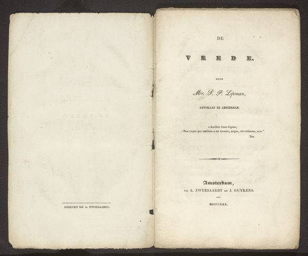
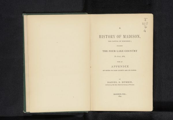
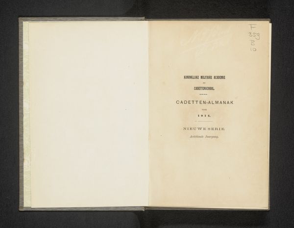
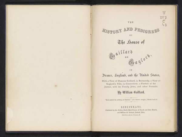
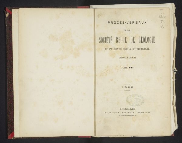
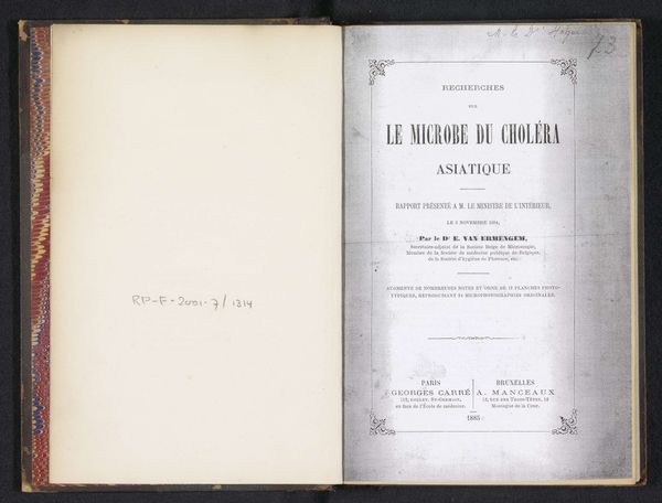
This is the cover of “Over den duur en het verloop der geïnduceerde galvanische stroomen”, a dissertation by Arend Jan Nijland, printed in 1870. The book’s form blends typography with material presence. Observe the stark contrast between the aged, off-white paper of the open pages and the assertive black typography. The layout, symmetrical and structured, employs varying font sizes to create a visual hierarchy that draws the eye to the title. Each word is carefully placed, indicative of a deliberate engagement with the page as a field of intellectual and aesthetic display. Consider how this arrangement functions semiotically. The formal typography is not merely descriptive; it embodies the scientific and academic values of its time, communicating authority through its design. It suggests an era of scientific positivism and a belief in the power of rational discourse, all within the physical bounds of this modest volume. The book challenges us to question how form influences our interpretation of content and to reconsider the interplay between aesthetics and knowledge.
Comments
No comments
Be the first to comment and join the conversation on the ultimate creative platform.
