Copyright: CC0 1.0
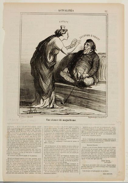
Editor: This is "My friend, you have really grown..." by Honoré Daumier. There's no date listed, but it's at the Harvard Art Museums. It looks like a lithograph. I'm struck by the stark contrast between the figures, and the use of line to convey texture. What do you see in this piece, from a formal perspective? Curator: The lithographic technique employed here is crucial; Daumier masterfully exploits its potential for tonal variation. Observe how the density of line dictates form. The figure representing "Europe" is rendered with a softer, more continuous line, implying volume and solidity, while "Italie" is depicted with fragmented, almost skeletal strokes. The stark opposition creates a powerful visual dichotomy. Editor: It’s interesting how the lines themselves are doing so much work. I hadn’t considered the difference in the strokes being a deliberate contrast. Curator: Precisely. The composition, too, is key. Notice the positioning of the figures: "Europe" looks up, while "Italie" extends a hand, creating a diagonal axis that implies a shifting power dynamic. The formal elements serve to underscore the thematic content, wouldn't you agree? Editor: Absolutely. Looking at the piece in terms of its formal composition really highlights the artist's message. Curator: Indeed. It reveals how effectively Daumier manipulates the visual language of art to convey complex ideas.
Comments
No comments
Be the first to comment and join the conversation on the ultimate creative platform.
More like this