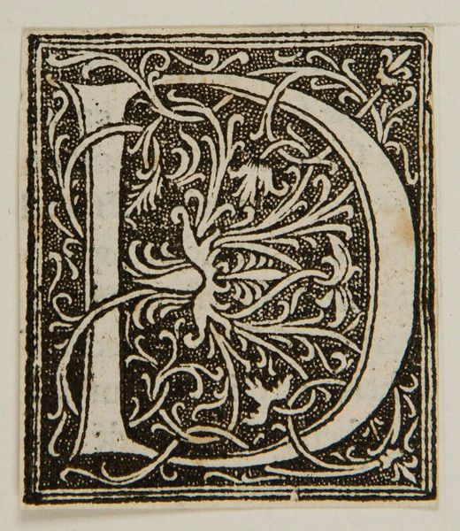
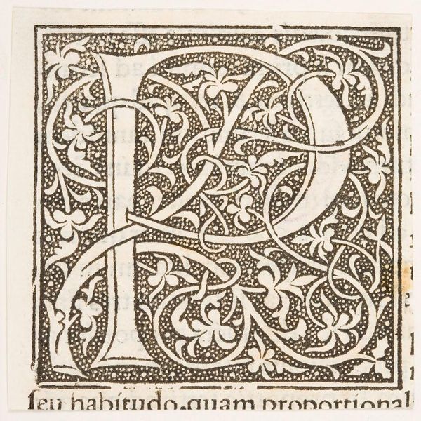
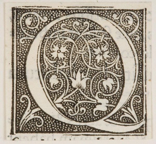
Roman Majuscule Alphabet c. 1520
Dimensions: 15.8 Ã 22.5 cm (6 1/4 Ã 8 7/8 in.)
Copyright: CC0 1.0
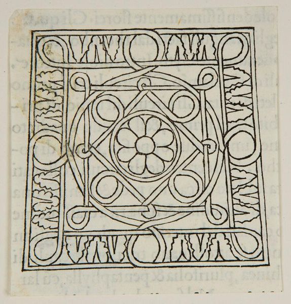
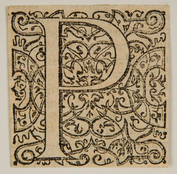
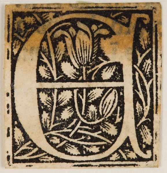
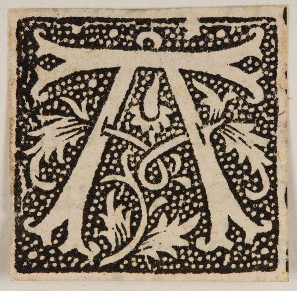
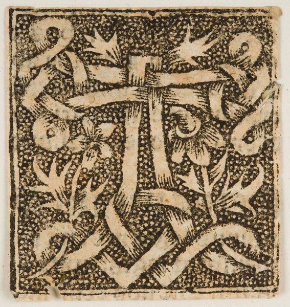
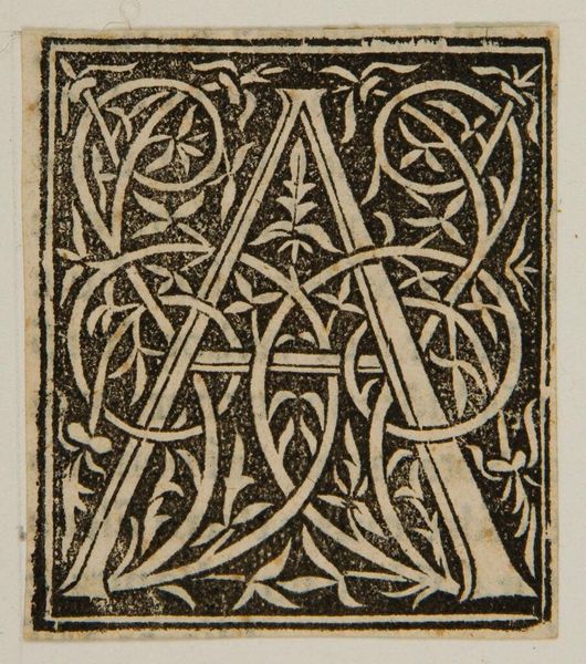
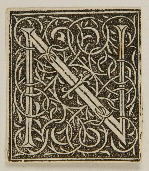
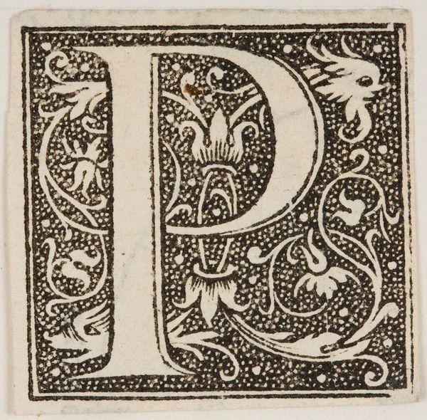
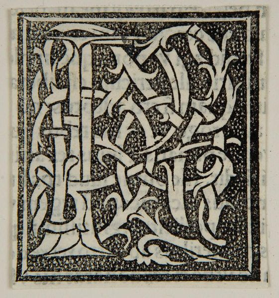
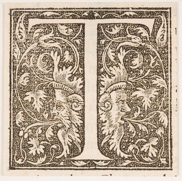
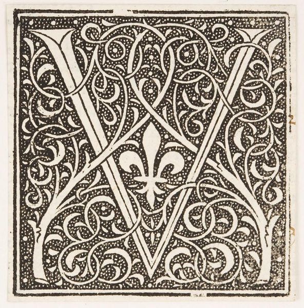
Curator: This is Daniel Hopfer’s "Roman Majuscule Alphabet.” Hopfer, who lived from 1471 to 1536, has created here a fascinating study of form. Editor: The lettering strikes me as bold, yet softened by the delicate filigree. It feels both monumental and intimate simultaneously. Curator: The composition guides the eye across each letterform, encouraging a detailed examination of its curves, lines, and negative space. The floral infill creates a kind of visual echo of the structure of each letter. Editor: I see this as a testament to the engraver's craft. The creation of such intricate detail on metal, the labor involved in producing multiple impressions—that’s a testament to early printmaking. Curator: Precisely. The visual elements create harmony through repetition and variation. Consider how the floral patterns, while consistent in style, uniquely complement each character. Editor: Absolutely. It's about accessibility, too. The proliferation of alphabet prints democratized learning, making elegant letterforms accessible beyond the elite. Curator: It’s really incredible to see how Hopfer balances the abstract potential of letterforms with the natural world through ornamentation. Editor: Seeing the alphabet elevated like this reminds you of both the artistry and effort involved in early book production, before mechanical typesetting.
Comments
No comments
Be the first to comment and join the conversation on the ultimate creative platform.
More like this