About this artwork
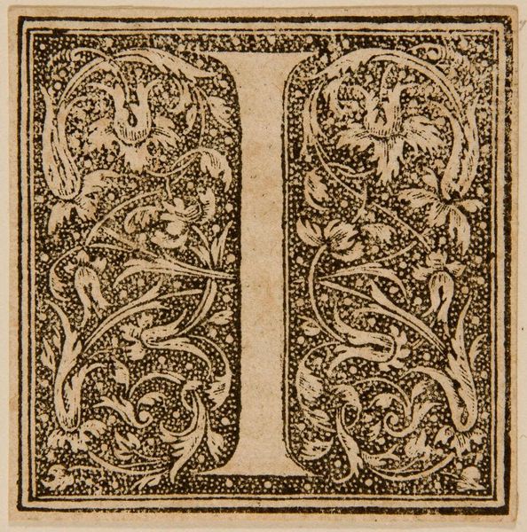
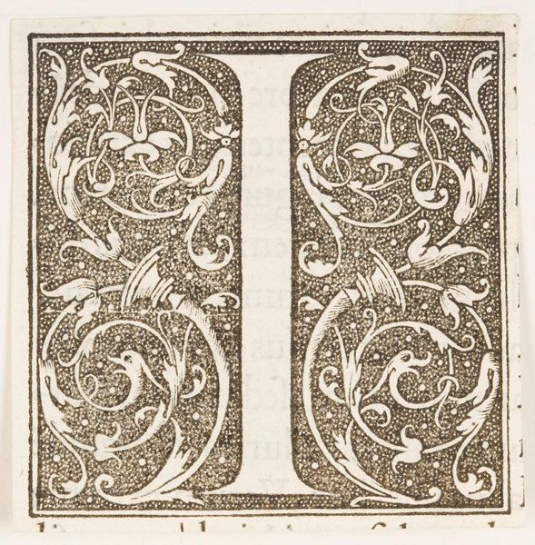
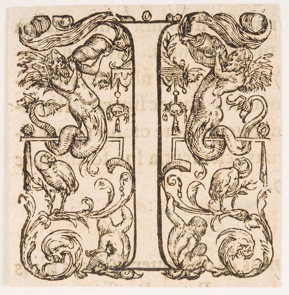
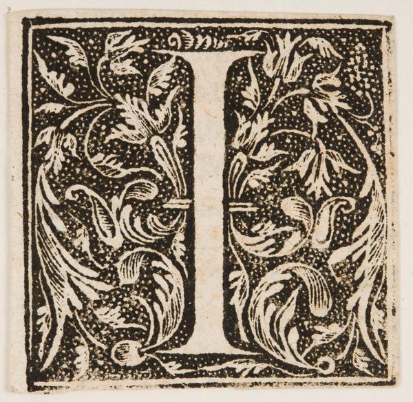
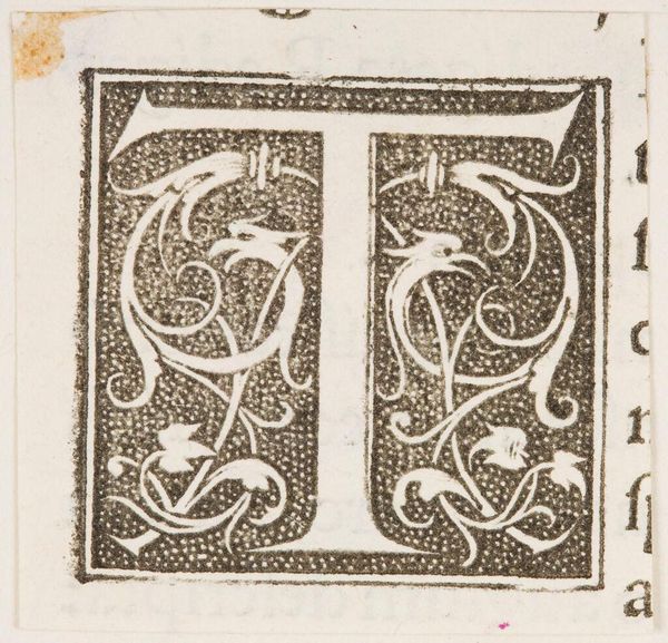
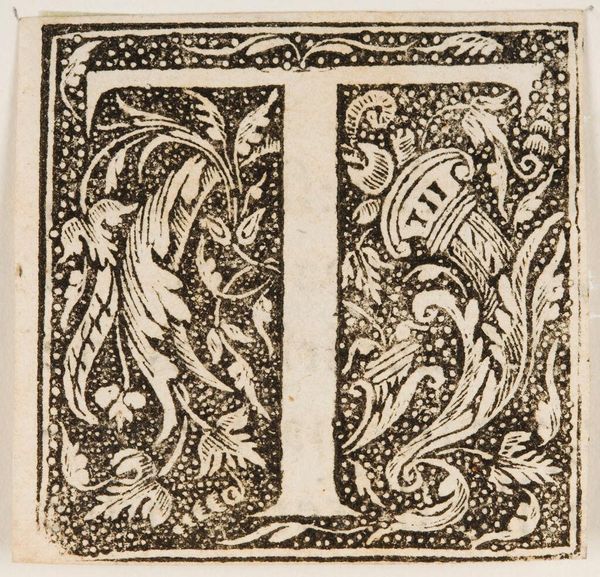
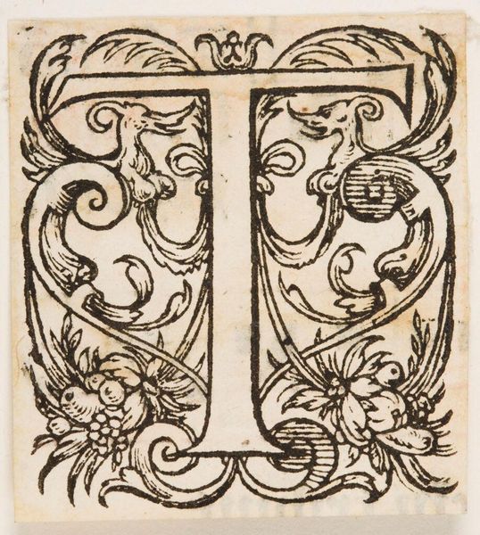
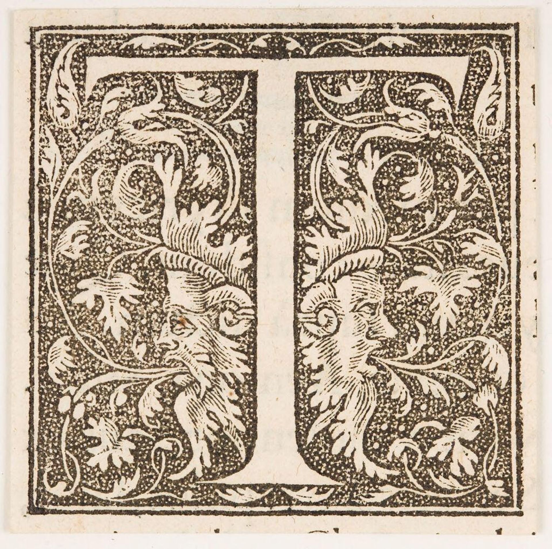
Editor: Here we have an initial for "Letter T," created by an anonymous artist. Its intricate design is quite striking. What do you see in this piece? Curator: The stark contrast between the black stippled ground and the white letterform immediately establishes a visual tension. Note how the foliate designs intertwine with the letter, blurring the boundary between the symbolic and the decorative. Editor: It’s interesting how the faces emerge from the foliage. Curator: Precisely. These Janus-like figures, with their enigmatic expressions, complicate our reading of the initial. Are they merely ornamental, or do they suggest a deeper narrative? Consider how the artist uses line and texture to create depth and volume, drawing the eye into a world of symbolic forms. Editor: It's given me a new appreciation for the artist's technique. Curator: Indeed, and encourages us to consider the letterform not just as a signifier, but as a complex visual composition in its own right.
Artwork details
- Location
- Harvard Art Museums
- Copyright
- CC0 1.0
Comments
No comments
About this artwork
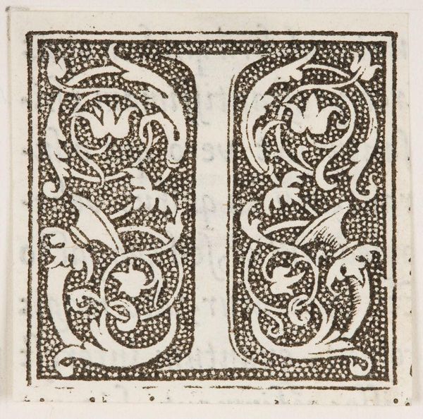
Editor: Here we have an initial for "Letter T," created by an anonymous artist. Its intricate design is quite striking. What do you see in this piece? Curator: The stark contrast between the black stippled ground and the white letterform immediately establishes a visual tension. Note how the foliate designs intertwine with the letter, blurring the boundary between the symbolic and the decorative. Editor: It’s interesting how the faces emerge from the foliage. Curator: Precisely. These Janus-like figures, with their enigmatic expressions, complicate our reading of the initial. Are they merely ornamental, or do they suggest a deeper narrative? Consider how the artist uses line and texture to create depth and volume, drawing the eye into a world of symbolic forms. Editor: It's given me a new appreciation for the artist's technique. Curator: Indeed, and encourages us to consider the letterform not just as a signifier, but as a complex visual composition in its own right.
Comments
No comments