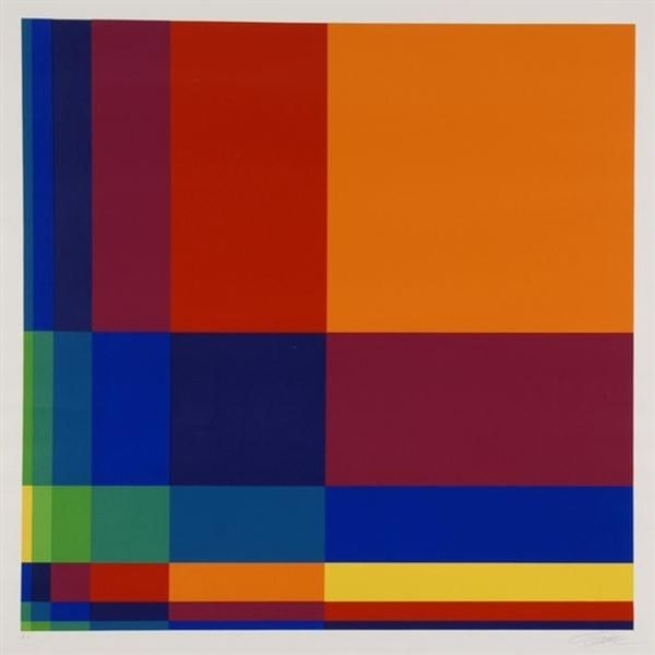
painting, acrylic-paint
#
op-art
#
painting
#
op art
#
pop art
#
colour-field-painting
#
acrylic-paint
#
geometric pattern
#
geometric
#
geometric-abstraction
#
pop-art
#
line
#
modernism
#
hard-edge-painting
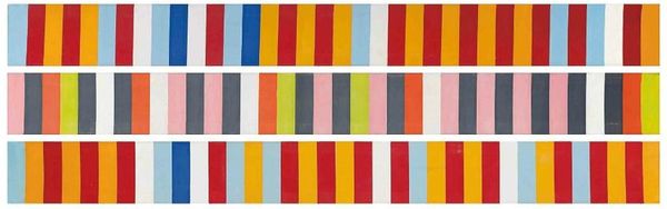
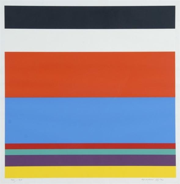
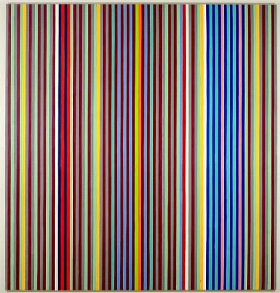
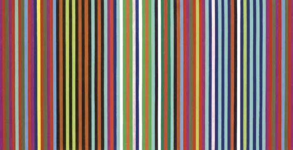
Copyright: Gene Davis,Fair Use
Editor: This is "Wall Stripes No. 3" by Gene Davis, painted in 1962. It looks to be acrylic on canvas. It's surprisingly simple, just horizontal bands of color. What strikes me is how the different colors vibrate against each other. What's your take? Curator: Well, consider that Davis emerged in a Washington D.C. art scene grappling with Abstract Expressionism. "Wall Stripes No. 3," from 1962, represents a decisive break. Think about the social context: America’s booming consumer culture. How might a work like this participate in the cultural conversation? Editor: So, you're saying this painting engages with Pop Art tendencies, even though it looks purely abstract? The colours are really eye-catching. Curator: Precisely! It mirrors the bold, manufactured hues of mass-produced objects. What is compelling here is to ask if there is also an evocation of the readymade, but applied to abstract form. It refuses the angst of Abstract Expressionism. And also note the scale; does this seem like an intimate, personal statement or something intended for public consumption? Editor: I see what you mean! It feels… almost like advertising, in a way. The scale isn't small, and its boldness gives off a very direct energy. What kind of political message, if any, can we interpret from a piece such as this? Curator: Its politics might be in its embrace of a democratic aesthetic, challenging the art world's traditional hierarchies and making a painting accessible. It becomes a visual manifesto reflecting changing times. Editor: That makes me appreciate it even more! The context of the ‘60s really transforms how I see the painting. Curator: Exactly. Understanding its place in art history illuminates its intentions. Art doesn’t exist in a vacuum.
Comments
No comments
Be the first to comment and join the conversation on the ultimate creative platform.
More like this