Curatorial notes
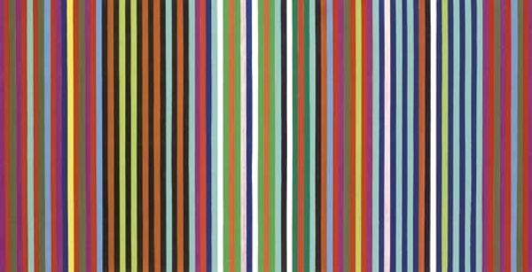
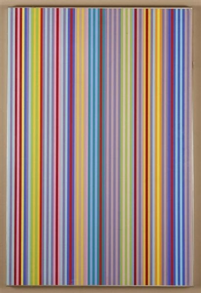
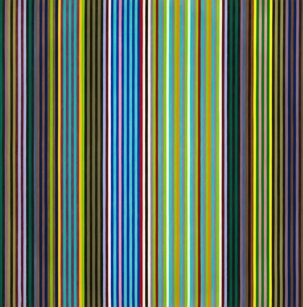
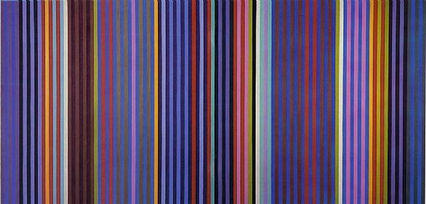
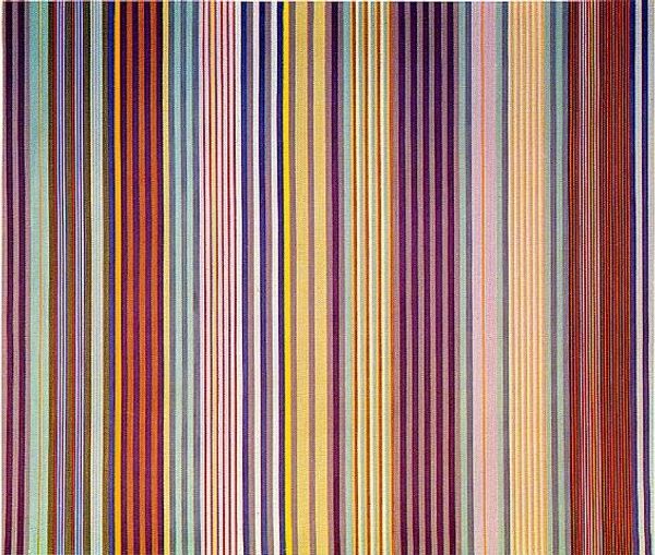
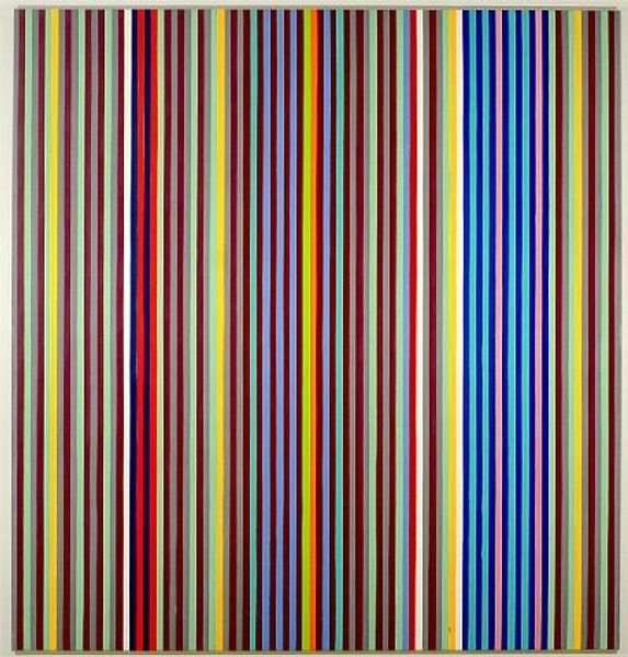
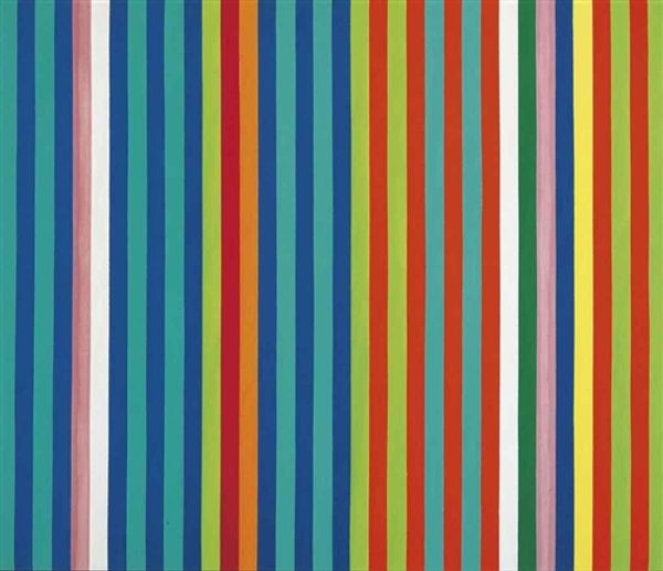
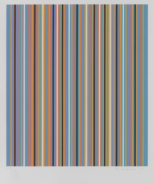
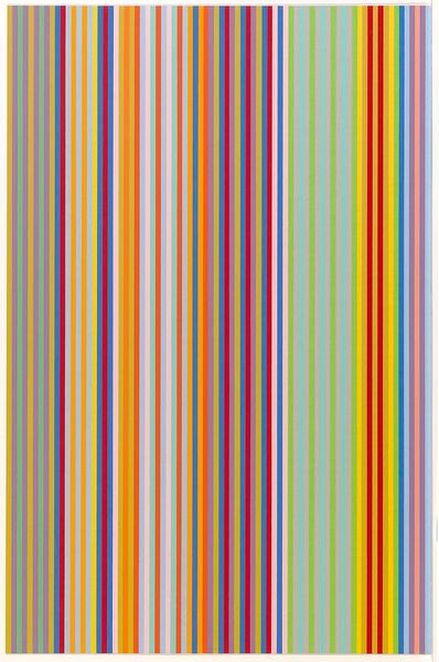
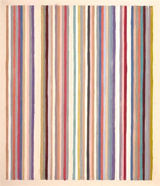
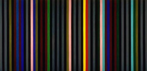
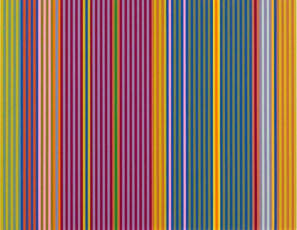
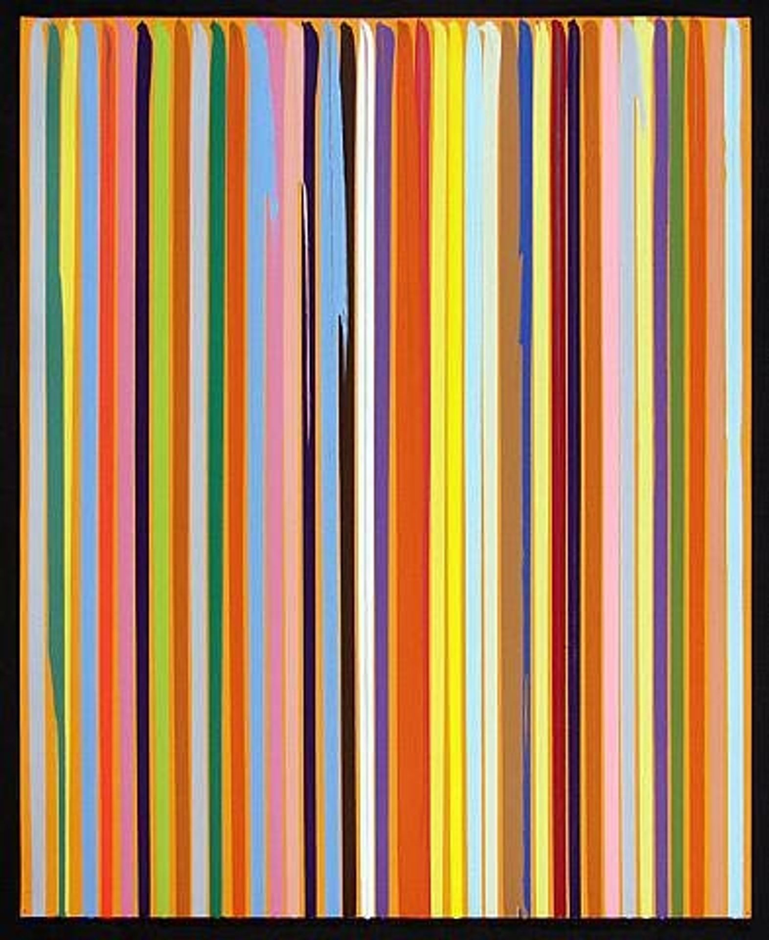
Editor: We are looking at Ian Davenport’s "Poured Lines: Orange" from 2005, made with acrylic paint. The stripes of vibrant colors immediately give it a playful feel, but something about the rigid order feels…almost regimented? How do you interpret this work? Curator: Those colorful lines strike me as visual echoes. It reminds me of color field paintings; the emotional impact relies almost entirely on color and the simplicity of form. The ordered lines can symbolize societal structures and rules we unconsciously internalize. Yet the “poured” aspect introduces an element of chance, chaos, even… are these rigid forms solid, or fluid? Does this visual friction prompt us to question established orders? Editor: I see what you mean about questioning the order... the way the paint drips gives it an almost rebellious feel. It’s so controlled, yet letting go. It feels very modern. Curator: Exactly! The artist harnesses accident and control. Think about the color choices, too. Orange often signifies energy, optimism, and creativity, yet each shade has nuances, adding complexity and disrupting simple, happy connotations. Do these juxtapositions of shades trigger cultural memories or even personal associations? Editor: That's interesting, I never thought about color as carrying memories. It really does invite a deeper consideration than just a fun painting. Curator: The key is to ask, “What is this combination of colours trying to tell me from a historical and social point of view?” And, also from your own individual experience, of course. What hidden cultural layers and coded messages might lie in such an everyday visual object? Editor: I'm leaving with more questions than answers! Thanks for unveiling some hidden meaning within what I thought was simply just...stripes.