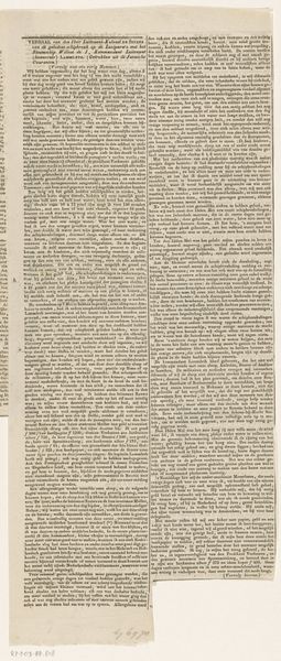
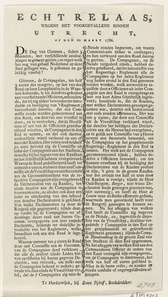
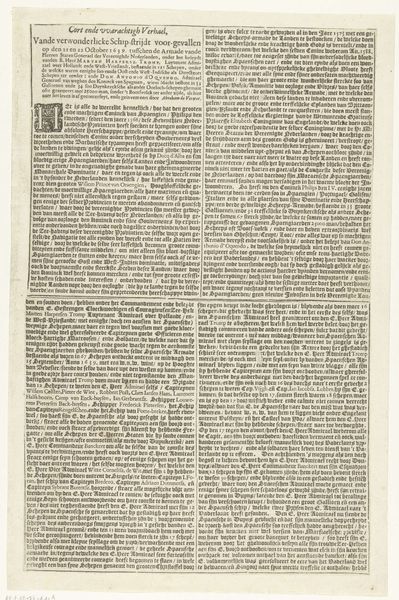
Tekstblad (tweede deel) bij de plattegrond van het belegerde Sas-van-Gent, 1644 1644
0:00
0:00
claesjanszvisscher
Rijksmuseum
print, textile, paper, typography, engraving
#
newspaper
# print
#
textile
#
typographical layout
#
paper
#
typography
#
engraving
Dimensions: height 173 mm, width 180 mm
Copyright: Rijks Museum: Open Domain
Curator: Today we're looking at a print titled "Tekstblad (tweede deel) bij de plattegrond van het belegerde Sas-van-Gent, 1644," created in 1644 by Claes Jansz. Visscher. Editor: It looks like a newspaper page…or a dense tapestry of tiny words! There’s a surprising graphic quality to the tight blocks of text. It's incredibly compact. Curator: Indeed. Visscher used engraving and typography to create this informational sheet related to a siege. Notice the meticulous arrangement and consistency of the letterforms, organized for efficient dissemination of information. Editor: Information, yes, but likely also propaganda. A siege is a fraught event, so the language and selection of detail had a profound political context, carefully shaping public opinion. Curator: Undoubtedly. The formalized structure gives an air of objective reporting. How it presents itself visually affects its meaning. Editor: Yes, and knowing this accompanied a map adds another layer of context. It becomes a tool of power, mapping out not just physical space, but also the flow of events and narratives related to conflict, further solidifying established viewpoints on class and conquest. Curator: Note the lack of ornamentation beyond the text itself. Every aspect of this work is purposed for clarity and efficiency. Its impact lies in its functionality, even as it exists as an aesthetic object today. Editor: What stands out most is the document’s vulnerability, its transparency regarding the past and present; it makes me consider how stories of power shape society's memory through various forms and viewpoints, even now. Curator: Studying the visual and material decisions help illuminate that purpose. The careful design emphasizes that disseminating precise, organized information was the principal objective of a piece such as this. Editor: The density also reminds me of the importance of alternative discourse during conflict, offering ways to counteract the dominant framework and shed light on many facets involved within conflict narratives.
Comments
No comments
Be the first to comment and join the conversation on the ultimate creative platform.
More like this