mixed-media, typography
#
stencil art
#
cubism
#
mixed-media
#
typography
#
typography
#
geometric
#
abstraction
Dimensions: 25 x 32.2 cm
Copyright: Public domain US
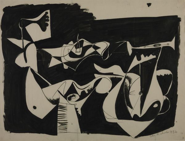
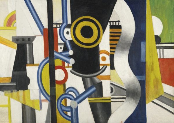
Fernand Léger made this mixed media work, on paper, called 'The Inhuman' in the early 1920s, and what strikes me is the kind of controlled chaos of the thing. There’s an interplay between flat graphic shapes and suggestions of depth, all rendered in muted tones, which feels very typical of his cool machine-age aesthetic. The surface has this tactile quality, like layers building up, creating subtle variations in tone and texture. The bold lines and geometric forms seem to almost jump off the page, colliding and interlocking in a way that's both dynamic and unsettling. Look at the way the letters of the title are integrated into the composition; they become shapes within shapes, kind of hard to read, which speaks to the artist’s interest in the relationship between language and form. It’s this balance of abstraction and representation, where every element contributes to the overall visual rhythm. You could compare it to the work of Stuart Davis, who similarly explored the fusion of text and image in his paintings, although Leger is the cooler of the two! It's this kind of ambiguity that makes art so engaging – it invites us to bring our own experiences and interpretations to the table.
Comments
No comments
Be the first to comment and join the conversation on the ultimate creative platform.
More like this