Copyright: CC0 1.0
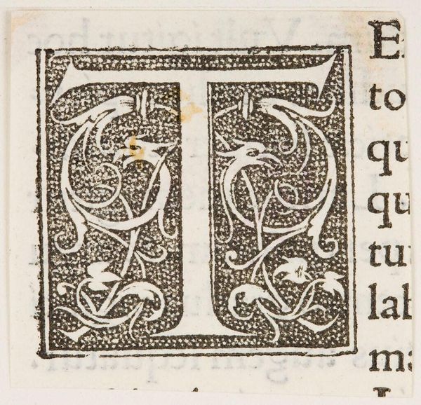
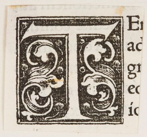
Curator: Here we have "Letter T," an intriguing typographical piece from an anonymous artist. It’s part of the Harvard Art Museums collection. Editor: The initial impression is one of controlled chaos. The rigid block around the 'T' contrasts sharply with the organic, almost vine-like decorations within. Curator: Indeed. The letterform itself is a study in contrasts—the bold, unyielding lines of the T playing against the delicate, swirling foliate designs. Editor: The 'T' of course has its own powerful symbolism, often linked to concepts like truth or even divinity, anchored here by the flourishing life around it. Curator: Symbolism aside, observe how the composition uses positive and negative space. The artist masterfully balances the density of the letter with the surrounding emptiness. Editor: It really shows that even the smallest, most utilitarian design can hold layers of meaning and invite deeper contemplation. Curator: Precisely. It’s a testament to the power of form and the visual language embedded in our everyday lives.
Comments
No comments
Be the first to comment and join the conversation on the ultimate creative platform.
More like this