Copyright: CC0 1.0
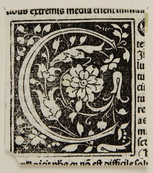
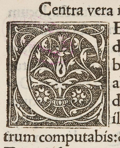
Editor: This is "Initial C," a small, anonymous print. I'm struck by the intricate botanical design nestled within the letterform. What do you see in this piece, focusing on its composition? Curator: The composition presents a fascinating interplay between the rigid geometric structure of the letter 'C' and the organic, almost chaotic, arrangement of the floral elements. Note how the negative space is just as important as the positive. Do you agree? Editor: Yes, the contrast is quite striking! The way the black ink defines both the letter and the flora creates a dense visual experience. It's a masterclass in balance, despite its small scale. Curator: Precisely. The artist skillfully manipulates the formal elements to achieve a harmonious whole. Editor: I see how looking at its structure reveals so much about the artist's intention. Thanks! Curator: Indeed, every formal decision contributes to the work's overall effect.
Comments
No comments
Be the first to comment and join the conversation on the ultimate creative platform.
More like this