Copyright: CC0 1.0
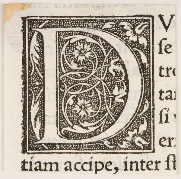
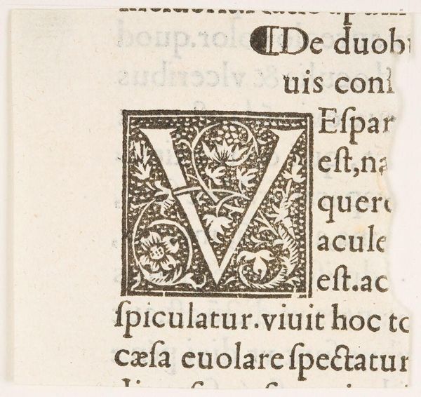
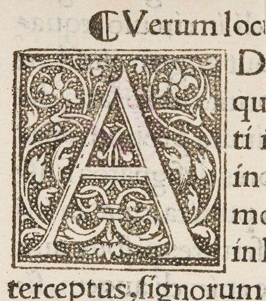
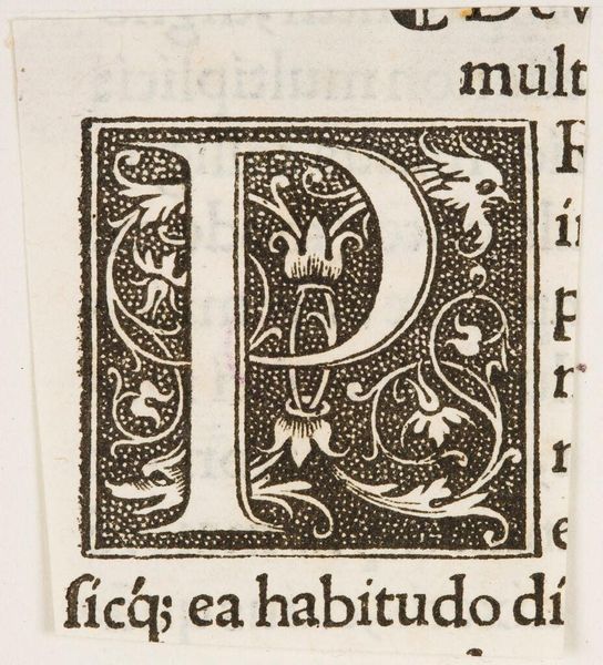
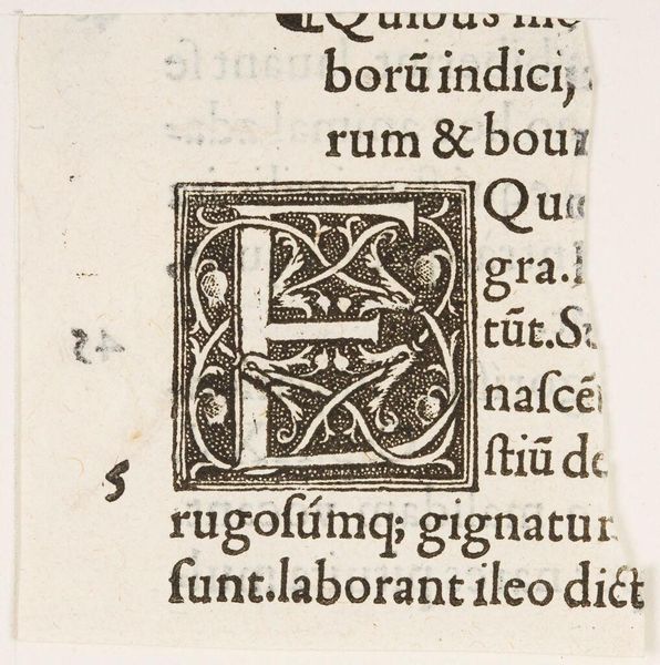
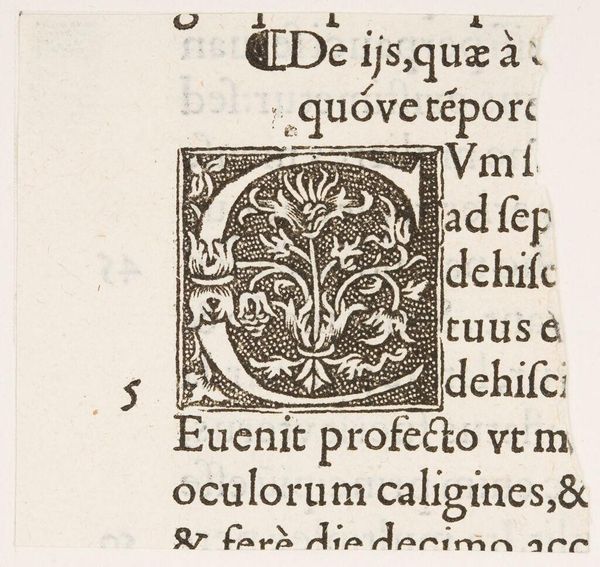
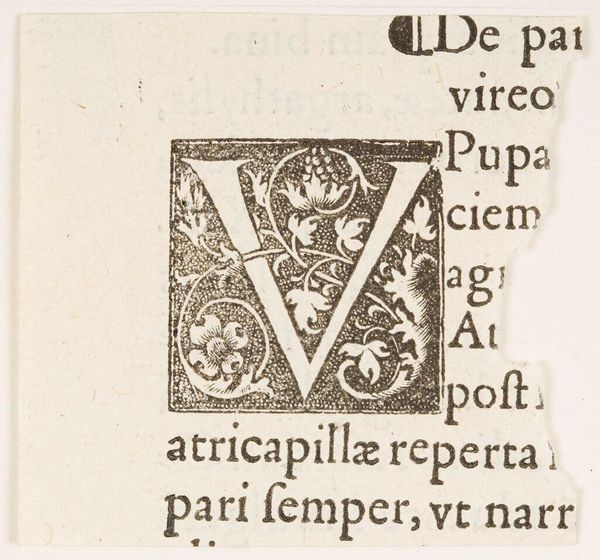
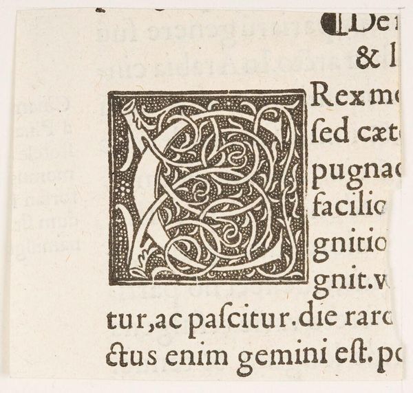
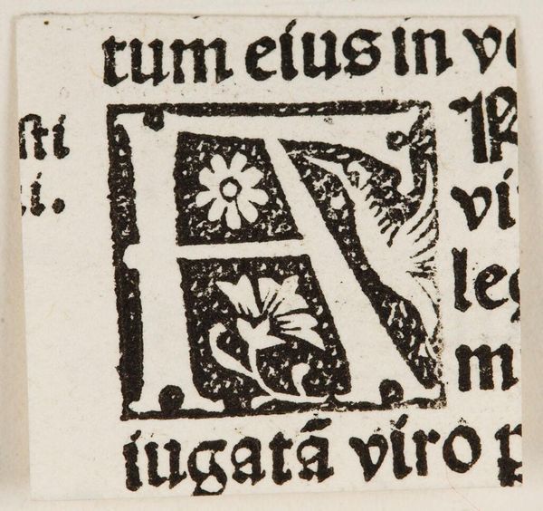
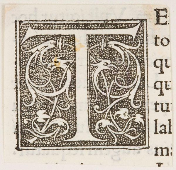
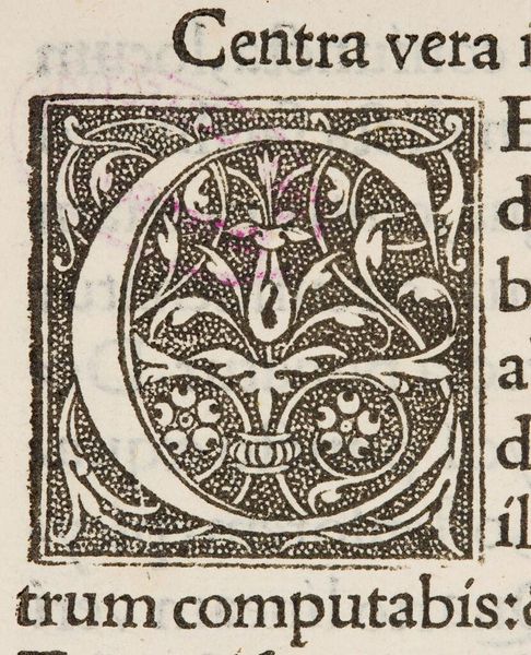
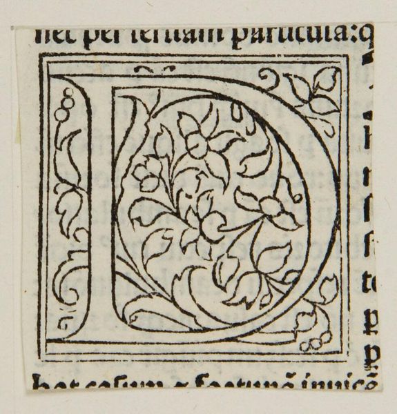
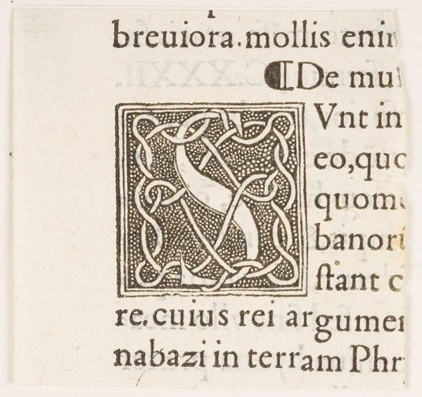
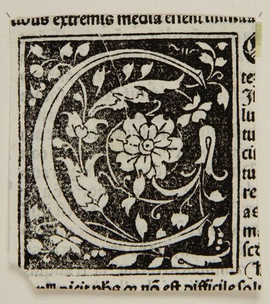
Curator: Here we have a woodcut initial, titled "Capital M," of unknown origin, found within the Harvard Art Museums collection. What strikes you first about it? Editor: The sheer intricacy of the design is captivating. Look at the stippling effect and the way the white space of the "M" contrasts against the dense, dark background. Curator: Indeed. These decorated initials were crucial in early printed books. They served not only to mark the start of a chapter, but also to visually communicate the book's value and the printer's skill. Editor: It is an exceptional interplay of positive and negative space, isn't it? The letterform itself, simple in its basic structure, is elevated by the ornamentation. Curator: Considering the rise of printing and increased literacy at the time, such details democratized access to learning while still maintaining a sense of artistry. Editor: I'm struck by how modern this feels despite its age. It speaks volumes about the enduring power of clean lines and bold design. Curator: It's a fascinating glimpse into the intersection of art, technology, and the evolving social landscape of its time. Editor: A testament to the power of form and function working in perfect harmony.
Comments
No comments
Be the first to comment and join the conversation on the ultimate creative platform.
