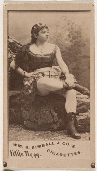
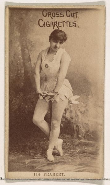
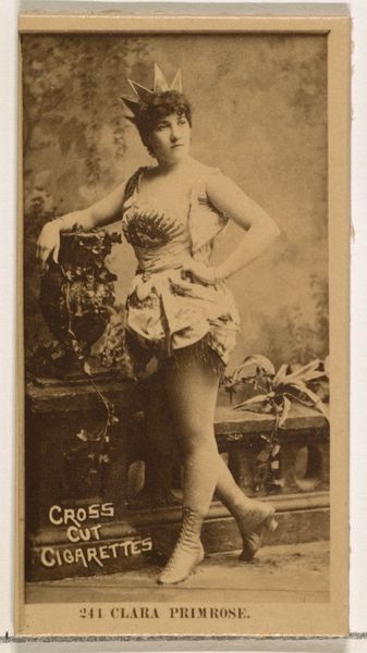
Card Number 124, Frankie Kemble, from the Actors and Actresses series (N145-2) issued by Duke Sons & Co. to promote Cross Cut Cigarettes 1880s
0:00
0:00
drawing, print, photography
#
portrait
#
drawing
# print
#
impressionism
#
figuration
#
photography
Dimensions: Sheet: 2 5/8 × 1 7/16 in. (6.6 × 3.7 cm)
Copyright: Public Domain
Curator: This is Card Number 124, Frankie Kemble, from the Actors and Actresses series, created by W. Duke, Sons & Co. in the 1880s. The piece employs photography and printmaking techniques. I find it quite fascinating that it exists primarily as advertisement. What are your initial thoughts about this image? Editor: I find it quite interesting! I noticed the way Frankie is holding a walking stick, or maybe some kind of cane. The contrast in her dress seems intentional, and there is even text across the top. But overall, I find myself struggling to find meaning in all these stylistic choices and its composition as a whole. How do you interpret this work, considering it's so much more than just a pretty face? Curator: Precisely. Let us begin by analyzing its compositional structure. Note how Kemble's figure is centrally positioned, bisecting the vertical axis. Observe the relationship between the organic curves of her attire and the implied rectangular format of the card itself. Semiotically, what do you believe is the intended message here? What is the significance of presenting an actress alongside an advertisement for cigarettes? Editor: Well, I'm no semiotician! If I were to guess, I'd say the advertisers are intending to associate the actress's beauty, or sophistication, with their cigarette brand? It's supposed to make the cigarettes more appealing, maybe even aspirational? Curator: An astute observation. This type of commercial work seeks to engage viewers using associations with status or popularity through portraiture. Now consider the tones. There's a clear distinction between lighter and darker areas, yes? Is this random, or does it suggest that they're strategically deployed to generate an interplay? Editor: Yes, now I see the strategic nature of that tension, creating depth but also directing attention to the upper part of the image, where her face is. The darker sections really accentuate the brighter tones of her lace details, especially on her neckline. So that means these visual techniques would add allure to her overall presence. The advertisers are using a full compositional arrangement to create that desired image for the viewers, right? Curator: Exactly! This analytical exercise is what I seek. It refines the critical understanding of commercial art. Thank you for this engaging discussion. Editor: This was illuminating. It helps to know how to unpack the compositional elements and strategic symbolism for the average viewer.
Comments
No comments
Be the first to comment and join the conversation on the ultimate creative platform.
More like this