drawing, graphic-art, print, paper, ink
#
drawing
#
graphic-art
#
script typography
#
hand-lettering
# print
#
old engraving style
#
hand drawn type
#
hand lettering
#
paper
#
word art
#
ink
#
hand-drawn typeface
#
thick font
#
handwritten font
#
coloring book page
Copyright: Rijks Museum: Open Domain
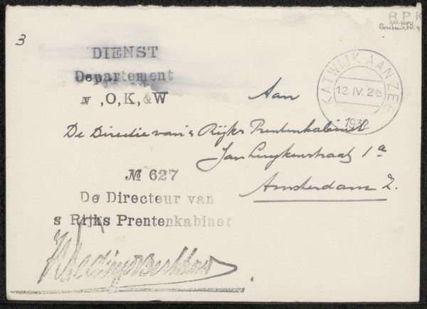
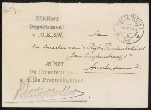
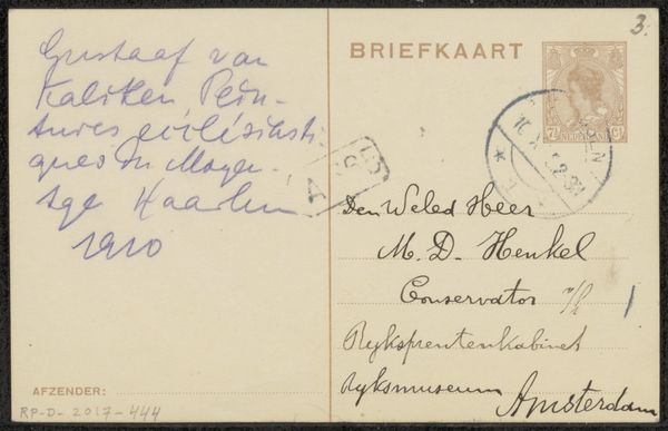
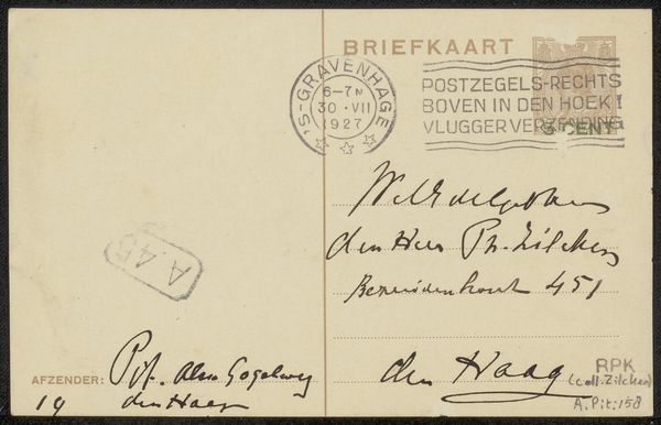
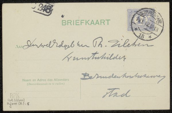
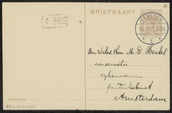
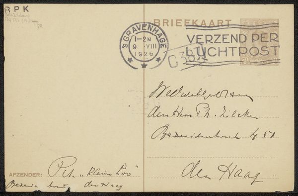
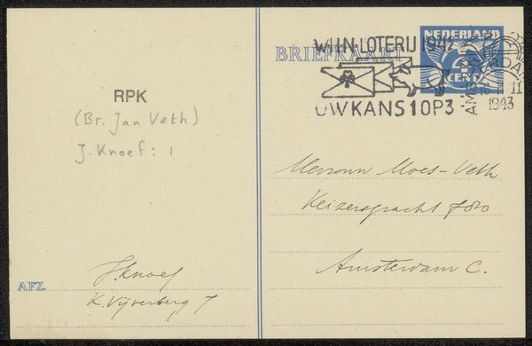
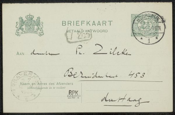
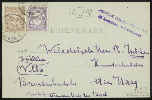
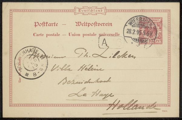
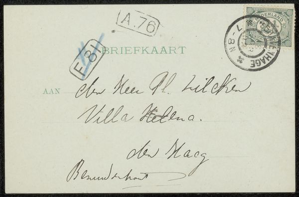
Curator: This is "Briefkaart aan Willem Bogtman," a postcard addressed to Willem Bogtman, possibly created in 1939 by Henriëtte Roland Holst-van der Schalk. The materials seem to be a combination of print, ink, and paper, primarily rendered through graphic art. Editor: Immediately, I notice the contrast between the rigid typography of the printed form and the fluid, almost frantic quality of the handwritten address. The materials feel quite humble, commonplace. Curator: Yes, it's fascinating how the official, printed part is juxtaposed with the personal, handwritten inscription. The postcard format itself was a relatively accessible medium, allowing for broader social and political communication. It was almost like a public declaration with a private addressee. Editor: For me, the postal markings and address overwrite that sense of 'official'. The handwriting on top of a printed form almost underscores the material reality – the labor of sending, receiving, reading... the materiality makes the correspondence intimate and active. And you can even make out the Haarlem address. Curator: Absolutely. It reflects the socio-political atmosphere of the time as well. Think about 1939 - the pre-war anxieties. Even something as simple as correspondence carries a heavier weight in such contexts. Postcards served as vital connection lines. Editor: Agreed, though I’d suggest it emphasizes human contact more than broader political anxieties. Paper itself can represent ideas and material vulnerability; in that year the price of such items likely changed constantly! So a simple message bears so much meaning. Curator: Precisely! It provides us with a snapshot of social interaction amidst potential instability. What do you take away from this overall? Editor: For me, it's a tactile reminder of connection. The postcard transcends its immediate purpose. It's the humbleness that really gets to me! And you? Curator: A window into the past. Highlighting everyday communications that ultimately define larger narratives.
Comments
No comments
Be the first to comment and join the conversation on the ultimate creative platform.
More like this