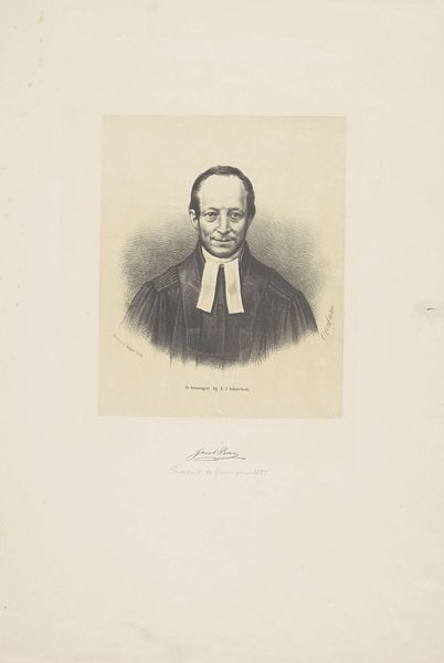
lithograph, print
#
portrait
#
lithograph
# print
#
academic-art
Dimensions: 368 mm (height) x 272 mm (width) (bladmaal)
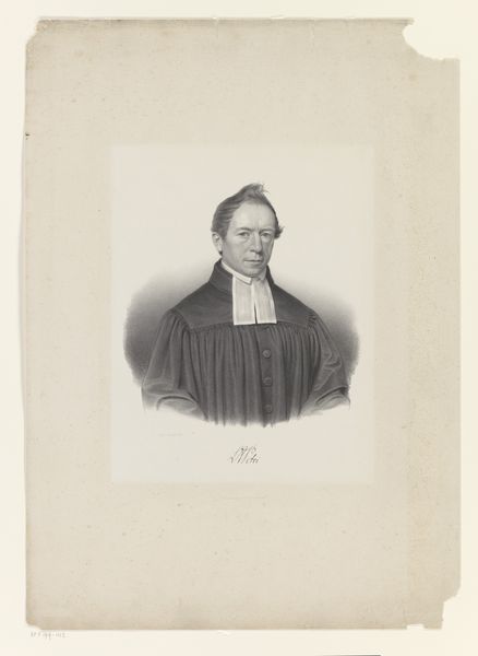
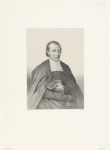
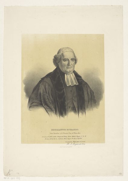
Curator: Here we have a lithograph from 1844, a portrait of Martin Lehmann created by Emil Ditlev Bærentzen. Editor: Something about that stark white collar and solemn face...makes me feel like I should confess something! Or at least, sit up straighter. Curator: The print utilizes academic art conventions to depict Lehmann. Note the careful use of shading to model the face and robe. It’s quite conventional and seemingly captures Lehmann with respect, while, most visibly, alluding to his role. Editor: Yes, the lighting emphasizes the wrinkles on his forehead and around his eyes. Creates an impression of deep thought and experience...a life lived, as they say! But those dark robes against the stark white...a high contrast and slightly severe choice for such an academic portrait. Curator: Contrast here, in its very essence, accentuates structure—a formal relationship of balanced chiaroscuro. The lines, though subtle, define the form and enhance the seriousness intended for this composition. Look at how the composition positions the figure. Editor: The tight crop around the figure creates a sense of immediate presence too, doesn’t it? Like he’s right here, about to start a sermon. A bit imposing, in a quiet way. Curator: Imposing presence achieved through line and tone, a study in conveying dignity through materiality, and careful application within compositional strategies. The success here comes from controlling gradations to suggest textures. Editor: It makes you wonder, doesn’t it, about the real Lehmann? Was he as serious as he appears, or did he ever crack a smile? What stories did those eyes hold? And in turn what was Bærentzen like? You sense the control, and that academic sensibility...was he ever tempted to break from convention, even slightly? Curator: While acknowledging your...spirited, subjective reflections, it’s worth reiterating that the artwork, considered from a Formalist position, uses careful formal structures. Its composition facilitates meaning through a network of signifiers—through line, tone, balance—within the very deliberate parameters of mid-nineteenth-century lithography. Editor: Agreed...but it’s those tensions within the structure that spark interest. The balance between the somber and the human. It reminds me how art can echo us. Thank you for that structure! Curator: A succinct mirroring, well conceived.
Comments
No comments
Be the first to comment and join the conversation on the ultimate creative platform.
More like this