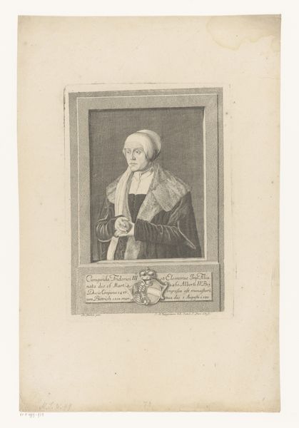
Dimensions: height 150 mm, width 96 mm
Copyright: Rijks Museum: Open Domain
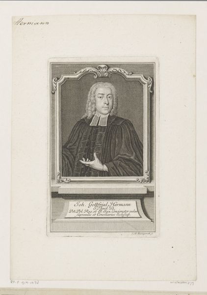
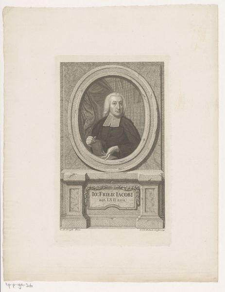
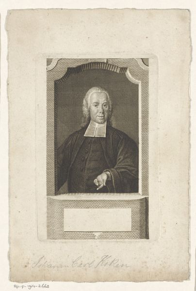
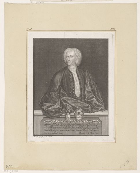
Editor: Here we have David Herrliberger’s "Portret van Johann Hofer," likely created sometime between 1752 and 1777. It’s a rather small engraving, and I’m struck by how formally Hofer is posed. What formal elements stand out to you in this piece? Curator: Formally, I am drawn to the use of line. Notice how the dense, cross-hatched lines create both tonal variation and the illusion of three-dimensionality. Consider the way Herrliberger has deployed line to delineate Hofer's face versus the draping of his robes. Editor: Yes, I see how the lines define the texture of the clothing versus the smoothness of the face. The hatching technique is so intricate! Curator: Precisely. And let us not disregard the subtle balance created by the composition: the rectangular border versus the oval face. How do those contrasting shapes impact your experience? Editor: I see it; the frame seems to solidify Hofer's presence, making him more imposing despite the print's diminutive size. Do you think the inscription affects the work formally? Curator: Undeniably. The decorative inscription provides both a visual anchor and contextual weight, reinforcing the subject’s importance while contributing to a harmonious composition overall. One could also see the contrast with the subject above as an artistic statement as to the subject being more than words. Editor: That’s a great point. I initially saw the inscription simply as providing context, but thinking about it now, its inclusion elevates the portrait's entire structure. Curator: Indeed. It encourages one to view Herrliberger's print not merely as representation, but as an essay in the language of visual forms. Editor: This has given me a whole new way of appreciating the deliberate construction of the portrait. Thanks!
Comments
No comments
Be the first to comment and join the conversation on the ultimate creative platform.
More like this