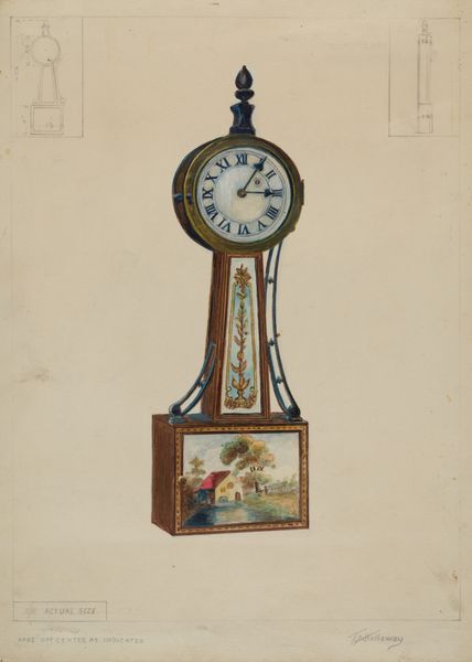
Dimensions: sheet: 8 x 9 7/16 in. (20.3 x 24 cm)
Copyright: Public Domain
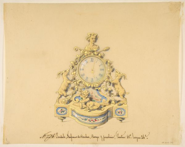
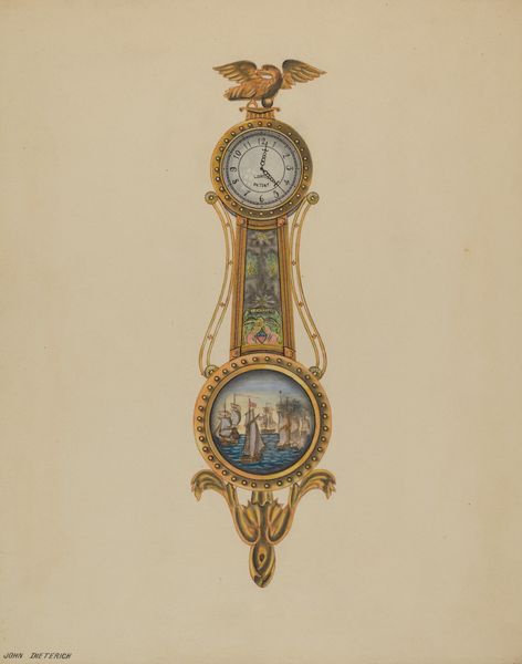
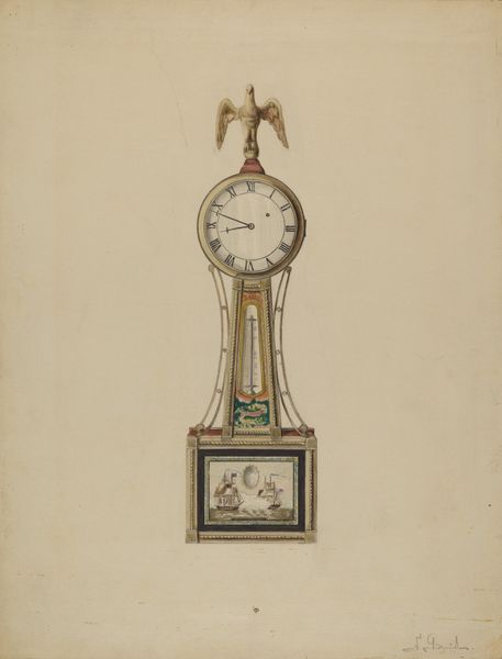
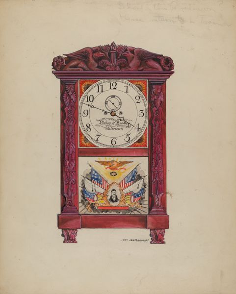
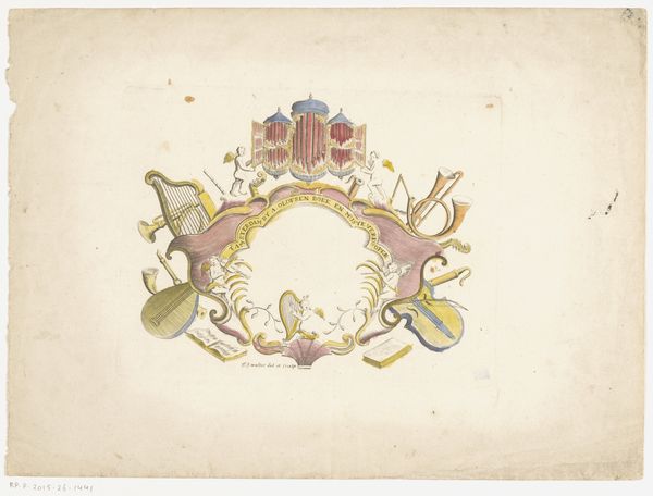
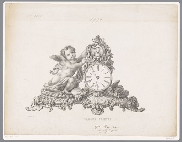
Editor: This is a nineteenth-century drawing entitled "Design for a Clock: Summer and Autumn," currently residing at the Metropolitan Museum of Art. It appears to be rendered in colored pencil and watercolor. The ornate detail makes me think of Rococo art, but what aspects of its composition really stand out to you? Curator: Note how the artist utilized symmetry and asymmetry to achieve a dynamic balance. The clock face itself is the central, stable point, framed by meticulously rendered, almost identical cherubs. However, the dynamism is introduced through the variance in their gestures and the subtle imbalance of the surrounding floral and faunal motifs. The decorative floral patterns provide linear rhythm. Do you observe how the artist’s color palette adds depth, yet retains flatness, typical of design drawings? Editor: Yes, the controlled color scheme, with its strategic highlights, is visually striking, keeping it grounded, rather than fully dimensional. Is the medium itself significant in this design? Curator: Precisely. The combination of watercolor and colored pencil allows for both precision and delicacy. The pencil defines the structure, while the watercolor imparts a soft luminosity. The clock seems tangible and ethereal all at once. This fusion is a vital attribute of design, wouldn't you agree? Editor: I completely see your point. Thank you for elucidating the formal qualities and helping me consider the interplay between media and composition. Curator: My pleasure! Analyzing its visual language enriches our comprehension beyond the purely functional nature of the clock design itself.
Comments
No comments
Be the first to comment and join the conversation on the ultimate creative platform.
More like this