drawing, coloured-pencil, paper, watercolor
#
drawing
#
coloured-pencil
#
neoclassicism
#
paper
#
watercolor
#
coloured pencil
#
watercolour illustration
#
decorative-art
Dimensions: sheet: 8 3/16 x 11 5/16 in. (20.8 x 28.8 cm)
Copyright: Public Domain
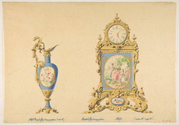
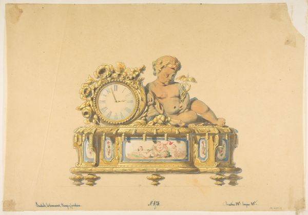
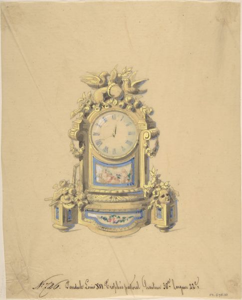
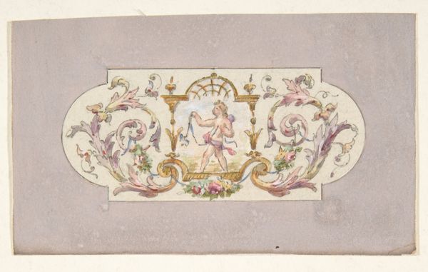
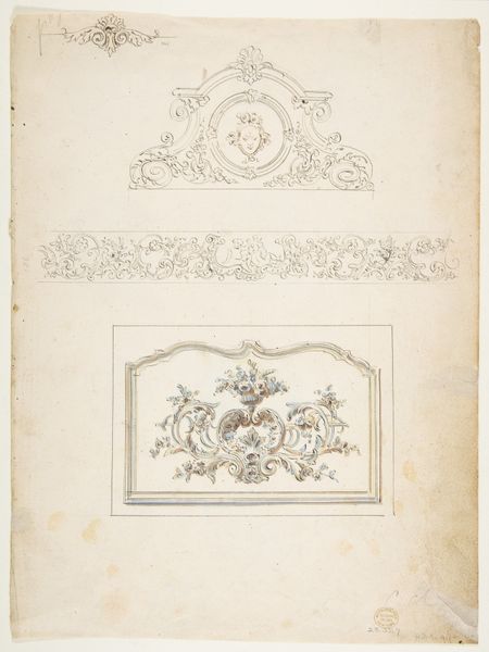
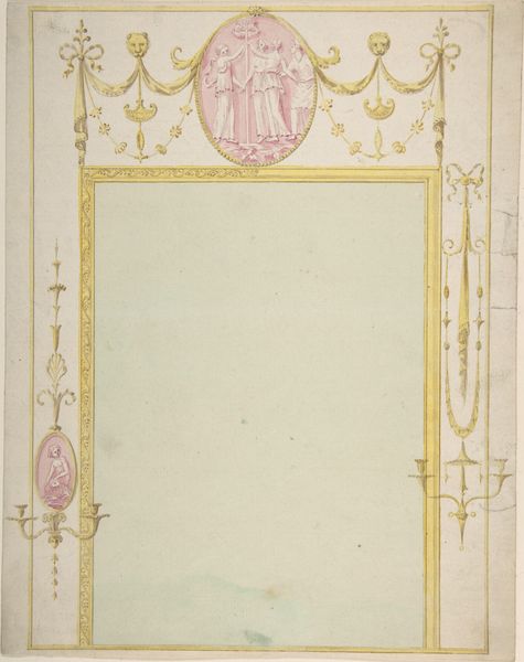
Curator: This delicate drawing offers us a glimpse into the decorative arts of the 19th century. It's titled "Design for a Clock: Three Birds," made with watercolor and coloured pencil on paper. You can find it here at the Metropolitan Museum of Art. Editor: It's charming, isn't it? There's something so light and airy about the colour palette; the gold filigree and soft blues are striking against the muted paper. Curator: Exactly! Note the inscription at the bottom. This meticulous detailing in the design drawing signals an intense consideration of materiality, it specifies "bronze and porcelain," implying both the clock's high cost and the skilled labor involved in its crafting. It reminds us that clocks like these were potent symbols of status. Editor: Absolutely, it's steeped in the socio-political context of the 19th century. Timekeeping wasn't merely practical; it reflected the increasing emphasis on industrial capitalism and structured labour. And clocks like these? They were powerful displays of wealth. The ornate design, the cherubic figures… It's all incredibly ornamental. Curator: The artist's consideration of color here is crucial. Consider the interplay of the gold and blues and how they activate and offset one another. But it's the unseen labour behind these types of items, as the decorative arts rise, do the maker's profit along with them? It all becomes obfuscated and a kind of veil arises regarding the socioeconomics. Editor: The "Three Birds" in the title suggest further symbolism perhaps – a flight towards industrial modernity, where consumerism drives desire towards the ornamental. You can interpret it in many ways, really. It seems that we as observers become aware of class distinctions that arise from labour's availability to a project's artistic success. Curator: A point well taken. It urges us to look at these designs not just as beautiful objects but as products embedded in their time. Editor: Indeed. I think investigating art pieces like this "clock design" makes us sensitive to broader shifts in the way objects functioned socially, signalling value. Curator: It's fascinating how a seemingly simple design can hold so much information. Editor: Exactly! These are objects that offer insight into class and culture, labour, and value as they operated within historical paradigms, a perspective that is also reflective of modern inequities today.
Comments
No comments
Be the first to comment and join the conversation on the ultimate creative platform.
More like this