Dimensions: image: 6 x 6 cm (2 3/8 x 2 3/8 in.) sheet: 19.9 x 13.9 cm (7 13/16 x 5 1/2 in.)
Copyright: National Gallery of Art: CC0 1.0
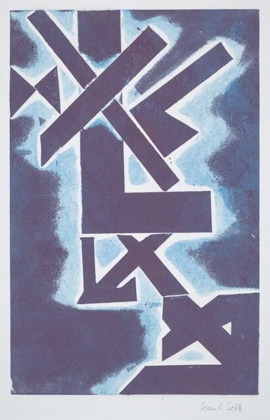
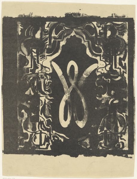
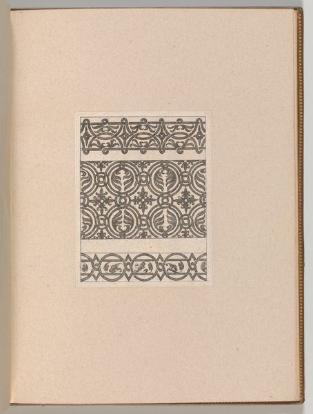
Curator: Let’s take a moment to look at “Letter ‘X’,” a graphic print that is likely a 1953 work by Dirk van Gelder using woodcut techniques. It presents a stylized rendering of the letter X, bordered by geometric florals. Editor: You know, looking at it, my first thought is that it's quite arresting! The boldness of the black ink against the stark white, combined with those repetitive geometric patterns… It’s almost hypnotic in a strange, old-fashioned way. Curator: Absolutely. Van Gelder’s embrace of Art Nouveau and Symbolist styles becomes pretty clear when examining the piece, particularly how the lettering intertwines with its decorative, botanical elements. We might explore how this emphasis on merging the ornamental with the structural served particular cultural purposes at the time, in a period still grappling with industrial modernity. Editor: I’m curious about the choice of "X", of all letters! It feels like there's a coded meaning, a little like staring into an Escher print and searching for the twist. Is it meant to evoke the unknown, maybe a crossing of paths, or simply the artist's signature mark? Curator: These symbolist influences could be explored as challenging the rationalism of modernism through abstraction and ambiguity. How might a single letter take on loaded semiotic weight? Van Gelder places “xylografie"—the Dutch term for wood engraving—beneath the letter. Above, we see something of mirror image, reading from right to left: X, followed by "ЯГOƆͶƎVИIX”. This inclusion emphasizes medium, process, but also something hidden. Editor: Hmmm. It kind of has a playful, subversive spirit—maybe a hint of rebellion within the constraints of graphic design. I wonder what music Van Gelder would listen to, working away at this intricate block print? Curator: Understanding the historical and artistic backdrop certainly frames our reception, helping us move beyond immediate aesthetic preferences towards a more informed perspective of the work's ambitions within its time. It encourages thinking critically about the formal choices. Editor: Agreed! So, less of an x marks the spot treasure hunt and more of an invitation to decode an era? That's something worth exploring. Curator: Precisely, a small print, a tiny doorway, a lot of art history. Editor: To x-plore! (Get it?). Ahem, I will see myself out.
Comments
No comments
Be the first to comment and join the conversation on the ultimate creative platform.
More like this