drawing, graphic-art, print, typography, woodcut
#
drawing
#
graphic-art
# print
#
form
#
typography
#
geometric
#
woodcut
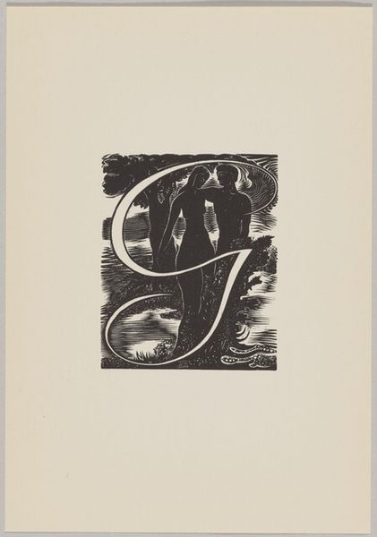
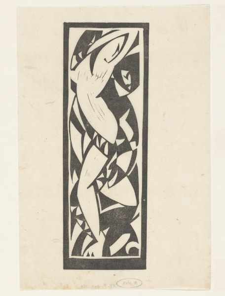
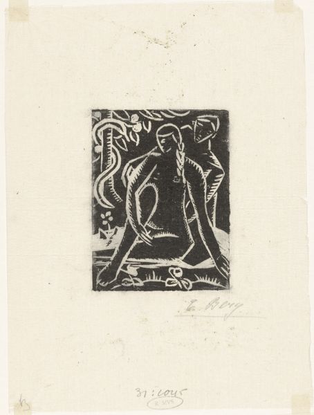
Dimensions: image: 6.7 x 4.7 cm (2 5/8 x 1 7/8 in.) sheet: 19.9 x 13.9 cm (7 13/16 x 5 1/2 in.)
Copyright: National Gallery of Art: CC0 1.0
Ina Rahusen made this woodcut "Letter I" sometime in the 20th century, and what's so charming about it is the way the positive and negative space play off each other in a very satisfying way, and it feels like there's a real joy in the making of this. The print has a stark contrast, like a cloudy winter day. Look at the snowflakes, how their delicate forms are carved out of the solid black ground. There’s something so satisfying about the way the artist has embraced the material. The crispness of the lines gives the letterform definition. The way the snowflakes curl around the central "I" reminds me of the way some of my own abstract forms repeat. When you see other examples of Rahusen's work, you start to see this kind of treatment a lot. Like the work of Hilma af Klint, Rahusen's work takes the motif and makes it into something otherworldly. It’s this quality that makes it so appealing, don’t you think?
Comments
No comments
Be the first to comment and join the conversation on the ultimate creative platform.
More like this