Ontwerp voor een logo voor boekhandel Scheltema en Holkema te Amsterdam 1876 - 1924
0:00
0:00
gerritwillemdijsselhof
Rijksmuseum
drawing, graphic-art, typography, pen
#
drawing
#
graphic-art
#
art-nouveau
#
script typography
#
typography
#
coloured pencil
#
geometric
#
pen
Copyright: Rijks Museum: Open Domain
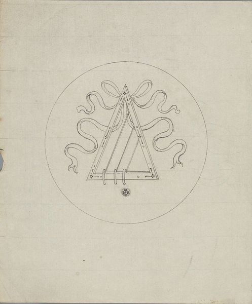
Curator: Here we have Gerrit Willem Dijsselhof's "Ontwerp voor een logo voor boekhandel Scheltema en Holkema te Amsterdam," a design drawing created sometime between 1876 and 1924, rendered with pen and colored pencil. Editor: The geometry is immediately striking; the interlocking letters, the enclosing circle. It has a powerful, almost architectural quality. Curator: Dijsselhof, deeply embedded in the Art Nouveau movement, was very much about bringing aesthetic considerations into everyday life, bridging the gap between art and commerce. Consider, this was commissioned work. This drawing functions as a microcosm reflecting the commercial surge in Amsterdam and a larger cultural prioritization of national identity in graphic representation at the turn of the century. Editor: You see the clear, decisive lines, the precision... it’s fascinating how the composition itself directs the viewer’s gaze, reinforcing the cyclical nature of language and communication intrinsic to a bookstore. Look at the space— the proximity between the 'S&H' monoliths. Curator: Note, also, that a certain class element is embedded into the semiotics; that is, we must read and write to purchase, we must access a cultural canon. So much rests, politically, on the commodification of written material, its power and inaccessibility, even today. Editor: Yet the aesthetic qualities are not to be overlooked. The balance between the text encircling the initials creates a dynamic rhythm. Notice the meticulous detail, how the colored pencil adds depth and shadow. It goes beyond mere representation; there is intention behind it, communicating visual engagement through geometrical exploration of a flat surface. Curator: Absolutely. But appreciating that visual strategy requires that we not disregard that Dijsselhof didn’t work in a vacuum, and the evolution of design in The Netherlands tells a far greater story that requires us to study more than shape and color to extract meaningful engagement from our history. Editor: Well said. In essence, exploring both formal and contextual layers offers a richer reading experience. Curator: Precisely. A complete history.
Comments
No comments
Be the first to comment and join the conversation on the ultimate creative platform.
More like this